Intercultural Design Competence (part 3/3)

In this blogpost, I want to sum up what I take away from the article about intercultural design competence. IDC is a continual process of cultural learning and understanding. A designer needs to be patient, because it may take some time. I think this graphic is a good visualization of the main points of the article:

Figure 2: A Summary of Intercultural Design Competence. Source: Image by McMullen 

Intercultural Design Competence (part 2/3)

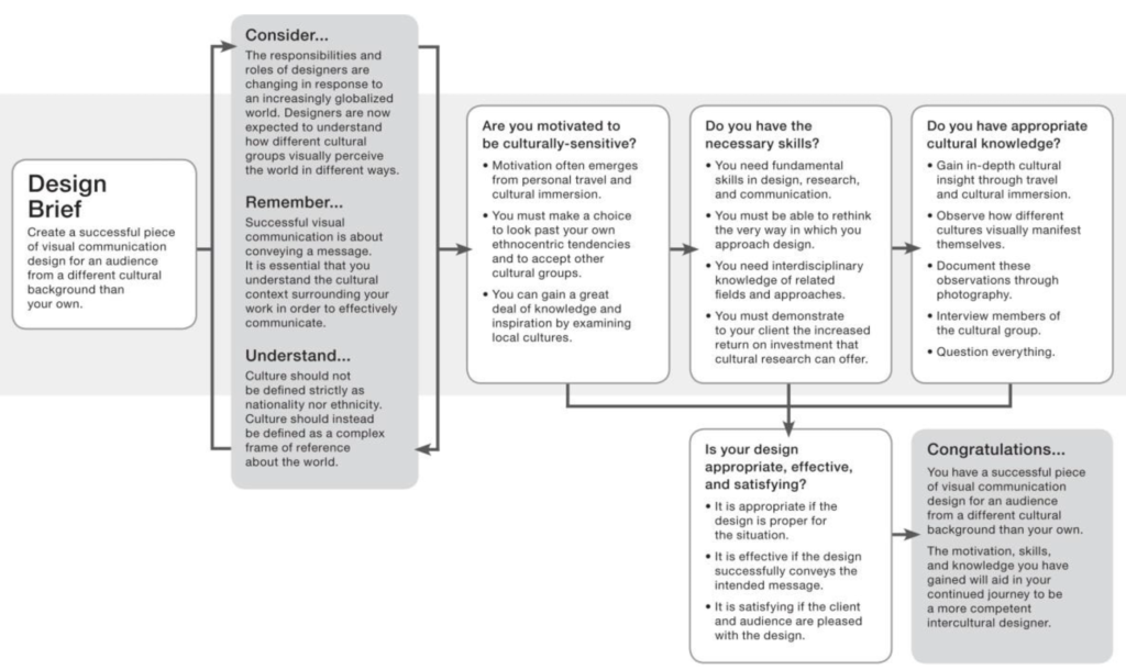
One concern many designers have is that misinterprations of their designs occur by people from other cultures. There are three common approaches to intercultural graphic design:

1) Graphic designers attempt to translate their own visual language into another culture’s visual language. This becomes more and more outdated because the same idea is often translated into multiple languages. But „many ideas do not clearly translate from one culture to another. Visual language, just like verbal language, has a specific grammatical structure. Whereas verbal language cannot be translated word for word, visual language cannot be translated image by image“ the article states.

2) Graphic designers focus on transforming their ideas rather than translating. They apply images or ideas only because of aesthetic reasons without really understanding them and copy specific styles of design. A designer should go further and rather „understand the images and ideas of different cultures, and then merge these with their own cultural knowledge to create an entirely new visual message.“ The article suggests the designer to be a chameleon and reflect local color but retain their form.

3) Graphic designers gain an understanding of the audience’s culture, because they want to avoid offending the audience. It’s important to not only avoid offending but to connect and look deeper.

Intercultural Design Competence (part 1/3)

New semester, new research topic. To put it short: I liked the topic logo design and was interested in it, but as we still have enough time to research in other fields, I looked for something I have a more personal connection to. Working on a master thesis is quite time-consuming and in order to keep going, being intrinsically motivated is important. 

As I really want to go abroad during my masters degree and I’m always fascinated by getting to know other cultures and becoming more and more open-minded, I thought of a cultural approach. I already wrote my bachelor thesis on the topic: „Erasmus students at the University of Salzburg. An analysis of motivation, satisfaction, communication and cultural challenges in the context of a stay abroad.“ Therefore, I conducted interviews with Erasmus students and I really enjoyed working on the topic and getting to know people with other different backgrounds. There is so much we can learn from each other. 

But now, back to my new topic: I started doing my research and came across this article:

https://www.academia.edu/29572529/Intercultural_Design_Competence_A_Guide_for_Graphic_Designers_Working_Across_Cultural_Boundaries?auto=download

Logo redesign

As I already mentioned in my last blog post, there are many reasons for a logo redesign. For example, the company was sold and the new partner wants to have a new corporate identity or the logo needs to be adapted to the contemporary taste or adapted to the target group.

Before redesigning a logo, it’s necessary to check the current appearance and then incorporate the new information. Additionally, think about the main advertising message or the slogan of the brand. Consider that it’s not always useful to add a dominant logo to an already very strong slogan.

If there are two logos and they should be merged into one, it’s also essential to identify elements that are indispensable and elements that can be removed.

Why companies change their logo from time to time

Companies change their logo every now and then for different reasons. In this blogpost, I want to find out which reasons there are. First of all, the change of a logo is always a risk and can arouse a lot of criticism from the consumers, because they got used to the old logo. It’s important to consider the possible wasted time and resources, if the logo redesign goes wrong. Is there a reason behind the redesign that is also understandable for the consumers and does it signal the right message? Or will the logo be changed for no reason?

Logo development

In my last blog post, I talked about the importance of logos for companies. Now I want to dive deeper into the topic of logo development.

Answer questions

As with every design task, the designer needs to ask who, what, why before creating the logo. 

  • Who is the client? What are the company’s values, attitudes and goals? What does the client want to be in the next year, what in ten years?
  • Who is the audience? Women or men? What age?
  • Who makes the final decision on the logo? Is it a person the designer doesn’t know and hasn’t seen before presenting the logo?
  • What is needed? Does a new logo solve the problem? Or is the problem larger?

EYA Youth Award

Today we visited the event of the European Youth Award which was under the theme „Watch out: Europe on fire“. I have to admit, I never heard of it before, but I really enjoyed listening to the ideas of the young entrepreneurs and start-ups. 

It’s hard to say which project I liked the most, because there are many that impressed me. My favourite projects were imagiLabs, socialbnb and Aivy. Not only the ideas behind the projects were great, but also the presentations themselves. They were easy to understand, emphasized the benefits and the slides were good looking, which makes a big impact. 

The history of logos

Many brands like VW, facebook and Lufthansa recently published new logo designs and everyone talks about it. Facebook’s new corporate branding could help to differentiate the parent company from the social network, because facebook is no longer just a social network, but also an umbrella organization for Instagram, WhatsApp, etc. This made me think about the importance of logos and ask myself the questions: Why is it important to change logos from time to time? Why are logos being simplified? What makes a good logo? But first things first: let’s start at the very beginning and dig into history. Why do logos exist? What is their purpose?