Companies change their logo every now and then for different reasons. In this blogpost, I want to find out which reasons there are. First of all, the change of a logo is always a risk and can arouse a lot of criticism from the consumers, because they got used to the old logo. It’s important to consider the possible wasted time and resources, if the logo redesign goes wrong. Is there a reason behind the redesign that is also understandable for the consumers and does it signal the right message? Or will the logo be changed for no reason?
Brand fatigue
A bad example is the clothing company GAP that changed its logo in 2010, because it wasn’t changed over 20 years. So it was changed, just because were tired of it. Only less than one week after the reveal, the company went back to the old one. The customers were just not ready for this next step and gave negative feedback. They thought it looked cheapy, tacky and ordinary. The company asked the customers to share their own designs of a new logo, but later went back to the old one.

Following trends
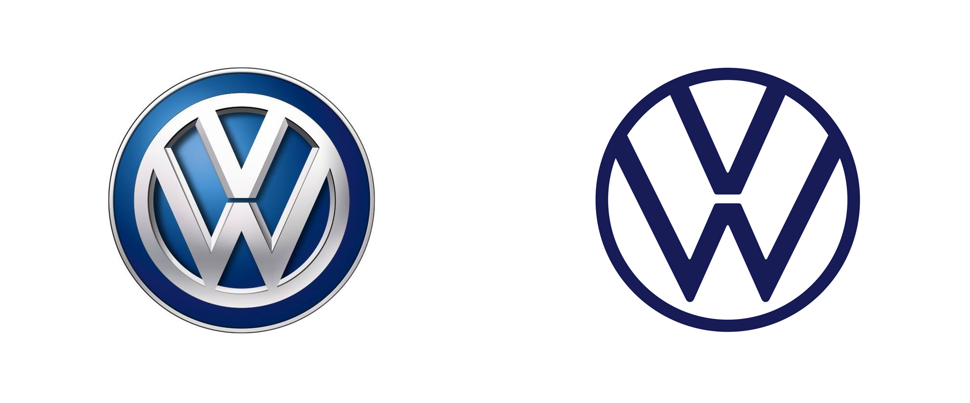
VW made a logo change in 2019 from a 3D to a 2D logo, because they wanted it to be more modern and with a higher contrast. The VW-marketing manager Sengpiehl also mentioned that he sees the brand VW on the same level as other international brands like Nike and Apple who already established a 2D logo and VW followed this trend. Not only the logo was changed, but also the whole brand identity including a different sound design.

Differentiation between company and brand
Another company that changed its logo was Facebook in 2019. It wanted to separate the wider corporation and the other Social Networks that are owned by Facebook like WhatsApp and Instagram from the core Facebook Social Network. The logo should make the differentiation between the brands and the company itself easier for the consumer. What’s interesting is that the name „Facebook“ stayed the same, but for the social network it’s used in lowercase and for the company in uppercase letters. Both logos are just wordmarks.

Strategy shift
Netflix changed its logo in 2014, because the company started out as an only DVD service, but had transformed into a global streaming brand. This change was made visible with the new logo.

These were just a few examples of reasons for redesigning a logo, but there are many more.
Sources:
Geoghegan, Tom (2010): Lessons to be learnt from the Gap logo debacle. Online: https://www.bbc.com/news/magazine-11517129 (28.12.2019.
Fazzini, Kate (2019): Facebook has a new all-caps logo. Online: https://www.cnbc.com/2019/11/04/facebook-has-a-new-logo.html (28.12.2019).
Koch Alexander (2019): Jetzt auch Volkswagen R mit neuem Logo. Online: https://www.autozeitung.de/neues-vw-logo-2020-193444.html (28.12.2019).
Enderwick, Barry (2014): Why Gap’s logo change failed but Netflix’s didn’t. Online: https://www.linkedin.com/pulse/20140722154130-16677-why-gap-s-logo-change-failed-but-netflix-s-doesn-t-t/ (28.12.2019).
David (2018): Netflix Sans — Netflix entwickelt eigene Schriftart. Online: https://medium.com/@dvd/netflix-sans-netflix-entwickelt-eigene-schriftart-a3f85bb0304e (28.12.2019).
Pictures:
https://www.pinterest.ie/pin/130815564147954396/