Was ist “Calle Libre” und wie viel Platz gibt es in Österreich für Murals?
Month: January 2020
Die größten Leinwände der Stadt
Im Winter 2017 haben Laura, Leonie und ich eine Dokumentation über die Stadt Aalborg in Dänemark gedreht. Zu dritt sind wir im Bachelor in den Norden geflogen, um zu zeigen, welches Ästhetik-Verständnis die Menschen dort haben und wie Street Art ihren Platz in der Stadt gefunden hat. Seitdem beschäftigt mich das Thema Murals, so werden diese “Wandbilder” genannt, sehr.
Binaural Audio
Das Wort binaural steht für „zweiohrig“ und ist ein Audiosignal bestehend aus zwei Kanälen, je ein Kanal pro Ohr, was jedoch nicht gleich zu setzen ist mit dem Begriff „Stereo“. Anders als bei Stereosignalen, werden bei der binauralen Aufnahme noch räumliche und kopfbezogene Aspekte beachtet, die durch Metadaten in die Audiospur mit abgespeichert werden. Das räumliche Hören erlaubt es komplexe Räume durch Schallortung zu analysieren und sich dadurch zu orientieren. Wichtige Parameter wären hierfür zum Beispiel die interaurale Zeit- und Intensitätsdifferenz und die daraus resultierenden Änderungen im Frequenzgang, um eine räumliche Lokalisation über das menschliche Gehör wahrzunehmen. Diese Änderungen im Frequenzspektrum können durch eine Übertragungsfunktion beschrieben werden, welche auch Außenohr-Übertragungsfunktion oder Head-Related Transfer Function (HRTF) genannt wird.
Räumliche Hörwahrnehmung
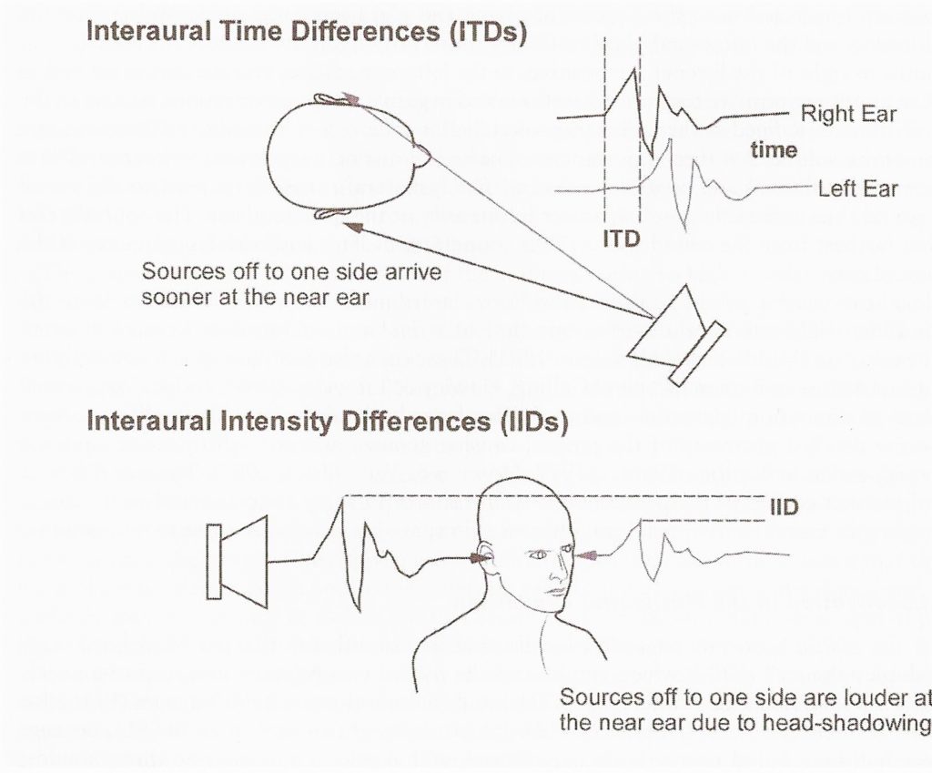
Die räumliche Wahrnehmung ist geprägt durch verschiedene Faktoren. Um eine Schallquelle richtig zu lokalisieren, werden die interauralen Unterschiede vom rechten zum linken Ohr in der horizontalen Ebene und zusätzlich mit den Reflexionen des Körpers, Kopfs und in der Ohrmuschel klanglich wahrgenommen. Mit den interauralen Unterschieden sind zum einen die interaurale Laufzeitdifferenz ITD (engl.: interaural time difference) und zum anderen die interaurale Pegeldifferenz ILD oder auch IID (engl.: interaural level difference, interaural intensity difference) gemeint.
Head Related Transfer Function (HRTF)
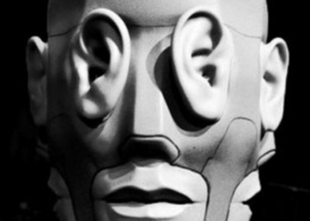
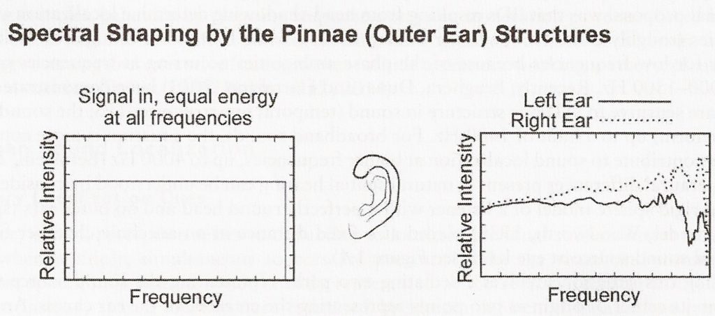
Bei der speziellen Übertragungsfunktion der HRTF werden diese kopfbezogenen Informationen für das rechte und linke Ohr einzeln an jeder Position berechnet. HRTFs werden ohne den Einfluss von Rauminformationen aufgenommen, also in schalltoten bzw. reflexionsarmen Räumen, damit das Ergebnis nicht verfälscht wird. Hierbei werden die akustischen Verfärbungen des Außenohrs, also der Ohrmuschel (Pinna), für den gesamten Frequenzbereich gemessen. Wie es in der unteren Abbildung dargestellt ist, ist der Unterschied vor allem in den höheren Frequenzen enorm.
Da die Pinna bei jedem Menschen anders geformt ist, sind dementsprechend auch die HRTFs verschieden. Es besteht aber die Möglichkeit sein eigenes individuelles HRTF zu erstellen, um es dann selbst zur Faltung für 3D Audio zu nutzen.
Binaural Audio ist also die Wiedergabe räumlicher Klanginformationen über Kopfhörer an zwei Ohren, welche die physischen Färbungen des Klangs durch den eigenen Körper mit einbeziehen.
Quellen
Kapitel: “Binaural Audio Through Headphones”, Agnieszka Roginska (Buch: Immersive Sound, S. 88ff, 2018)
Buch: “Binaural and Spatial Hearing in Real and Virtual Environments”, Robert Gilkey und Timothy R. Anderson (2014)
Buch: “Handbuch der Audiotechnik”, Weinzierl, Stefan (2008)
Prokrastination: Typologie
Wie prokrastinieren wir eigentlich?
- Der Saubermann: Eigentlich stapeln sich fast immer Zeitschriften, leere Kaffeetassen, Zettel oder ein riesen Kabelsalat auf seinem Schreibtisch. Normalerweise ist so ein Arbeitsumfeld auch gar kein Problem. Der Saubermann kann sehr gut in dieser Atmosphäre arbeiten. Wenn aber eine wichtige Deadline auf ihn zu kommt, muss plötzlich alles sauber und aufgeräumt sein bevor er loslegen kann.
- Der Panikmacher: Am Anfang ist er noch ganz gelassen. Die Deadline liegt in weiter Ferne. Alles ist gut. Genug Zeit, um sich anderen Dingen zu widmen. Kurz vor der Deadline fällt ihm dann aber doch ein, dass da noch eine unerledigte Aufgabe wartet. Jetzt wird ihm bewusst, wie viel Zeit er verschwendet hat und bekommt Panik. Er verrennt sich so sehr in seine Panik, dass er sich selbst im Weg steht und am Ende unzufrieden mit dem Ergebnis seiner Arbeit ist.
- Der Listenmacher: Bevor der Listenmacher überhaupt mit einer der vielen Aufgaben anfangen kann, muss eine To-Do-Liste erstellt werden. Ohne Liste geht gar nichts. Darauf wird detailliert aufgelistet was erledigt werden muss. Am Ende hat er eine schöne, lange Liste, die wichtigen Aufgaben darauf sind dennoch nicht erledigt.
- Der Multitasker: Am liebsten arbeitet er an mehreren Aufgaben und Projekten gleichzeitig. Er fängt eine Sache an, hat dann einen Einfall zu etwas ganz anderem und widmet sich dann dieser Aufgabe. Irgendwann stapeln sich lauter angefangene Aufgaben auf seinem Schreibtisch, doch keine davon hat er beendet.
- Der Internet-Junkie: Er ist immer online, wenn nicht am Laptop, dann mit dem Smartphone. Alle paar Minuten checkt er seine E-Mails, prüft, was in seinen sozialen Netzwerken los ist und schaut sich Videos an. Das macht er nebenbei, während er eigentlich mit ganz anderen Dingen beschäftigt ist. Ohne es zu merken, vertrödelt er damit Stunden seiner Zeit.
Technische Auseinandersetzung
Um aus analogem Material Texturen für digitale 3D-Objekte erstellen zu können, muss man zunächst die Funktionsweise des Shaders (Softwaremodul der 3D Computergrafik) verstehen. Real wirkende Texturen brauchen zumindest einen Farb-, Relief- und Spiegelungskanal. Um das Polygonnetz (Mesh) zu verformen, bedarf es auch einer Displacement-Map. Der Spiegelungs- und Displacementkanal funktionieren mit Luminanzwerten, der Reliefkanal mit RGB-Werten.
Bei der Erstellung der Malereien, bedarf es der Überlegung, ob diese kachelbar sein sollten. Zumindest sollten sie nach Bearbeitung randlos abschließen, sodass ein Objekt vollkommen „umhüllt“ werden kann. Schon im Malprozess kann man die Kanten des Bildes so gestalten, dass die Nachbearbeitung nicht sichtbar wird. Ebenso eignen sich quadratische Formate besser zur Erstellung von Texturen.
Zu Digitalisierung eignet sich am besten möglichst hochauflösende Digitalfotografie mit einem simplen Studio Setup. Wichtig hierbei ist eine Aufnahme in Raw-Format und gleichmäßige Beleuchtung der Malereien, ohne dabei zu viel Struktur zu verlieren.
Die Nachbearbeitung der Texturen kann man in folgende Schritte gliedern:
Grundbearbeitung/ Farbtextur
- Zuschneiden, Ausrichten des Bildes
- Belichtung optimieren/korrigieren
- Retusche: Fehler, Schmutz
- Farbkorrektur/Grading
- Vertikales und horizontales verschieben der Ränder, sodass die Außenkanten des Bildes in die Mitte kommen
- Retusche der Kanten mit Stempelwerkzeug oder Reperaturpinsel.
Displacementmap: ausgehend von Farbtextur
- Schwarzweißfilter anwenden
- Hochpassfilter anwenden, sodass das Bild kontrastloser wird
- Leicht weichzeichnen, damit einzelne Pixel nicht herausstehen und die Übergänge weicher werden.
Normalmap: Ausgehend von Farbtextur
- Photoshop – Filter – 3D – generate Normalmap
- Werte für das jeweilige Bild angleichen
- anwenden
Nicht gegenständliche Malerei im virtuell dreidimensionalen Raum
Die Entscheidung, analoge Verfahren in einen Digitalen Prozess zu integrieren ruht aus dem Streben, zwei Welten miteinander verschmelzen zu lassen, damit etwas entsteht, welche keine beider Welten überflüssig macht. In meinem Fall geht es konkret um Malerei als Shadingmethode im virtuell dreidimensionalen Raum. Im weiteren Verlauf des Textes möchte ich auf verschiedene Anwendungsmöglichkeiten, Malerei als Shadingmethode einzusetzen, aufzeigen:
Malerei als Stilmittel in der 3D Illustration/Animation
Der Finale Look einer 3D Illustration/Animation ist zum Großteil von der Texturierung abhängig. Auch wenn diese in den Meisten Fällen keine Inhaltlichen Informationen kommuniziert, bestimmt sie Wiedererkennungswert und Qualität des Renderings.
Malerei als Visual im Fokus
Hierbei dient Malerei als Alleiniges Merkmal des Renderings. Allein durch räumliche Verzerrungen, Kameraeinstellung, Schärfentiefe oder Oberflächenanimationen wir der virtuelle 3D Raum sichtbar.


Malerei als Bedeutungsträger
In Beiden Vorhergegangenen Klassifizierungen kann Malerei auch Inhalte Kommunizieren. Je nach Muster oder Animation des Musters kann eine Aussage gestaltet werden.
Improving the App’s User Experience through Information Architecture
It is important to organize information so that it is easily understandable for the user and intuitively usable. Then the user will stay engaged and nothing stands in the way of using the app frequently and efficiently. Especially an app for a conference programme needs a good structure, because it contains many layers of information. Here are the 8 principles of IA aplied to mobile applications:
The principle of objects:
Content should be treated as a living, breathing thing. It has life-cycles, behaviors, and attributes. It needs to be clear where buttons lead and the navigation bar should change depending on the page’s content.
The principle of choices:
More is less. Keep the number of choices to a minimum. Only important Information for the user should be shown, which also depends on the buttons the user uses.
The principle of disclosure:
Show a preview of information that will help users understand what kind of information is hidden if they dig deeper. Giving meaningful names to the buttons and other navigational elements.
The principle of examples:
Show examples of content when describing the content of the categories. If you choose to add categories (for example to an online shop) you should add a short but meaningful description of the category.
The principle of front doors:
Assume that at least 50% of users will use a different entry point than the home page. When developing a web application you need to test it with at least 5 users per target group. It’s important to not always start from the homepage, but from different pages like the login page.
The principle of multiple classifications:
Offer users several different classification schemes to browse the site’s content. Make navigation from one page to the other easy and intuitive. There should be more than one way to get to the desired information.
The principle of focused navigation:
Keep navigation simple and never mix different things. The navigational elements should be clear and understandable leaving no room for misunderstanding.
The principle of growth:
Assume that the content on the website will grow. Make sure the website is scalable. Don’t mix up things. Keep it organized and clean.
IA forms a skeleton of any design project. Visual elements, functionality, interaction, and navigation are built according to the information architecture principles. It’s a fact that even compelling content elements and powerful UI design can fail without appropriate IA. Technically, these terms relate to each other but they are by far not the same. IA is a blueprint of the design structure which can be generated into wireframes and sitemaps of the project. UX designers use them as basic materials so that they can plan the navigation system.
UX design means much more than content structuring. In the first place, UX designers aim at making pleasant interaction models, so that users feel comfortable using the product. Good information architecture is the foundation of efficient user experience, so IA skills are essential for designers. Effective IA makes the product easy to use but only combined with design thinking will the product bring about a powerful user experience.
Sources:
https://careerfoundry.com/en/blog/ux-design/a-beginners-guide-to-information-architecture/, https://www.gruenderszene.de/lexikon/begriffe/user-experience?interstitial, https://applikeysolutions.com/blog/designing-the-information-architecture-ia-of-mobile-apps,
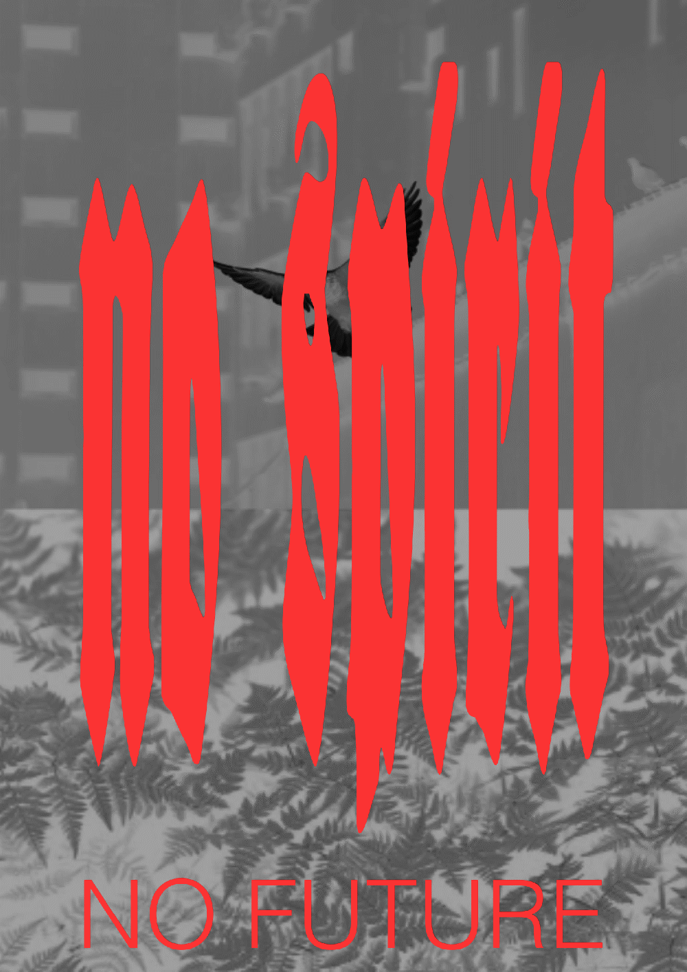
Blackletter
Why blackletter? I do not intend to design a of blackletter typeface, but I want to create something classic, but edgy at the same time. Doing my first sketches I realized, that my letters did kind of resemble blackletter a little. It was not at all intended, but I guess some knowledge about blackletter might be useful for me.
Blackletter, also known as Gothic script, evolved from the Carolingian minuscule in the 12th century. There was a high demand for books at that time and material was expensive. The Carolingian minuscule was very time consuming to produce and needed a lot of space. Blackletter was kind of a reaction to this problem: it saved time and space. Characteristic for blackletter are their kinked, sharp shapes with a high degree of breaking.
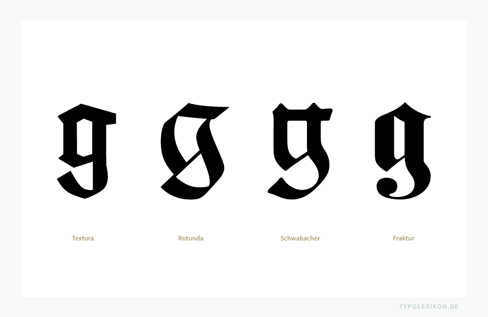
There are several forms of blackletter existing: Textualis, Rotunda, Schwabacher and Fraktur.
In the 14th – 15th century blackletter had it’s high point in Western Europe. At the same time the Renaissance started in Italy. People strived for something more elegant – the Humanist Antiqua evolved. Nevertheless, in german speaking countries, blackletter remained very important. They were heavily used by the Nazis, which was the reason for their ban in 1941. Now, 80 years later, blackletter is somehow still associated with the Third Empire. It has hardly been used since then, although I feel like it is having a little revival right now in the design scene.
In order to understand the shapes I went back to their origin: handwriting with a broad-edged pen. Although my letters didn’t look as good as I imagined they would, I still began to understand some relations.
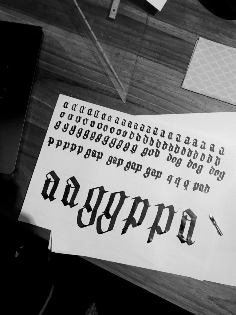
DETAILS I NOTICED:
At the end and the beginning of a letterform’s stroke, there are no serifs but quadrangles. They are a consequence of writing with a broad-edged pen.

The contrast is very high. Thin, decorative lines are sometimes used to close shapes, that are commonly open (f. e.: a, g, k, s, v, w, y)

The shapes of the letters are quite narrow and stand very close to each other. They do not need a lot of space.

Most curves are completely fractionised into straight lines, but still, there are some curves and rounded edges.

The capitals of blackletter are often eye catching and quite calligraphic.

The history of the nonlinear story-part 1
The first nonlinear stories written were the “Iliad” from the 8th century BC and the “Mahabharata” in 5th century BC.The “Mahabharata” is one of the two major Sanskrit epics of ancient India. It is actually a poem just like the “Iliad” is. The “Iliad” tells the story of the last few weeks in the final year of the Trojan war. These two poems have a common nonlinear narrative between them, which is called “into mid-affairs”: This story either begins in the middle or in its conclusion.
So, the idea is not new and has been used for a very long time, but of course the majority of books, movies or any other form of story-telling have been written in a linear way. In the 19th and 20th centuries few novelists, such as Virginia Woolf, William Faulkner, or Marcel Proust, used nonlinear narratives in their books.
Besides “Citizen Kane” by Orson Welles published in 1941, it was only after the Second World War that the nonlinear storytelling became known to a broader audience, mainly through cinema. There was Stanley Kubrick’s “The Killing” from 1956, but the 60ies really were the next step. “La Dolce Vita” by Federico Fellini and “Breathless” by Jean-Luc Godard set the start for a relatively packed decade. No greater developments were made in the 70’s and the 80’s.
Finally, the 90’s was the decade in which the nonlinear narrative took the center of the stage, with a lot of financial success, winning many prestigious awards.
WHAT HAPPENED SO FAR?
The first semester comes to an end in no time and that is the reason for this post. I simply wanted to state that I am surprised how much I enjoyed the education we got.
For my part, I used the first semester to experiment with different techniques and tried mixing some of them with one another. As I wrote in my first blog post, the most interesting thing in my opinion is to have a look at the future of visual design. What I found out so far, is that the borders between the different design disciplines are disappearing more and more and it is very crucial for a designer to at least know some things about other disciplines than their specialized one too. I for example may not be the best graphic designer, web-designer oder type-designer at all, but I try to understand all of those disciplines and I always try to combine the ones I need for a specific project.
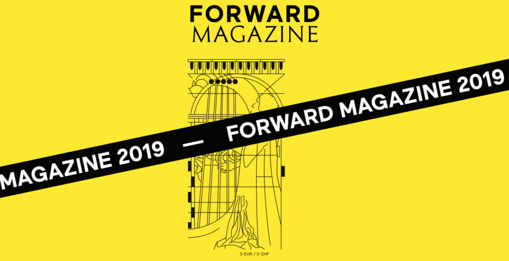
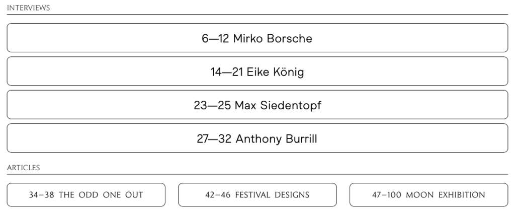
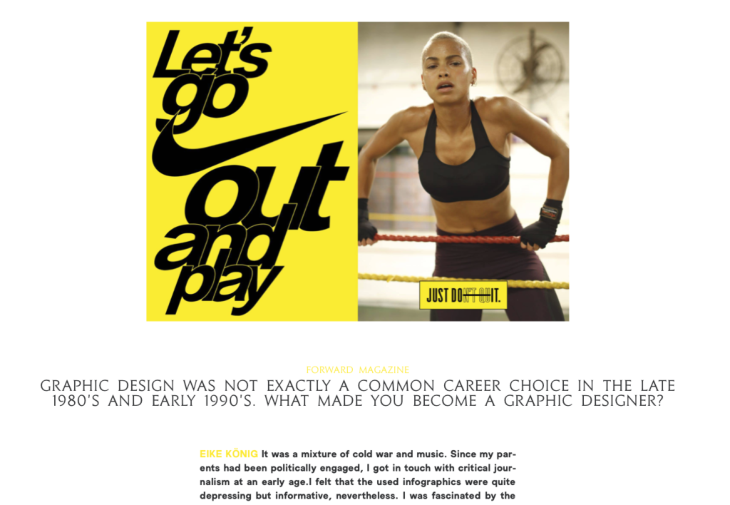
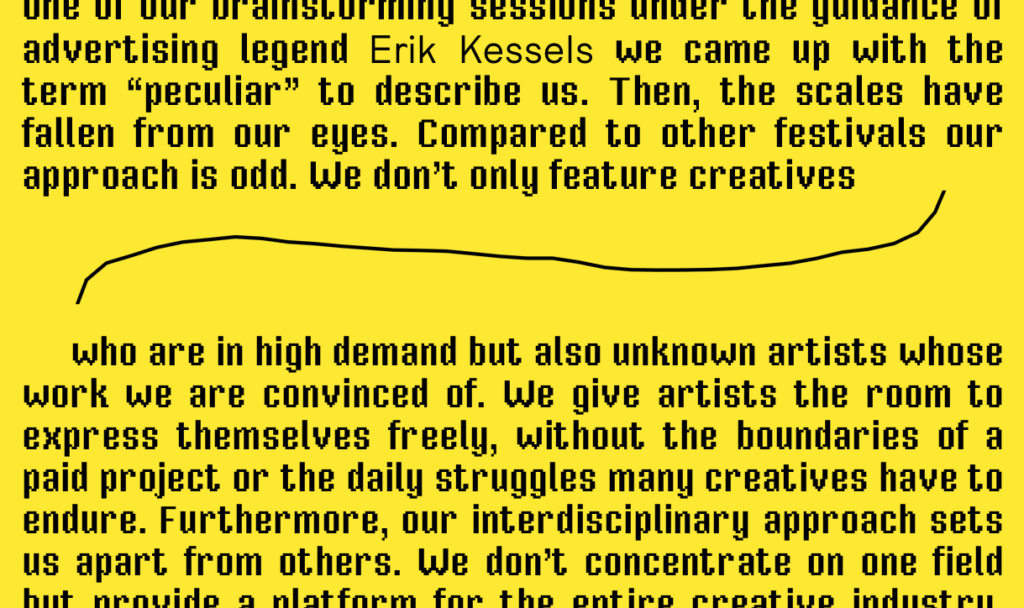
I have not had any real experience with web design so far, but had the possibility to create a digital version of last years forward magazine and succeeded. I succeeded, although I did something I wasn’t aware I was capable of. The fact that I allowed myself to enter a new path is the reason why I will also be able to create a digital version of next years forward magazine, what is a super cool opportunity for me to get some exposure (plus some money). Although everyone is talking about specialization, it is definitely not my way of thinking. I try to soak up as much knowledge as I can and I try to build a skillset with very diverse skills, to be able to realize my own ideas. As a matter of fact design is changing and some „specializations“ will simply get redundant.
Although topics such as animated posters, may rather be the present than the future, I tried to create some quick ones, just to get a feeling what this dynamic medium can offer me over static posters. Besides the static and animated posters, you can also visit: www.julianpresent.com/forward to get insights on what I did.

