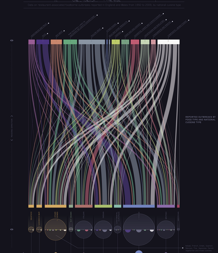
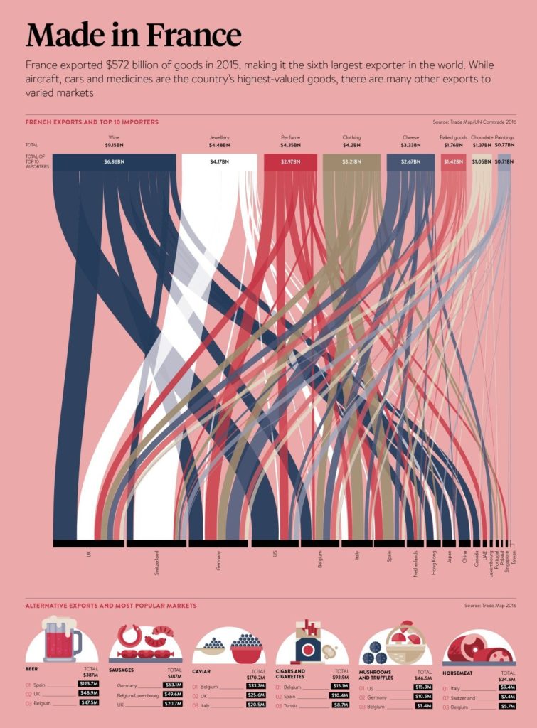
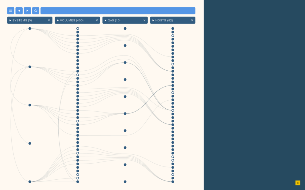
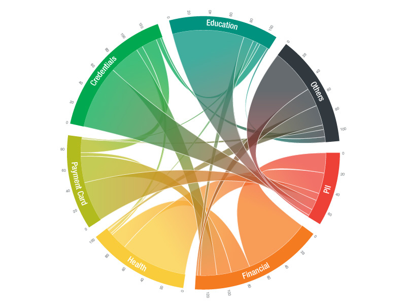
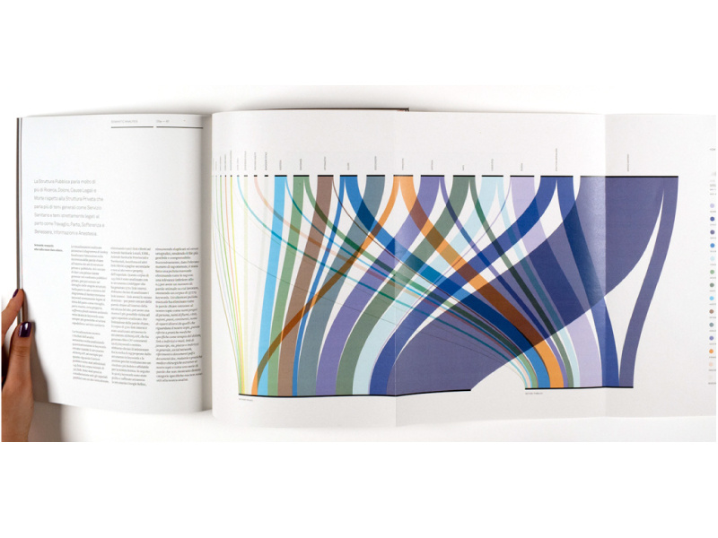
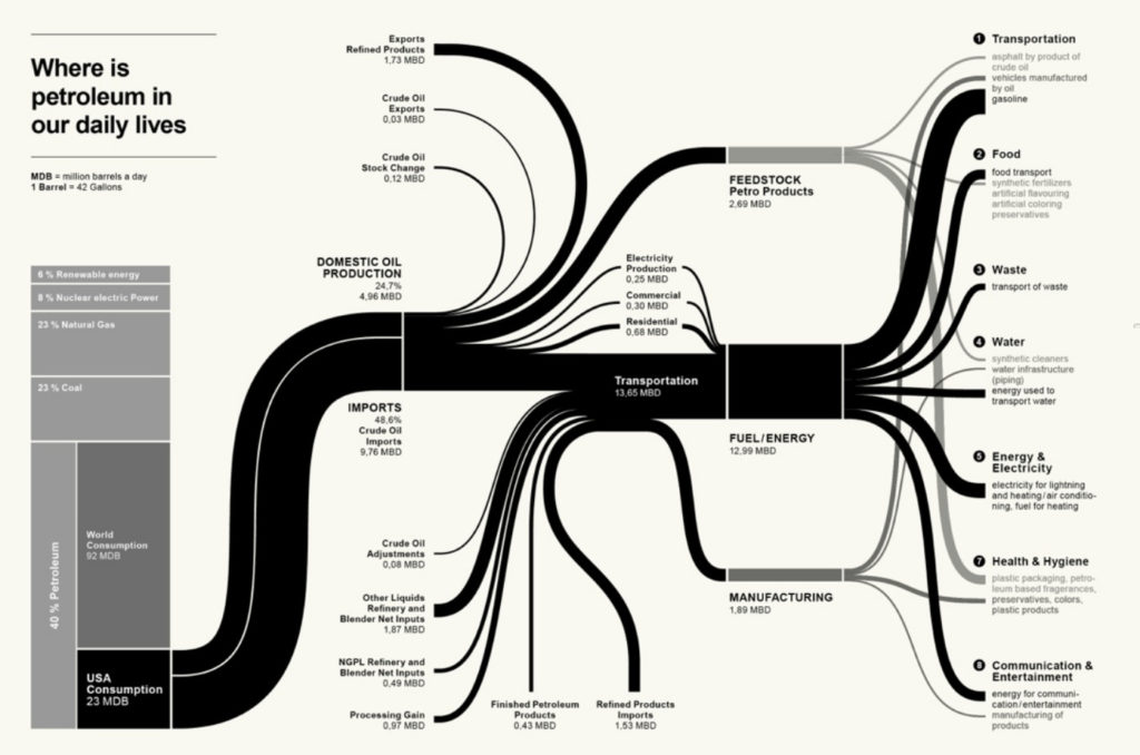
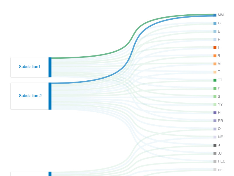
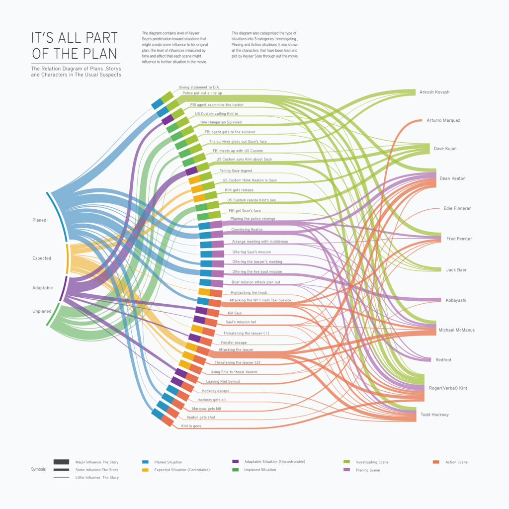
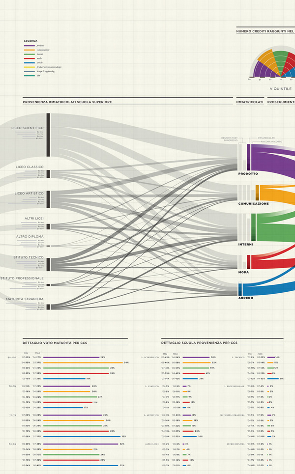
Sankey diagrams are a specific type of flow diagram, in which the width of the arrows is shown proportionally to the flow quantity. They are typically used to visualize energy or material or cost transfers between processes. They can also visualize the energy accounts or material flow accounts on a community level. Sankey diagrams put a visual emphasis on the major transfers or flows within a system. They are helpful in locating dominant contributions to an overall flow.
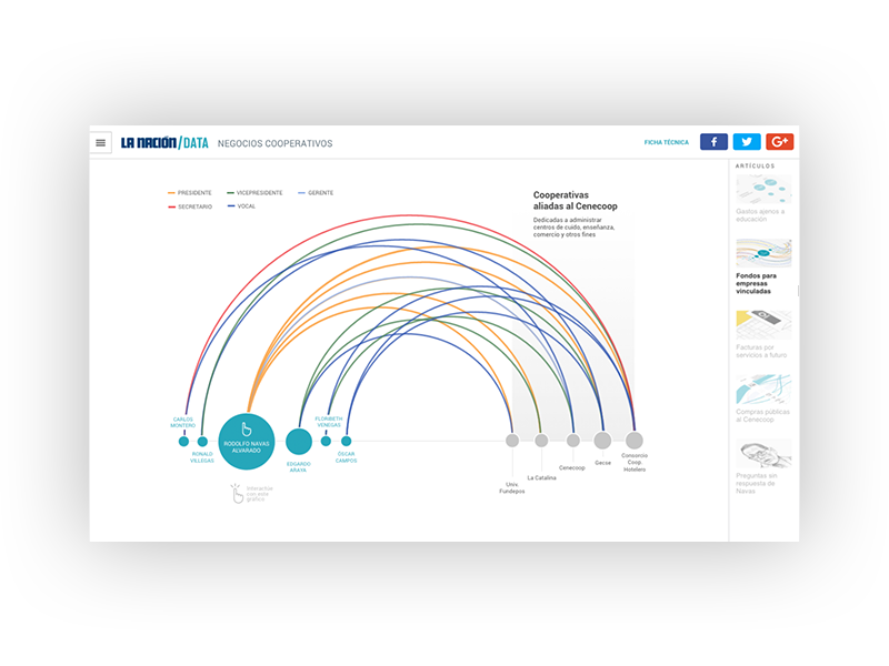
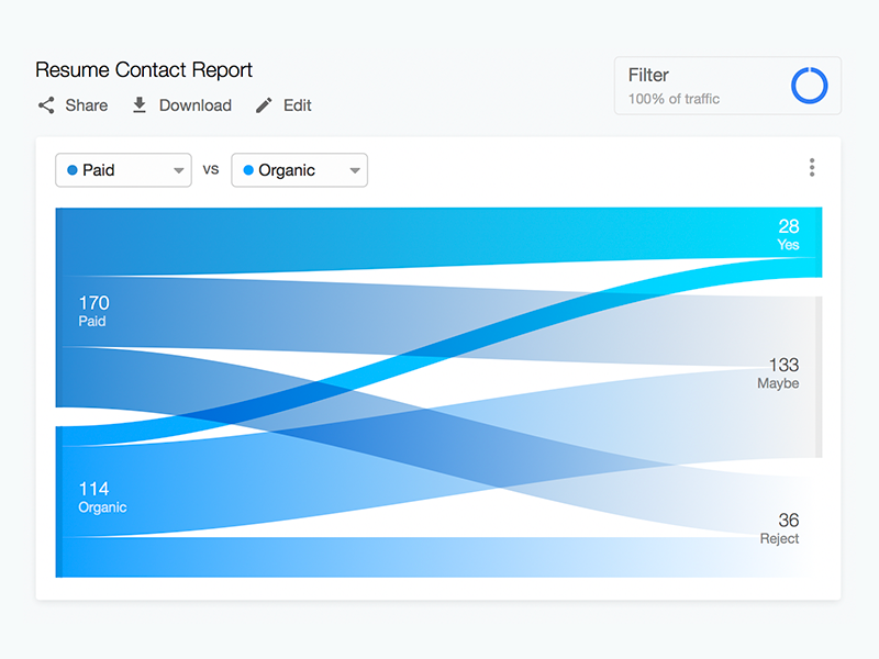
This kind of diagram is often used for voter transition analysis, so I wanted to explore different examples of sankey diagrams and also I wantred to find out how they are done.
