Title of work: Gamification as a marketing and customer loyalty tool
Type of work: Master thesis
Author: Sebastian Eschenbacher
Date & Place: Mittweida University, 27.12.2014
Course of studies: Industrial Management
Author: Michael Kernbichler
International Design Discourse 1
Here is an overview of all the lectures from the International Design Discourse 1.
01 Design Lecture – Andrey Sudarikov
Andrey Sudarikov is a Russian designer and the founder of the design studio PlayDisplay. He works mainly in the field of interaction, AR and game design. In his lecture he will present some of his very impressive projects. For someone like me, who can do almost nothing in 3D, it is always fascinating to see what is possible. Especially the project at the airport in Singapore stuck in my mind
02 AbsolventInnen Lecture – Saskia Schmidt
The most interesting lecture for me was definitely that of Saskia Schmidt. The first impression of the video was an extremely positive surprise for me, because she built, visualized and structured the lecture very well. It was really pleasant to listen to her talk about what her path from study to independence looked like.
When things didn’t work out for her in Germany and Holland, she decided to come to Austria and became part of the IND11 course at the FH. But after she failed in programming, Saskia was allowed to do a lap of honor. But this gave her the opportunity to start an internship at En Garde. During this time she could learn a lot and took a lot with her. You can also see that in the projects she shows. At En Garde she designed invitations, brandings like for the Rostfest and a brochure for the children’s program of the playhouse).
Afterwards, Saskia Schmidt had the opportunity to do an internship at Studio Grau in Berlin. Studio Grau works in the field of packaging, branding, book design, etc. What she emphasized as particularly positive – Because Studio Grau is not a big design agency, she quickly got more responsibility and was allowed to realize projects for big clients as an intern. During her time in Berlin she also wrote her bachelor thesis “Museum Friedland”.
After finishing her Bachelor Saskia looked for a job. However, she soon left the agency where she could take over the art direction, because the cooperation just didn’t fit. She reduced her hours at the agency and started to work fluently at another agency (Von K Design), where her tasks included high fashion and branding.
However, the desire for independence did not let her go and she decided to leave her job and take the step into the unknown. But then, very surprisingly, a three-month project with En Garde came up.
After completing the project, which Saskia also presented in the lecture and which I particularly liked because of the Wes Anderson style, she finally wanted to start as a freelance designer. But then Saskia received a call from Berlin and was given the opportunity to represent her then boss at Studio Grau for four months, who was looking for a replacement due to her pregnancy. Saskia suddenly found herself in a different situation – she was not only supposed to design, but also had to take care of customers, employees, organizational matters, etc.
Afterwards she finally managed to become self-employed and Saskia became a freelancer in Graz. When she talks about it, she emphasizes how important the network she had built up was and that this laid the foundation for her self-employment. In addition, she also presents some of her projects and shows various designs (wine bottles, beer mats, a hairdresser redesign, etc.)
Finally she talks about the fact that the most beautiful network of friends is made up of friends – where I can only fully agree with her.
To sum up, I enjoyed the lecture very much, because it is always very interesting for me which path graduates of the FH take.
03 Design Lecture – Astrid Kury
Astrid Kury begins her presentation by asking what constitutes a collective interdisciplinary environment within which one is motivated to actively participate, and she concludes that working with others in a democratic society leads more quickly to unique ideas and the perfect balance between form and content, and also provides social cohesion and equal access.
As a cultural studies scholar and director of the Academy of Graz, she has always been confronted with the challenges of interdisciplinary work in the course of her career – it took some time for everyone to understand what someone from a particular discipline meant. It was difficult to find a generally understandable way of expressing herself, as everyone had an understanding of the respective subject area within the framework of her or his discipline and on the basis of her or his own previous knowledge. This is where the example of modernity came in. After this hurdle was overcome, the collaborative work developed into a self-runner, many new insights were gained through the networking of the different disciplines and the process offered more and more room for creativity.
The question of whether we want to enter into a dialogue and work together with experts from other disciplines is the same as the question of which world we would rather live in – a selfish, competitive one or a generous one, in which sharing ideas leads in the best case to joint success and a good cause. I agree with her, but with the reservation that it can of course also lead to conflicts, especially since interpersonal friction can often arise when many different people with different educational backgrounds meet, especially since these encounters are not organic.
What I find very exciting about her collaborative approach is that projects can be implemented that would be extremely time-consuming and challenging for a single person. Different approaches to a particular topic can paint a more coherent picture, just as collected data, as it increases, comes closer and closer to a normal distribution.
What also appeals to me personally is Astrid’s attitude to the fact that everyone can make a creative contribution to something. She encourages people to become aware of this and to contribute generously. She believes it is easier to generate innovative ideas when several brains are involved in their development. The advantage of collaboration is therefore that there is mutual exchange, it brings coherence to complexity and it benefits from sharing ideas and knowledge.
04 Design Lecture – Florian Doppel-Prix
In his lecture “Is it art or can we toss it?” Florian Doppel-Prix will talk about projects in the field of exhibition design. His various works gave a good insight into the world of exhibition installations. Since exhibition design is not something I deal with intensively, it was very interesting for me to learn more about this field and the work in it.
05 Designmonat Graz – Burcin Cem Arabacioglu
In his talk about sustainability in life and design, Burcin Cem Arabacioglu hits the nail on the head for me. He talks about how sustainable design can influence a sustainable life and that it is a responsibility of designers to bring sustainability to people. I think it’s a pity that it was difficult to follow the lecture because the tone was not ideal.
06 Designmonat Graz – Sylwia Ulicka
The topic of sustainability is also taken up in the lecture by Sylwia Ulicka. She will once again address another aspect of this topic – our consumer behaviour. The researcher, designer and professor from Mexico presents her views in a very understandable way and I agree with her on many points.
07 Designmonat Graz – Ursula Tischner
Ursula Tischner also talks about the importance of sustainability. She also addresses the lifespan of products that clearly contribute to our consumer behaviour. In her talk it becomes clear that the consumption of all these people contributes enormously to the consumption of resources.
08 Klanglicht Lecture – INNOCAD/13&9
In their lecture, Anastasia and Martin Lesjak will present their product design studio (13&9) and their architectural office (Innocad). What particularly impressed me is the office they designed and planned themselves, which is divided into different working areas (architecture/research/product design/sound design).
In their presentation, they present two projects that I would like to go into more detail about.
1 Solar Innovation Center
The Solar Innovation Center is a solar power plant in Dubai. The architecture of this building fascinates me and the interplay of light and color moods is incredible. For example, different architectural ideas and the use of mirrors and foils create different color spectra depending on the position of the sun (thus depending on the angle of incidence of the light and the time of day). As a result, the interior of the building shines in different subtle colours at any time of the day. The decision to keep the interior design and the walls of the Solar Innovation Center mostly plain white was a very good idea, as this makes the colour spectacle even more effective.
Another “feature” of the solar power plant is the sound system. Special sensors are used to create sound compositions to match the individual colors.
2 Architectural Fashion
For an exhibition in Berlin, Anastasia and Martin Lesjak have newly realized and interpreted three of their projects. The theme was the transformation of product design and architecture into fashion. Thus they presented the above-mentioned projects as pieces of clothing, or more precisely, dresses. They work with the different textures of materials and use haptics to turn their projects into unique pieces of clothing.
The lecture by Anastasia and Martin Lesjak was very interesting for me.
09 Design Lecture – Wolfgang Schlag
In his lecture “Radio Work” Wolfgang Schlag talks about the emergence of radio and how radio was able to establish itself as a mass medium. He also gives an insight into his experiences as a radio journalist.
The history of radio begins on November 2, 1920, the day on which the first radio program ever was broadcast in Pittsburgh. In the beginning, about 40,000 people listened to the radio. But within two years, this figure rose to 500,000 people.
In Austria, the career of radio began in 1924, when the first RAVAG programme was broadcast. National Socialists used the radio for propaganda purposes during the Second World War.
In 1967 another form of radio finally started in Austria. The radio stations Ö1 and Ö3, which we still know today, started. In this year, Woodstock was one of the events held. Ö3 focused at that time on playing different genres and jazz, for example, was spread throughout the country via the radio station. One program called “Music Box” was very special – provocative and radical – as Wolfgang Schlag, who himself became a member of Music Box in 1986, describes it. A special feature of the format was, for example, playing a record for a whole hour.
In his lecture, Wolfgang Schlag gives an insight into his time at Music Box and talks about his tasks and experiences as a radio journalist.
In 1990 Ö3 and Ö1 developed into the radio stations we know today. It was decided to dedicate Ö3 to modern pop music and to fill Ö1 with world music and socially critical and political topics.
For me it was especially exciting when Wolfgang Schlag spoke about his own experiences, for example during the time of Corona, and shared his own opinions about the “radio of the future”. I can only agree with his opinion that radio will not die out. Personally, I cannot imagine being without radio, something I only became aware of in the course of this lecture. I also believe that research work, summarizing the essence of information and journalism are pillars of our society, even if we are often not so aware of it.
NIME 2019 – IllumiWear: A Fiber-Optic eTextile for MultiMedia Interactions
On this blog entry, I’ve taken a look at the paper from Josh Urban Davis of the Department of Computer Science in the Dartmouth College.
http://www.nime.org/proceedings/2019/nime2019_paper088.pdf
The IllumiWear is eTextile prototype that uses fiber optics as interactive input and visual output. Fibre optic cables are combined into bundles and the woven to create a bendable glowing fabric. By connecting light diodes to one side of the fibre optic cables and light sensors to the other side, loss of light intensity can be measured when the fabric is bent.
By this technology the IllumiWear is able to recognise the difference between a touch, slight bends, harsh bends and can also recover the exact location of these deformations.
Interactive Data Visualization: Javascript Data Visualization Libraries
We live in an era of data explosion, where nearly every application/website uses data to improve the experience delivered to the users.
Sometimes, the best feature is the data itself. However, table and number charts are often hard to read and it can be hard to draw insights from large data tables.
Instead different data visualization methods can be used that simulate the brain’s ability to process data in a visual way.
In my research I found different Javascript Libraries that could help to make data interactive.
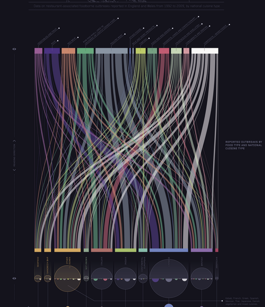
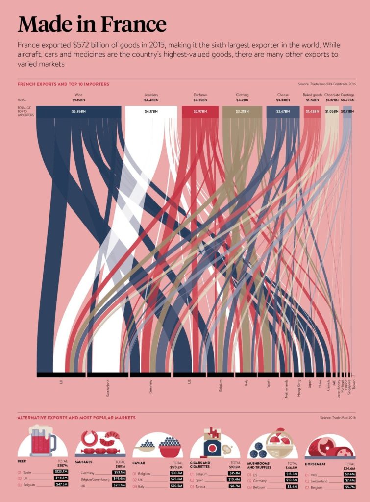
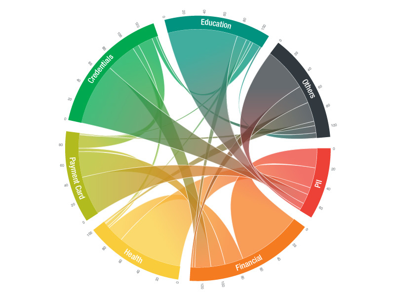
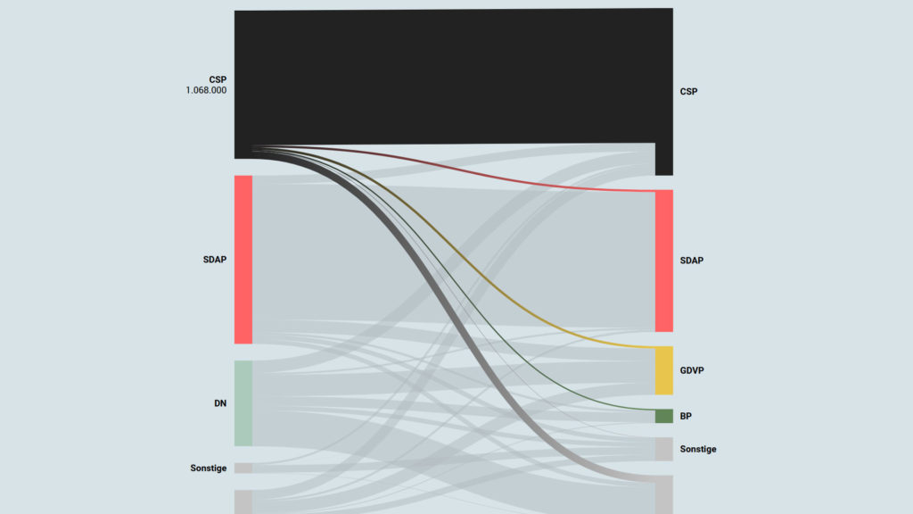
Interactive Data Visualization: Sankey Diagrams
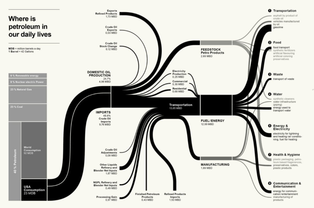
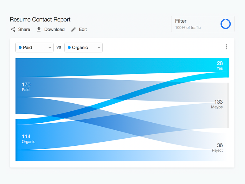
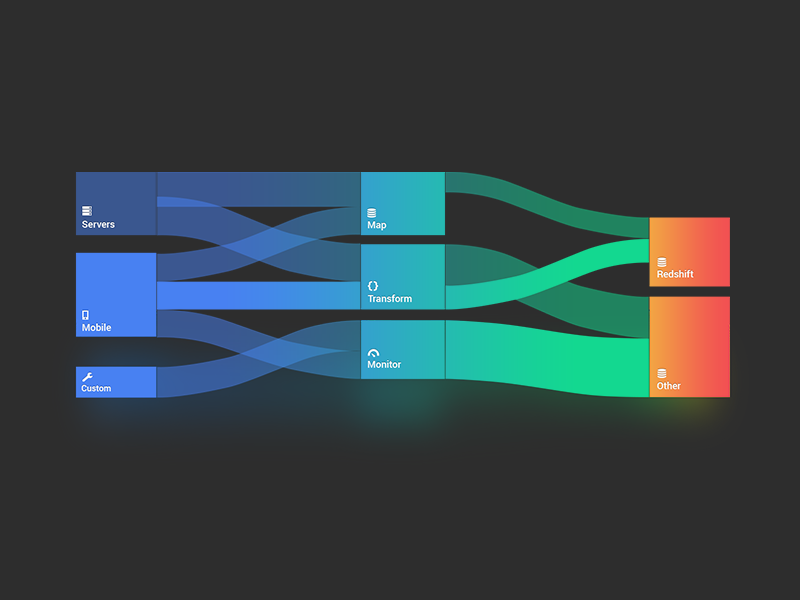
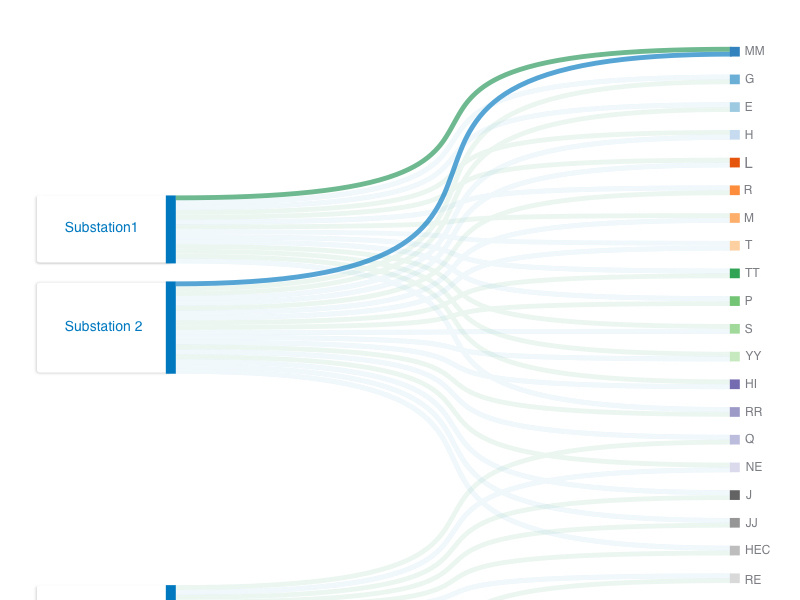
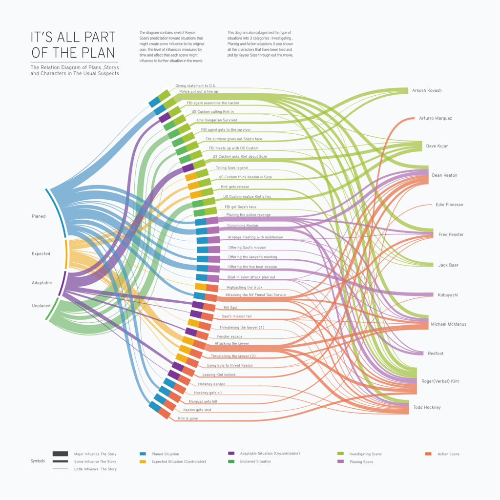
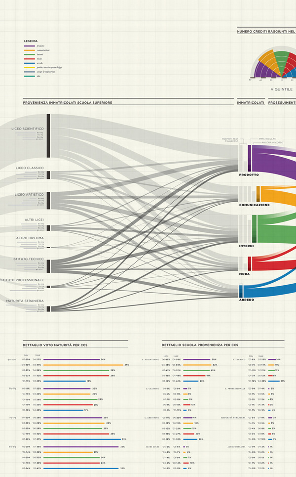
Sankey diagrams are a specific type of flow diagram, in which the width of the arrows is shown proportionally to the flow quantity. They are typically used to visualize energy or material or cost transfers between processes. They can also visualize the energy accounts or material flow accounts on a community level. Sankey diagrams put a visual emphasis on the major transfers or flows within a system. They are helpful in locating dominant contributions to an overall flow.
This kind of diagram is often used for voter transition analysis, so I wanted to explore different examples of sankey diagrams and also I wantred to find out how they are done.
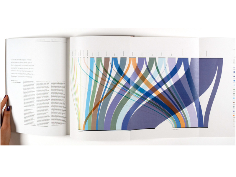
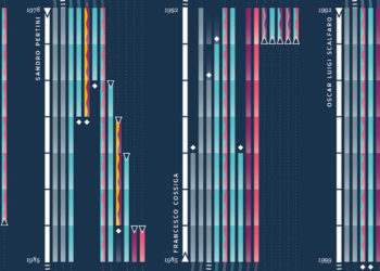
Static examples of Sankey Diagrams:
Interactive Data Visualization: Voter transition analysis
The voter transition analysis allows the user to see how the votes transitioned from one party to another after the elections. The idea is a simple one: if a party gains most votes in those municipalities in which another party had the most votes at the election before, it is interpreted as a vote transition between those parties.
This method is very popular in countrys like Austria and Germany but doesn’t really work in 2-Party systems like the US.
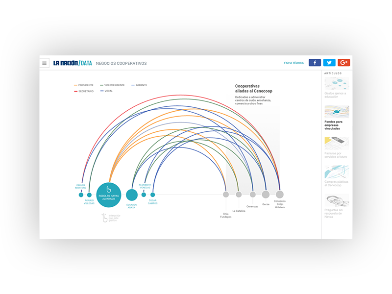
Below you can see some examples of interactive voter transition analysis:
100 Jahre Wählerströme // Der Standard
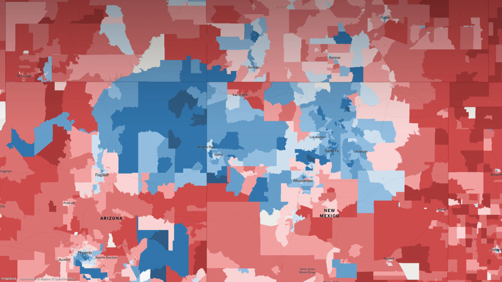
Interactive Data Visualization: Election results
Interactive visualizations and information graphics are becoming an inseparable part of modern print media as well as digital media, such as newspapers, magazines, online news websites, blogs, discussion forums and social media. The primary reason behind widespread acceptance of visualization techniques is their ability to represent large amount of complex data as a storyline.
When it comes to elections, beyond just good traditional journalism, readers have also come to expect good visual reporting.
An extremely detailed map of the 2016 elections
Interactive Data Visualization: Definition and Best Practice
Data can be very powerful. If you can actually understand what it’s telling you, that is. It’s not easy to get clear takeaways by looking at some numbers and stats. You’ve got to have the data presented in a logical, easy-to-understand way.
With data visualization the human brain processes visual information better than it processes text – so by using charts, graphs, and design elements, data visualization can help you explain information much more easily.