Mobile App Design: Creating Visual Structure

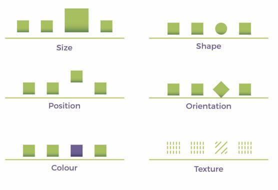
When the information architecture is in place you will gradually start with the visualisation process. The information architecture tells you where to put your information and how it is connected to but not how it is visualized in a way that the user can understand the connections. At this point, creating a visual hierarchy is important. You can create visual structure with different shapes, sizes, textures etc. (see below)

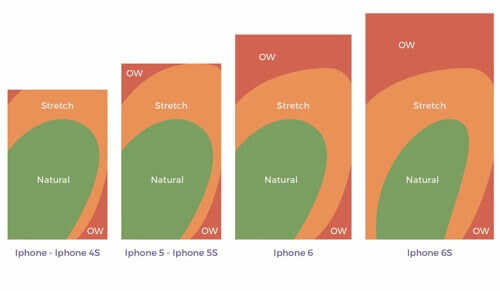
Most mobile applications will have buttons that need to be touched so that the user can interact properly with the data. Therefore, the size of buttons should be suited for touch and they should ideally be positioned in the lower half of the screen due to the increasing size of smartphone displays. (see below)

When you are creating a visual structure for your application, you should also write a style-guide that encompasses the colours you are using, details about the font you are using and how design elements are used correctly.

Sources:

https://uxstudioteam.com/ux-blog/screen-design/
https://www.springboard.com/blog/ux-design-principles/

Choosing Digital

Around 410 million tons of paper and cardboard are produced and consumed worldwide each year. The per capita consumption in Austria is around 218 kilos per year – that is approx. 4.2 kilos a week. This amount is about four times the global average (56.5 kilos). In the USA the consumption is 219 kilos, the European average is158 kilos and in Africa it is only 7.7 kilos per capita. Austria is thus one of the frontrunners in paper consumption, the EU and the US together consume around 37% of the world’s paper production.

Forests are not only the “lungs of the world” (they bind CO2 and release oxygen) and home to two thirds of all animal and plant species, they are also pollutant filters, regulate the water balance and stabilize the earth’s climate. The paper industry is the world’s fifth largest energy consumer, which needs more water than any other industry and threatens the livelihood of people and animals with its hunger for resources. 20 football fields disappear every minute and 40% of industrial forestry goes to the paper industry.

In recent years the smartphone has become a loyal companion in everyday life with increasing functionality. By 2014 most people in the industrialised world had a smartphone with the ability to download data depending on their needs. Since then print media have become obsolete in their use, because the fast-paced world of today is in need of a medium that transfers information worldwide within seconds and this information can be updated at any given moment. A mobile application, which makes use of the internet, is a powerful medium that can be used to transfer information instantaneously and it is also a viable antidote to deforestation for paper production.

Sources:

https://www.umweltberatung.at/papierverbrauch-steigt-weiter-an
https://de.statista.com/statistik/daten/studie/483406/umfrage/kohlendioxid-emissionen-bei-der-herstellung-von-papier-und-pappe-in-deutschland/
https://www.kartenmacherei.de/digitalisierung-in-der-familie/#kinder

Improving the App’s User Experience through Information Architecture

It is important to organize information so that it is easily understandable for the user and intuitively usable. Then the user will stay engaged and nothing stands in the way of using the app frequently and efficiently. Especially an app for a conference programme needs a good structure, because it contains many layers of information. Here are the 8 principles of IA aplied to mobile applications: 

The principle of objects:

Content should be treated as a living, breathing thing. It has life-cycles, behaviors, and attributes. It needs to be clear where buttons lead  and the navigation bar should change depending on the page’s content.

The principle of choices: 

More is less. Keep the number of choices to a minimum. Only important Information for the user should be shown, which also depends on the buttons the user uses. 

The principle of disclosure:

Show a preview of information that will help users understand what kind of information is hidden if they dig deeper. Giving meaningful names to the buttons and other navigational elements.

The principle of examples: 

Show examples of content when describing the content of the categories. If you choose to add categories (for example to an online shop) you should add a short but meaningful description of the category.

The principle of front doors: 

Assume that at least 50% of users will use a different entry point than the home page. When developing a web application you need to test it with at least 5 users per target group. It’s important to not always start from the homepage, but from different pages like the login page. 

The principle of multiple classifications:

Offer users several different classification schemes to browse the site’s content. Make navigation from one page to the other easy and intuitive. There should be more than one way to get to the desired information.

The principle of focused navigation: 

Keep navigation simple and never mix different things. The navigational elements should be clear and understandable leaving no room for misunderstanding. 

The principle of growth: 

Assume that the content on the website will grow. Make sure the website is scalable. Don’t mix up things. Keep it organized and clean.

IA forms a skeleton of any design project. Visual elements, functionality, interaction, and navigation are built according to the information architecture principles. It’s a fact that even compelling content elements and powerful UI design can fail without appropriate IA. Technically, these terms relate to each other but they are by far not the same. IA is a blueprint of the design structure which can be generated into wireframes and sitemaps of the project. UX designers use them as basic materials so that they can plan the navigation system.

UX design means much more than content structuring. In the first place, UX designers aim at making pleasant interaction models, so that users feel comfortable using the product. Good information architecture is the foundation of efficient user experience, so IA skills are essential for designers. Effective IA makes the product easy to use but only combined with design thinking will the product bring about a powerful user experience.

Sources:

https://careerfoundry.com/en/blog/ux-design/a-beginners-guide-to-information-architecture/, https://www.gruenderszene.de/lexikon/begriffe/user-experience?interstitial, https://applikeysolutions.com/blog/designing-the-information-architecture-ia-of-mobile-apps,

Information Architecture: Comparing the Conference Program to the App Solution

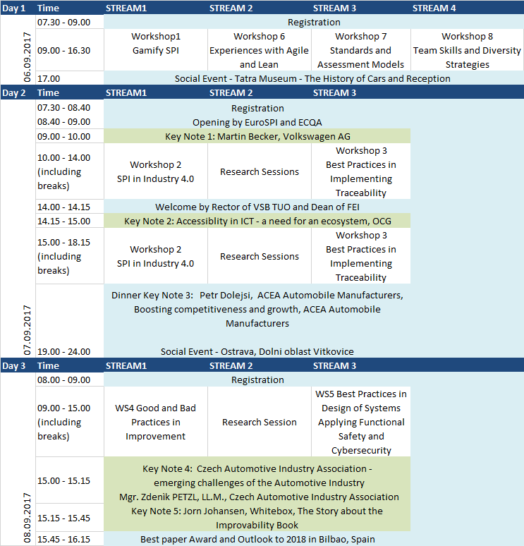
The former conference program consists of dates, time, names of streams and names of the lecturers. All of the information is displayed on one sheet, which is confusing. In the app the information is well-structured so that every important information is clearly visible depending in the user’s input. As consumers, we’re accustomed to finding exactly what we need, where we expect it to be. And when we find it easily, it’s generally no coincidence. It’s usually the result of extensive user research and testing.

Information Architecture is the practice of organizing the information / content / functionality of an app or website so that it presents the best user experience it can, with information and services being easily usable and findable. These are 8 principles for optimizing an IA:

  1. The principle of objects: Content should be treated as a living, breathing thing. It has life cycles, behaviors, and attributes.
  2. The principle of choices: More is less. Keep the number of choices to a minimum.
  3. The principle of disclosure: Show a preview of information that will help users understand what kind of information is hidden if they dig deeper.
  4. The principle of exemplars: Show examples of content when describing the content of the categories.
  5. The principle of front doors: Assume that at least 50% of users will use a different entry point than the home page.
  6. The principle of multiple classifications: Offer users several different classification schemes to browse the site’s content.
  7. The principle of focused navigation: Keep navigation simple and never mix different things.
  8. The principle of growth: Assume that the content on the website will grow. Make sure the website is scalable.

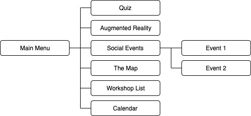
This is the overview of the information architecture of the conference app:

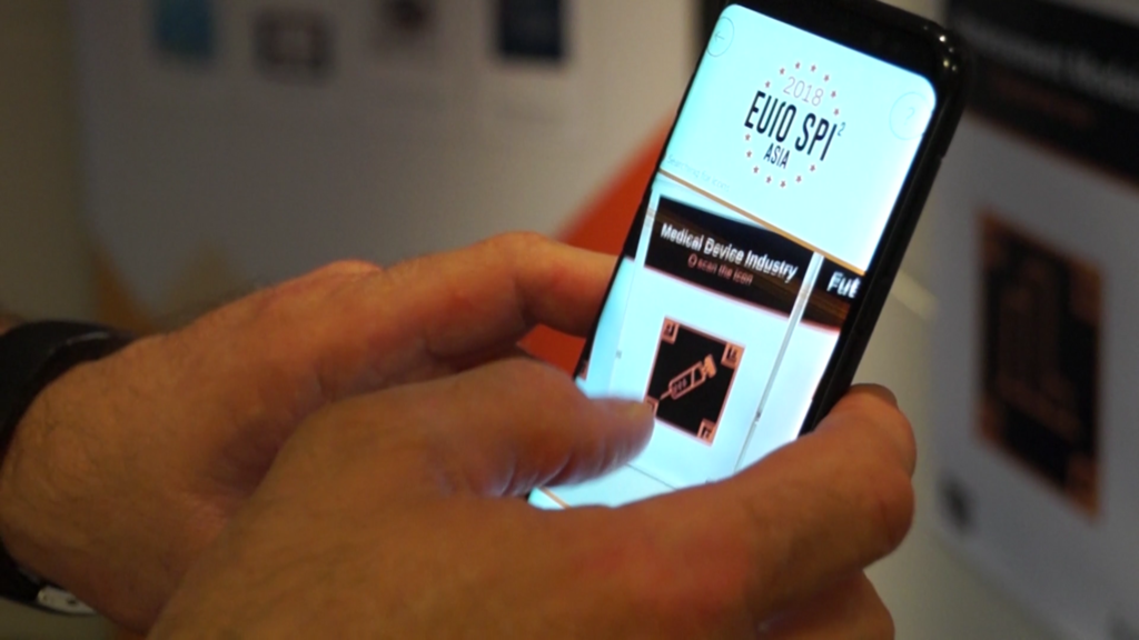
The App solution is easily updatable and more sustainable than the paper solution. The userfriendly design helps visitors to find the Information they need. The App can be used on all mobile devices and the former version is available for iOS and Android.

Quellen:

www.eurospi.net, https://careerfoundry.com/en/blog/ux-design/a-beginners-guide-to-information-architecture/, https://applikeysolutions.com/blog/designing-the-information-architecture-ia-of-mobile-apps

Usability Standards – DIN EN ISO 9241

Bei der Gestaltung einer App sollte man einige Normen beachten und die Usability nicht aus den Augen verlieren. Das Deutsche Institut für Normung hat Grundsätze für die Gestaltung und Bedienung einer App festgelegt. Nicht alle Teile der DIN sind für eine Software wie beispielsweise eine App von Bedeutung. Die Gestaltungsgrundsätze in 110 und die Gebrauchstauglichkeitsgrundsätze in 11 sind wesentlich.

110

Hier sind vor allem die Grundsätze der Dialoggestaltung zwischen dem Menschen und interaktiven Systemen festgelegt. Es geht darum als Nutzer das gewünschte Ziel effektiv zu erreichen. Es gibt dazu sieben Dialoggrundsätze. (Aufgabenangemessenheit, Selbstbeschreibungsfähigkeit, Erwartungskonformität, Steuerbarkeit, Fehlertoleranz, Individualisierbarkeit, Lernförderlichkeit)

11

In diesem Kapitel sind Normen für die Gebrauchstauglichkeit einer Software festgelegt. (Effektivität, Effizienz, Zufriedenheit) Effektivität bedeutet in diesem Fall, ob es dem Nutzer gelungen ist an das gewünschte Ziel zu erlangen. Effizienz beschreibt den Aufwand, der dazu notwendig ist das Ziel zu erreichen und Zufriedenheit ist das abschließende Kriterium bei dem es um subjektive Komponente geht. Ob der Kunde zufrieden ist hängt immer von seinen Bedürfnissen, Vorlieben und Zielen ab.

Quellen:

Hartmann, Markus. 2008. Usability Untersuchung eines Internetauftrittes nach DIN EN ISO 9241: Am Praxisbeispiel der Firma MAFI Transport-Systeme GmbH.

EYA 2019

The European Youth Award (EYA) is a great opportunity to meet young and talented people with a vision for the future. Through digital technologies they tackle societal challenges people face every day.

LiGENCE (www.ligence.io)

The first to present their idea was LiGENCE. It was impressive to see how heart Ultrasound imaging can  be used more efficiently through this programme, because quicker results mean less effort for doctors and that potentially leaves time for more patients. The topic of heart diseases is especially important because 1,5 Million people die from this type of illness every year.

Eye Build It (www.eye-build-it.com)

Eye Built it is really cool, because it gives even completely paralyzed people a way to express themselves and be creative. It is a block building game which works through eye tracking and there are online communities to join where it is all about digital inclusion. This idea has a lot of potential and is ideal for physically impaired people.

Path Out (www.path-out.net)

Path-Out is a video game on Steam which features young Abduhla who finds his way to Europe from Syria which has become a warzone. What is interesting about this videogame is that it is based on a real story. The style of the game reflects the feelings they wanted to convey.

imagiLabs (www.imagilabs.se)

The imagiLabs Accessory is a great way for girls to learn about programming. However when you look at toys like Lego Mindstorms they can also easily amaze girls and give them the opportunity to programme a device. The starter kit is expensive and for premium use you need to pay monthly.

Forest and Climate (www.sumeiklima.org)

Forest and Climate uses satellite data against deforestation and for collecting data that they use to determine where different tree species are ideally planted. They encourage people to plant trees in the designated areas and want to track where and when these trees are planted. This is a good idea to prevent climate change and it would be great for this idea to work well.

mCommunity (www.m-zaednica.mk)

mCommunity is an App where you as a citizen can take action by reporting a problem. This active communication with citizens should then lead to important changes that citizens can suggest themselves. It is an idea worth testing, but I am not sure if this will work for every community. I can’t imagine a Million people who all talk about their own  problems in the community.

Socialbnb (www.socialbnb.net)

Socialbnb started in Cambodia where they met a man who wanted to open a school for the village, but couldn’t afford it. When you book through Socialbnb night costs 44€ in average, which is very cheap when you compare it to Airbnb or booking.com. With the money they helped the man to build a school in Cambodia, which I believe is a fantastic idea.

Aivy (www.aivy.app)

Aivy is an intelligent career counsellor app for android and iOS, which aims to discover hidden potential through psychometric tests and helps to find a fitting job for the user. The is simple to use and collects data to show ideal jobs for you, which is great, but because there is such a variety of jobs available nowadays it can also be inaccurate.

FreeHour (www.freehour.eu)

Free Hour is an App where you can import your calendar and have friends who can see your free hours to meet up with them. You can also mark unavailable free hours, which I find amazing. The app is practical, easy to use and has the potential to bring people together. The idea seems to me well thought through. 80% of students in Malta are already using this app on a daily basis.

Eyelight (www.eyelight.tech)

Eyelight is a 3D real-time surface for visually impaired people to find their way through a building. This enables them to feel where they are positioned and how far object are away from them. They tested a static version of this and it worked, but the 3D real-time surface is still in the making.
Mobile App-Entwicklung für Green Conferences

1440 erfand Johannes Gutenberg den Buchdruck mit beweglichen Lettern und kann damit als der erste Typograf der Geschichte gesehen werden. Fotografie und Film wurden erst im 19. Jahrhundert erfunden. Damals war man abhängig von Materialien und chemischen Prozessen, um beispielsweise eine chemisch aufbereitete Platte für 20 Sekunden zu belichten und ein Bild festzuhalten. Heute sind es meist Datenträger und Daten, die Wissen speichern, und es gibt Computer, die komplexe Funktionen ausführen können und Bildschirme, die diese Information wiedergeben.

Während des Bachelorstudiums „Informationsdesign“ entwickelte ich im Team eine App, die das ausgedruckte Konferenzprogramm der internationalen EuroSPI Konferenzreihe (http://2019.eurospi.net)  ersetzte und die sowohl für IOs als auch für Android erhältlich ist. Das Screendesign dieser App wird laufend weiterentwickelt und es kommen regelmäßig neue Features hinzu.  Die nächste EuroSPI Konferenz findet 9.-11 September 2020 auf der Hochschule Düsseldorf statt. Das über die App online verfügbare Konferenzprogramm kann jederzeit aktualisiert werden, es ist papierfrei, das App-Menü ist einfach zu bedienen und stellt somit einen Schritt in Richtung Nachhaltigkeit dar, da es das Konzept der papierlosen Konferenz umsetzt.

Viele Menschen reisen regelmäßig zu Events wie Tagungen oder Konferenzen, die zeitlich begrenzt sind. Dabei fällt viel Papiermüll in einer kurzen Zeit an. Die Flyer mit dem Programm des Events können beispielsweise nicht weiter verwendet werden. Die App ermöglicht das Aktualisieren von Daten ohne Papier und die interaktive Bedienung des Screens ermöglicht es dem Nutzer, rasch zu gewünschten Informationen zu gelangen. Durch den gezielten Einsatz von Screendesign, wofür kein Papier notwendig ist, kann man Information umweltfreundlich sowie nutzerfreundlich gestalten und verändern.

Veranstaltungen sind ein wichtiger Wirtschaftsfaktor, eine fachliche oder emotionale Bereicherung und soziale Kommunikationsplattform des Berufslebens. Dabei werden allerdings große Mengen an Ressourcen beansprucht, Emissionen verursacht und damit unsere Umwelt beeinträchtigt. In Österreich gibt es das “Österreichische Umweltzeichen für Green Meetings & Green Events” und Richtlinien für die Zertifizierung. (UZ62)

Quellen:

Christian, Thomas. 2019. 10 Regeln für ein benutzerfreundliches User Interface. 10 04. Letzter Zugriff 23 10, 2019. https://247grad.de/blog/design-development/user-interface/.

Bundesministerium für Nachhaltigkeit und Tourismus. Das Österreichische Umweltzeichen Green Meeting & Green Events. Letzter Zugriff 30 10, 2019. https://meetings.umweltzeichen.at/.

Lehrerinnen Fortbildung Baden-Württemberg. Elemente des Screendesigns. Letzter Zugriff 22 10, 2019. https://lehrerfortbildung-bw.de/st_digital/medienkompetenz/gestaltung-layout/screendesign/scrtipps/1-2elem.html.

Schwarz, Daniel. 2019. A Guide to Responsive Design + Breakpoints. 16 09. Letzter Zugriff 30 10, 2019. https://uxtricks.design/blogs/ux-design/responsive-design/.

Creative Bloq Staff. 2013. 10 things print designers need to know about screen design. 22 04. Letzter Zugriff 22 10, 2019. https://www.creativebloq.com/web-design/how-design-screen-guide-print-designers-1131786.

Williams, John Moore. 2017. 10 essential UI (user-interface) design tips. 30 05. Letzter Zugriff 22 10, 2019. https://webflow.com/blog/10-essential-ui-design-tips.