Email Marketing as Part of a Digital Marketing Strategy

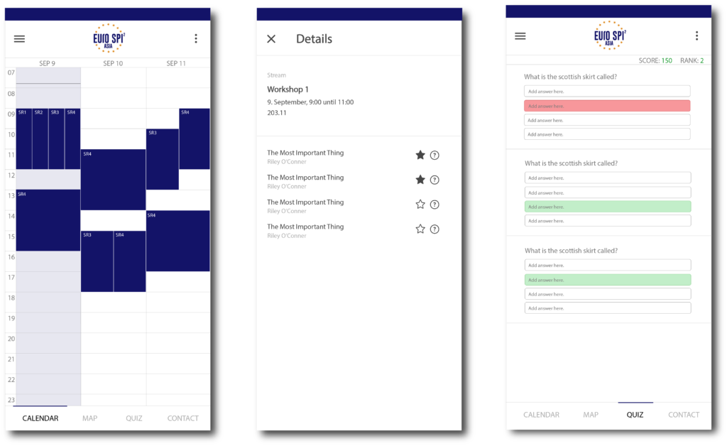
Writing email has become easier due to automation. You can now send emails to the target group with content based on the subscribers’ preferences. With just one click you can send an email to thousands of people who should receive the information, which makes marketing an event a lot easier. Email marketing is still an important aspect of a digital marketing strategy because everybody has an email address, though not everybody is present on social media. When it comes to the business sector email is still the most common channel of communication. A study from 2019 shows that the amount of email users is significantly higher than those who use social media on a daily basis.

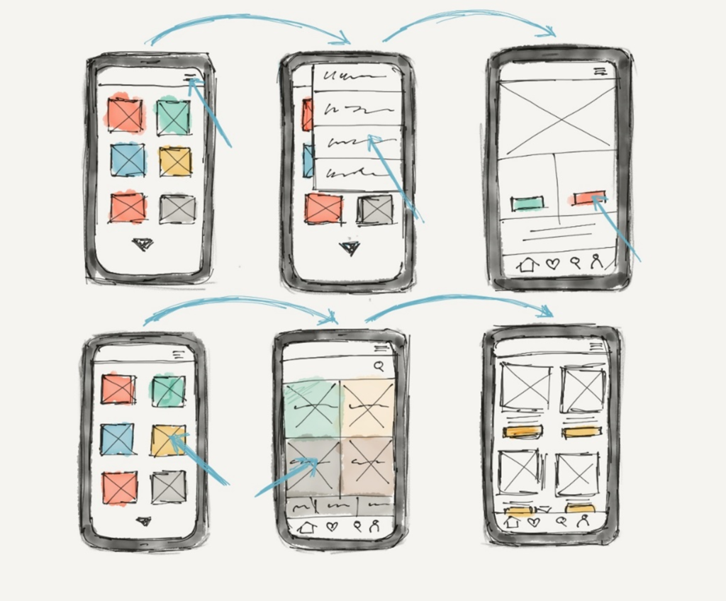
When sending an email it is important to focus not only on the content but also on the design. In digital marketing, an email should be just as well thought through as the design of the website. All visual elements should follow the corporate design of the company. The email should easily be recognisable as an email from the specific corporation or event. Usually, when you design an email there are three steps that you follow. You write a text, then you make an HTML and CSS design based on that and then you set a target group who will receive the email. It depends on the email client if the recipient gets the text version or the designed HTML and CSS version with the corporate design. Most email clients nowadays support HTML and CSS and can therefore display the email with the corporate design, but make sure that you still include the text-only version, so your target group will receive the information as well.

Sources: https://www.campaignmonitor.com/blog/email-marketing/2018/08/5-ways-to-use-email-in-your-next-digital-marketing-campaign/, https://www.campaignmonitor.com/blog/email-marketing/2019/06/why-email-should-be-cornerstone-for-digital-marketing-strategy/

Bewertung einer externen Masterarbeit

Titel:  Analysis of Gamification Mechanisms in Modern Service Applications
Verfasser: Dario Bozic
Universität: Karl-Franzens-Universität Graz (Geisteswissenschaftliche Fakultät/Institute of Information Science and Information Systems)
Abgabe: 2014

Gestaltungshöhe
Bei der Arbeit handelt es sich um eine wissenschaftliche Auseinandersetzung mit dem Thema und dabei ist auffällig, dass die Ästhetik nicht im Fokus steht. Die visuelle Aufarbeitung ist nicht besonders ansprechend. Das Layout ist monoton, es sind keine klaren Gestaltungselemente zu erkennen.

Innovationsgrad
Das Thema der Arbeit ist innovativ. Es werden Gestaltung, Einsatz und Nutzung von bestimmten Gamification-Mechanismen analysiert. Prinzipiell ist das nichts Neues, allerdings sieht der Autor diese Gamification-Mechanismen als ein neues Marketing-Tool, mit dem man Produkte auf neue Art und Weise vermarkten kann. Das Ziel der Arbeit ist es, die Wirkung von Gamification in mobilen Applikationen auf Österreichische „Brands“ im Gesundheits- und Mobilitätssektor zu analysieren und herauszufinden, wie und wann die Gamification-Mechanismen am besten eingesetzt werden, um ein Produkt bestmöglich zu vermarkten.

Selbstständigkeit
Gamification-Mechanismen im Kontext von Marketing und Sales zu setzten, schafft eine spannende, neuartige Auseinandersetzung mit einem innovativen Thema. Die Selbstständigkeit der Arbeit schätze ich daher als hoch ein.

Gliederung und Struktur
Die Arbeit umfasst eine Einleitung, einen Hauptteil, einen Schlussteil, ein Literaturverzeichnis, ein Abbildungsverzeichnis, ein Tabellenverzeichnis, ein Abkürzungsverzeichnis sowie Anhänge. Die Kapitel bestehen aus mehreren Unterkapiteln, wobei die Anzahl der Unterkapitel pro Kapitel ist nahezu gleichbleibend ist. Auffällig ist, dass der Titel der Arbeit „Analysis of Gamification Mechanisms in Modern Service Applications“ lautet, aber in der Forschungsfrage Gamification in den Kontext von Marketing gestellt wird. Als Leser hätte man sich erwartet, dass dies auch im Titel der Arbeit zu erkennen ist. Die Struktur der Arbeit ist sehr klar und leicht verständlich, der Aufbau ist logisch.

Kommunikationsgrad
Das Thema wird in der Arbeit sachlich bearbeitet und die einzelnen Gamification-Mechanismen werden genau analysiert. Der Text ist gut lesbar, logisch, leicht verständlich, einfach aber nicht banal geschrieben. Eine Definition des Fachbegriffs „Service Applications“ fehlt allerdings in der Arbeit.

Umfang der Arbeit
Der Haupttext der Masterarbeit umfasst 36 Seiten. Inkludiert man das Literaturverzeichnis und den Anhang sind es insgesamt 48 Seiten. Da die Arbeit hauptsächlich aus Text besteht und die Seiten platzsparend gefüllt wurden, würde ich die Länge der Arbeit als akzeptabel beurteilen.

Orthographie, Sorgfalt und Genauigkeit
Der Autor drückt sich klar aus und die Arbeit ist auf für einen Laien Großteils gut verständlich, da ein Abkürzungsverzeichnis vorhanden ist. Neben dem Abkürzungsverzeichnis finden sich auch ein Literaturverzeichnis und ein Tabellenverzeichnis ebenso wie eine Liste von Anhängen, die alphabetisch geordnet sind. Im Text habe ich einen Tipp- bzw. Rechtschreibfehler in der Arbeit entdeckt. Ansonsten ist der Text aber fehlerfrei.

Literatur
Einschlägig relevante Literatur (Bücher, Artikel, Fachzeitschriften etc.) wurde von dem Verfasser gesammelt. Das Literaturverzeichnis umfasst 8 volle DIN A4. Darüber hinaus gibt der Autor eine große Anzahl an Büchern und Fachzeitschriften als Quellen für seine Arbeit an. Internetquellen wurden nur spärlich verwendet.

The App as Part of Digital Marketing

From 9-11 September 2020, the EuroSPI² Conference took place as a hybrid (half online) in Düsseldorf, Germany. The design of the EuroSPI² app is part of the digital marketing around the event, which is becoming increasingly important, especially during the current coronavirus crisis when most events are partly or fully held online. The app was created to help conference participants find their way around the conference venue and see where and when workshops and keynote presentations take place and which speakers are presenting in which workshops or holding keynote speeches. The app includes a small quiz and game with a scoreboard with questions about the history and traditions of the event itself and the event location. Users have reported that the app with its new features is a great addition to the event and it worked smoothly. We also got some valuable feedback we will use to improve the app for next year’s conference.

Due to the coronavirus crisis and the increase in online activity, the company ISCN has decided to additionally invest in LinkedIn ads, content marketing, a redesign of the event’s website for next year. I designed ads according to the corporate design and branding (see below) and launched an online advertising campaign. As mentioned before, the website of the event has to be redesigned to address the relevant target group and to attract new customers. Based on a target group analysis, we turned our attention to specific social media channels and finally decided to advertise on LinkedIn, as our target group can mainly be found there. After the first content was generated and everything was up and running, it was challenging to keep an overview of the various other channels that have also been set up besides LinkedIn. I soon learned about creating an editorial calendar, which helps you to plan what to post and when and where to post it. An editorial calendar is also used by businesses to control the publication of content across different media. In Addition, we created a document where we have all the previous content, so that we have an overview of what has been posted and what will be posted.

In October, after the event, we launched an online platform with courses based on research fields that the event focuses on. This ensures that people can interact with the brand throughout the year. We are also working to improve the app and after the next update users will be able to switch from online to onsite mode within the app without having to reinstall it and they can choose if they wish to receive messages within the app throughout the year leading up to the next event. The messaging system is also a way of staying in touch with our customers all year round.

Sources:

https://2020.eurospi.net, https://www.ama.org/pages/what-is-digital-marketing/, https://sproutsocial.com/insights/social-media-calendar/, https://hbr.org/2020/04/

Lecture #8 INNOCAD and 13&9

INNOCAD and 13&9 are both transdisciplinary companies that specialize in architecture, sound design, interior design, research and product design. Their corporate philosophy is about acknowledging diversity. Through this, they can design holistically and have innovative ideas. One of their projects was to design the interior of the solar innovation centre in Dubai. This is a museum for solar energy in the desert. The building is a helix-like tower, which has an atrium in the middle. Heliostats project sunlight into the building and through other mirrors to the bottom of the building. In their cellar, INNOCAD experimented with dividing light into spectral colours. They also realized that there is a direct connection between light frequencies and sound frequencies, so they installed sensors to create sound for the light show. I believe that it is especially important to experiment with the elements first – as they did – because you can refine your idea and concept this way.

INNOCAD were inspired by the golden ratio and their formerly golden logo and designed their head office, the “golden nugget”, accordingly. They also designed a dress which was inspired by the golden ratio. It consists of a band which is folded according to the golden ratio. The dress was 3D printed and made of  3D knitted metal fibres. I find this idea to use the same design approach for fashion design interesting. However, the dress lacks functionality and is, therefore, more like a piece of art.

Rolling Stones was a project, where INNOCAD designed the interior of the armoury museum in Graz. The element they used throughout the project was “Murnockerl” to create a holistic design, which is connected to the city of Graz. In the visitor centre, they designed a unique shelving system, inspired by the “Murnockerl”. Additionally, they made a modern armory sculpture made of laser-cut stone veneer. In another project, they designed dynamic floor tiles by creating a relief that looks different depending on where you position yourself in the room. Afterwards, a dress was designed using the dynamic tile as a core element. These three elements were then exhibited in Berlin. In each room within the exhibition, there is a mirror, a screen (showing the making of) and a sound installation. The soundscape was inspired by each object and its material. I watched the video they showed at the end of the lecture and what I saw was a well-designed exhibition with great sound design and it actually inspired me a lot.

Lecture #6 Questioning Material Culture

Sylwia Ulicka, a designer from Puebla, explains that there have to be global actions to save our ecosystem because the regulations that are in place now are not sufficient. Millennium goals were not accomplished. There are three major aspects that need to be considered when it comes to sustainable development: the ecological, economical and social dimensions. This is called the triangle model of sustainable development. It aims to maximize economic gain while minimizing or eliminating environmental and social damage. I think the triangle model of sustainable development is helpful and can be used to save our ecosystem in the future if we use it properly.

The eco-efficiency approach comprises three main principles: reduce, reuse and recycle. We’ve convinced ourselves that these principles (and new technologies) help us to be more eco-friendly, but this is not always the case. Carbon dioxide emissions continued to grow and increase by almost 60% between 1970 and 2010 while global biodiversity decreased by 30% between 1970 and 2008. The growth of the population and the increase in consumption are the two main causes of this loss. 

In his book, Alastair Fuad-Luke describes three types of design that typically play out at three levels. At the first level, there are social design or user-centred design. At the second level are gender design and design for social innovation. These first two levels are usually economically viable. Third level designs are speculative design or radical design, which are outside of the paradigm. Walker S. proposes that for a candle holder you could just use a potato and a fork, but this is not aesthetically pleasing to us, so we have designed candle holders. Design is not only a problem-solving activity. Personally, I agree that aesthetics are just as important as functionality. A product can work perfectly, but not look appealing and therefore nobody wants it. 

Sylwia Ulicka has worked with students on objects of discomfort and describes them as being radical, critical and speculative. We cannot talk about sustainable design without questioning the status quo. (www.objetosincomodos.com) I found the project “casa de campagna” especially interesting. In 2019 there was an earthquake in Mexico with a magnitude of 8.2, which destroyed thousands of homes. There was a proposal to help with the reconstruction of the most damaged estates by donating about 20% of the campaign budget, but this, unfortunately, did not happen. Therefore, students decided to make a tent out of posters of the campaign.

Lecture #2 Work Work Balance

Saskia Schmid decided to study “Information Design” at FH JOANNEUM in Graz and she completed her internship at EN GARDE which is a design agency in Graz, Austria. The office had lots of open space and you don’t have a fixed desk area where you are supposed to sit, which Sakia thinks was good. Personally, I think that this is a cool feature that can be beneficial in a lot of situations but it can also be challenging if you have no space to put your stuff for more than one day.

Saskia Schmid then worked at Studio Grau and Wednesday Paper Works, which belonged together at the time. The project “Museum Friedland”, which is the name of a place where a big refugee camp was situated, became the main topic of her bachelor thesis. After she had finished her bachelor’s degree she started to work at a company where she was about to become creative director, but it didn’t work out as expected and after this job, she worked at two other agencies, where she could do what she loved. It can be challenging to have a lot of responsibility. Working on many projects at the same time is exciting, but also energy-draining as I know from having to work and study at the same time. Of course, doing what you love is important and should be part of your daily routine. 

Saskia strived to be independent and after quitting her job once again she began working on a project together with EN GARDE. Then, she got a call from Studio Grau informing her that their boss was pregnant and they needed a substitute for some time, so Saskia decided to return to Berlin to work at Studio Grau. In Berlin, she also worked on “fyta”, which is a blog about plants and a lifestyle brand. The network that she built during this time helped her to become independent. She currently works for agencies like Jack Coleman, Studio Grau, Novozamsky and Kopfstand as well as other studios and she says that the best network you can have is a network of friends. I think it’s great that she had the courage  to follow her heart and leave her former jobs to work on something else because those jobs did not appeal to her. She is now an entrepreneur in the field of communication design. I’ve come to realize that she is right about the fact that being independent and being an entrepreneur is a process and an extensive network of contacts is needed to be successful. Of course, if your network consists of friends this is even better. 

Conference Programme App: The Current Status of Development

I have been designing the interface of the EuroSPI App to meet the needs of EuroSPI Conference participants in 2020. Due to the coronavirus crisis, across the globe, most events involving larger numbers of people had to be postponed or held online to prevent the virus from spreading. This is why the EuroSPI Conference 2020 will be online for all participants and only a relatively small group of participants will be able to take part on-site. In previous years the conference programme was printed on a flyer and given out to participants on-site. However, this will not entirely be possible this year because the majority of attendees will take part online. The app is currently being developed to ensure that all relevant information gets to every participant. We are developing the app to be dynamic and to allow intuitive interaction with the interface. To make the conference programme app dynamic we have added transitions between screens and we will also include short animations to give the user positive feedback (e.g. for giving the right answers in a quiz)

The app has a set of functions which have been specified in cooperation between me as a designer and the software development team:

  • Displaying the programme in the form of a calendar
  • Showing conference papers per session and selecting favourite presentations
  • Playing a quiz by and scoring points with a scoreboard for all participants
  • Providing links to specific places of the online programme
  • Integrating a map to guide conference attendees locally

This year also we designed a database on the internet (MySQL based) with tables that the app can access so that a scoreboard for the quiz could be designed, and also for storing the conference calendar to be accessed by the app.

Here are some screen designs I have created over the past few months:

Currently, the app contains four main sections, the calendar, the quiz, the map and the contact information, each of which has its own functionalities. Behind this information architecture, there is a database, which is filled with the data that is displayed and the app dynamically changes the content if changes are made in the database. This means that any changes to the conference programme schedule, for example, pose no problem at all. Within the app, a user can now access the conference programme and interact with it by reading and favorizing specific content. The app gives the conference participants a good overview of the programme and also displays more detailed information on the presentations if you tap on them. This enables users to only see what interests them. The visual structure of the elements on screen helps the user to work with the app intuitively. We decided to put the main navigation bar at the bottom of the screen to make it easier for the user to reach it. This element will be frequently used and needs to be easy to use. Some other less important buttons are further up on the screen.The app is still being developed and tested through prototyping. The current version will be released in September 2020. The main goal of the app is to support the event by efficiently providing attendees with all the relevant information and getting them interested in the culture of the host city/country by providing some fun activities like quizzes. Not only does the app represent an efficient way to get information about the ongoing event but – as I mentioned in some of my earlier blog posts – it is also more environmentally friendly than a paper version. I am looking forward to a successful launch of the app’s new update and a successful event in September 2020.

Prototyping and Testing the App’s Interface

Once an idea is formed and a concept is created, the design and style process begins, and this is where prototyping comes in. While working on quality management, prototyping is a fun and effective way to test ideas. It is a rather powerful tool that helps to create user-centred design. It provides the opportunity to test the idea or concept so that the team can work on the project with confidence, knowing that the user will love the product. It also gives the opportunity to draw the potential product and see whether there are any differences in how others view the product being created. In prototyping, the team can scribble or draw to show everyone what the product will look like and how it will work. This step is crucial, especially when working on apps and websites. The following picture illustrates an example of a paper prototype for the design of an app.

When testing a product, designers can also generate personas, which are potential users with individual needs that must be met. This is typically done before testing the prototype with real users. It helps to create a basic understanding of the users’ wants and needs to create the ideal product for them. Scenarios, which are stories about the usage of the new product, help determine what is needed to solve users’ problems. In some cases, using patterns that are used all over the world is a great way to make the product easy to use, but this is not always the case.

During the design process of the app for the conference programme we made prototypes to test the interface with actual users to find potential bugs and hurdles in the usage of the app. These can be small things such as using another word to describe something or exchanging an icon for a slightly different but better recognisable icon. Finding different solutions and being able to change things in the process is crucial. In the end the app has a fully tested and easily usable interface.

Digital Tools

There are many tools online, which you can use to prototype and test the current interface design. A tool I previously used is sketch, but there are many similar platforms. Here are some useful tools:

Sources:

Goodwin, Kim. 2009. Designing for the digital age: How to Create Human-Centered Products and Services. Indianapolis: Wiley.

Sammer, Werner. Rapid Prototyping für mobile startups. Accessed July 09, 2019. https://ut11.net/de/blog/rapid-prototyping-fur-mobile-startups/.

MicroTool. 2019. “Agiles Projektmanagement. Auf Änderungen schnell reagieren.“ Accessed June 09, 2019. https://www.microtool.de/wissen-online/was-ist-agiles-projektmanagement/.

Digital Guide Ionos. Human Centered Design. Accessed July 09, 2019. https://www.ionos.at/digitalguide/websites/web-entwicklung/human-centered-design/.

Visual Feedback: Animations in Mobile Apps

Motion elements should be considered from the very start when planning a user journey. When designing animations, you need to analyze their influence on the usability and desirability of the app and if you cannot see a clear, positive impact, reconsider your approach. All animations should illustrate how elements are connected and make information even clearer. Moreover, app animations should be a functional element rather than decor. There are different kinds of possible animations for different user inputs.

Feedback Animation: The user gets positive or negative feedback depending on his action. This is similar to pressing a button, so it imitates Interaction with real objects in the physical world. A feedback interaction can also be fun but it must serve a purpose.

Progress Animation: A progress animation needs to inform the user about the level of progress and can additionally be entertaining.

Loading Animation: It might also be viewed as a subtype of the progress animation and informs the user about the current status of the loading process and that a device is actually loading.

Attention-Grabbing Animations: These animations support a visual hierarchy by including motion. Motion is added to some elements to highlight them and make them more noticeable.

Transition Animation: Moving from one screen to another should be a positive user experience. Transitioning between screens is important in every app that doesn’t just consist of one static screen.

Navigation Animation: Here the designer’s mission is to simplify user interaction with a product as much as possible. That means the more complex the structure of an app is the more time a designer should spend on making navigation easier. 

Marketing/Logo Animation: The integration of branding is an important factor in most apps. Animating a logo or elements of the logo can make it more memorable and appealing.

Animated Notifications: You can use bright colors to highlight important information and animate any changes to make the user aware of key information.

Scroll Animation: Scrolling is one of the typical interactions we are used to in both web and mobile interfaces. Animation adds beauty and elegance to the process, makes it stylish, original and harmonious.

Storytelling and Gamification: One more reason for using animation in mobile apps is making it a part of a story or a game. Animated stickers, badges, rewards, mascots – these are only a few ways to make an app interface interesting and lively.

When designing an app you should decide whether an animation is beneficial in a specific context. Before applying animation in a mobile app, designers should analyze both positive and negative impacts this may have on app interactions. Here are some benefits, but it also depends on the context. A good in-app animation should:

…provide clear feedback to the user

…increase usability

…speed up the processes of interaction

Sources:

https://yalantis.com/blog/how-to-create-mobile-ui-animations-that-meet-users-needs/, https://blog.tubikstudio.com/ux-design-how-to-use-animations-in-mobile-apps/, https://yalantis.com/blog/-seven-types-of-animations-for-mobile-apps/, https://medium.muz.li/7-types-of-in-app-animation-improving-mobile-app-user-experience-5f8b7930be2

Combining Digital Transformation and Environmental Responsibility

Many established brands are failing to take full advantage of new technology, such as increasingly sophisticated automation, virtual reality and augmented reality. This is why the technological revolution has been accompanied by a slowdown in the growth of more traditional businesses. Companies like Amazon, Facebook and Netflix rely on technology but don’t physically manufacture.

This points to one of the biggest trends of the current age: the rise of software products. Consumer behaviour is evolving at a faster pace than many businesses can cope with. Consistently, across the board, traditional firms of all sectors are failing to deliver what their customers want and expect in the digital age. And, for those that fail to keep up, the impact can be substantial.

One single device like a smartphone can store a huge amount of data. Advances like this in technology and digitalization have the potential to drive society toward a sustainable future, but only if this can be done sustainably. For example, electric vehicles offer enormous potential to improve mobility, reduce harmful emissions and pollution, and mitigate climate change, but not if the electricity required to power them comes from unsustainable power generation, such as coal.

Renewable energies are of major importance in Austria. In 1990 only 61,4% of the total energy in Austria was supplied by renewable energy sources (e.g., hydropower, biomass, solar energy). As of 2018, renewable energies account for 81.59% of the energy in this country. 100% of renewable energy generation is planned to be achieved by 2030 and Austria will proceed to decarbonize the energy system by 2050.

Sources: https://www.information-age.com/how-companies-must-adapt-digital-revolution-123461760/, https://www.theguardian.com/global/blog/2015/nov/13/digital-revolution-environmental-sustainable, https://www.natixis.com/natixis/jcms/lpaz5_79618/en/real-environmental-impact-of-the-digital-world, https://theconversation.com/the-digital-revolution-could-unlock-a-green-transformation-of-the-global-economy-123645, https://investinaustria.at/en/sectors/environmental-technologies/renewable-energies.php, https://iiasa.ac.at/web/home/about/news/190711-TWI2050-digitalization-report.html