Pop Art Influence on Design / Part 2

In this blog-post, I am going to write a little bit more about historical connections and interinfluence between pop art and design in general, because I think it is important to understand interconnections between these two fields of work, if we want to take advantage of pop art approach in our design work.

As mentioned previously, pop art and design were intertwined from the beginning. Because the brightly colored visuals of pop art arose from commercial graphics, it was a matter of time until its aesthetics started to influence other design areas.

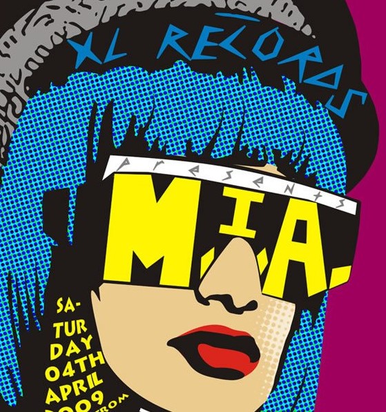
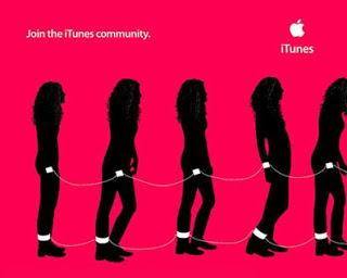
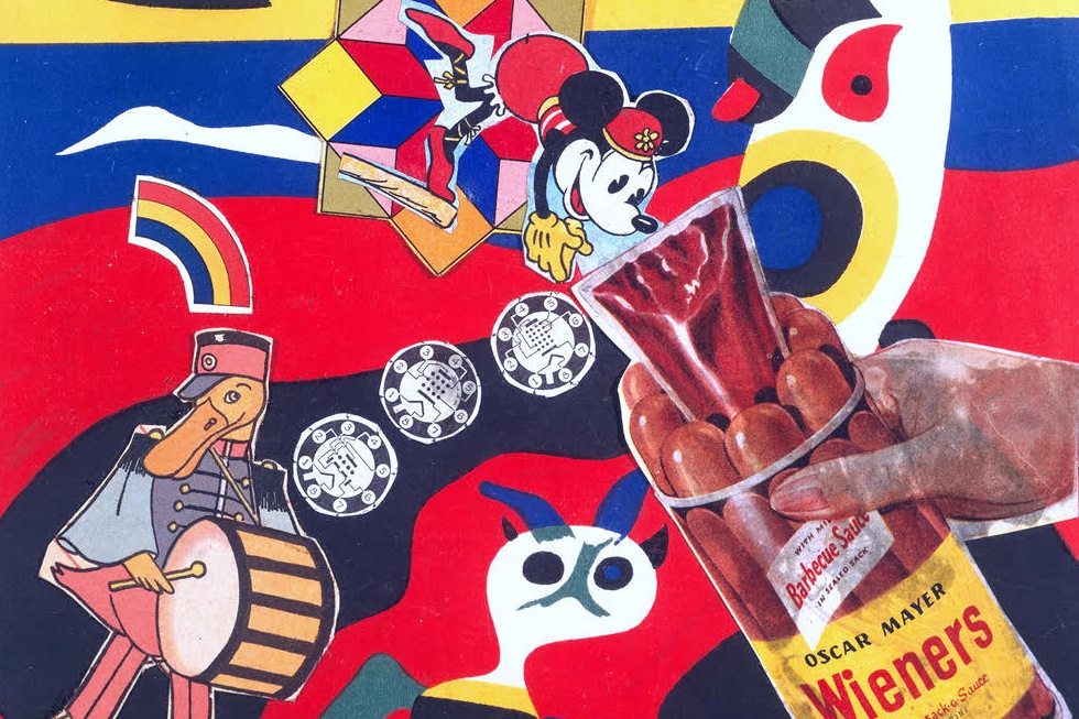
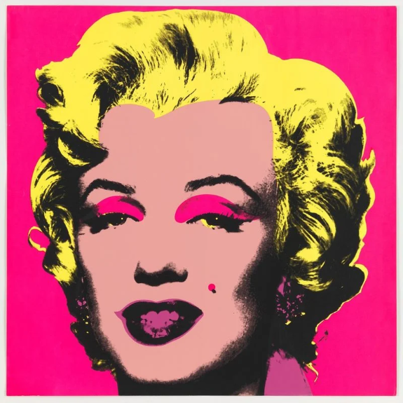
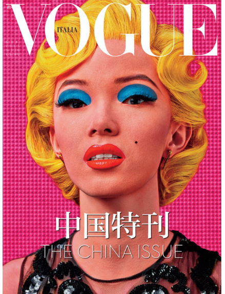
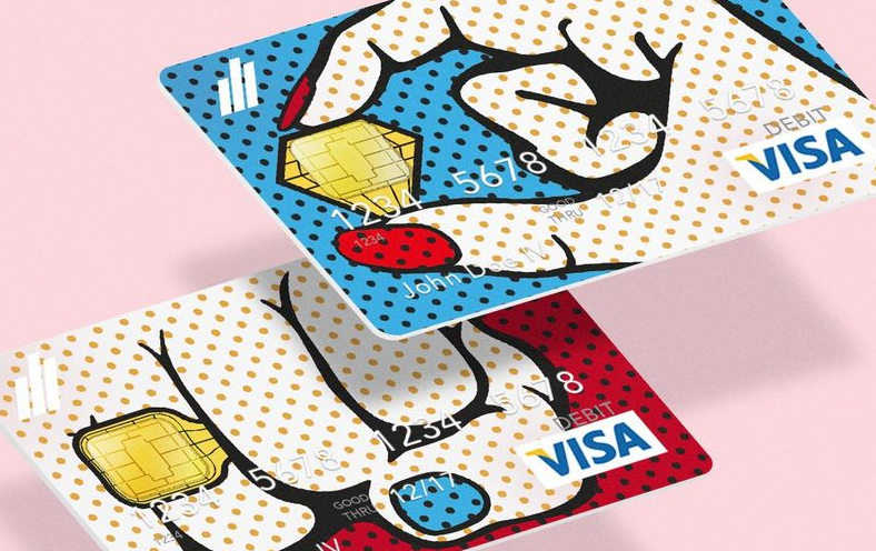
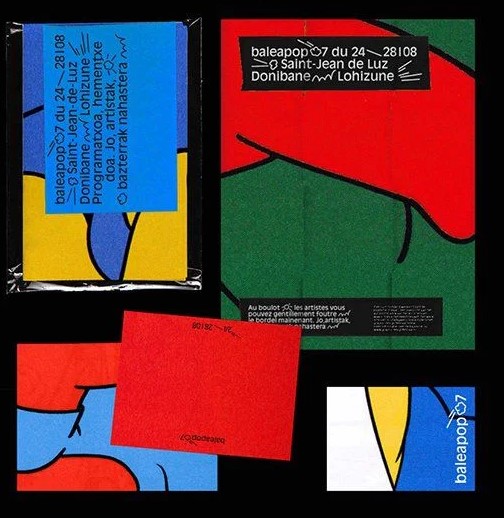
Industrially produced goods were often subjects of the work of pop artist, so it was influencing designers to create completely new objects. While pop art treated art as a business – it had an influence on designers, which wanted to create something appealing and commercially successful. The fashion industry and the furniture industry also didn’t take long to bled with pop art. Eventually, the commercial appeal of pop art found visibility in product design for furniture, fashion, and packaging. Designers still take inspiration from pop art; from its celebration of mass media and consumerism, to basic elements such as screen tones, bright colors, two or three-color images among others, etc. Especially one characteristic has remained through many of years of pop art replication: thick outlines and bold color palettes, which can be seen today as before, as the witness of pop art traces in many different art forms: contemporary product and package design, decorative elements and photography. 

Some of the central themes of pop art:

  • Using raster pattern
  • Showcase ordinary objects
  • Isolating material from its context
  • Enlarging and repeating objects
  • Consumption and materialism as a part of a theme
  • Use of collage
  • Reproducing, overlaying images
  • Use of saturated colors
  • Use lines and sharp color

Among other works of artists and designers who worked in Pop Art Design /Art manner, Demuth’s 1928 painting “I saw the figure 5 in Gold” is important to the evolution of design. It’s often regarded as the precursor to pop art, decades ahead of its time, due to its celebration of a pop-culture image and the use of striking, bold and vivid colors and shapes. Pretty avant-garde at the time, it seems like a contemporary poster even today.

One of the most interesting applications of pop art in web design is using a throwback style to design a webpage, especially with a style as interesting as this movement. Nowadays, there are a lot of websites inspired by this comeback of pop art in design in general.

Almost every designer finds it crucial to maintain an attractive and informative portfolio online. Some designers just make their pop art-infused works the centerpiece of the website.

Image source: Mike Kus

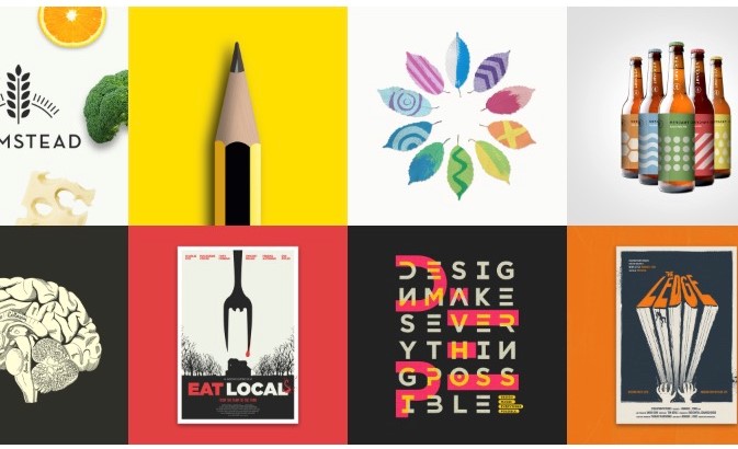
This website features a card-based layout within the obvious pop art theme. The more you look through his projects, the more you see it: saturated background colors, leaves optimized with patterns and colors, and the labeling on the bottles.

The other website dedicated to showcasing comedians in Spain, called Humoristas, reflects some of the main pop art attitudes – besides the fact that illustrations have a comic-vibe, it also reflects highlighting ordinary people, well known in pop art.


Sources:
https://www.essentialhome.eu/blog/pop-art-decor-is-coming-back-and-heres-why/
https://tsuki95moon.wordpress.com/2015/03/15/pop-art-design-in-graphic-design/
https://gmancreativeblog.com/2018/pop-art-and-design-a-short-guide/
https://www.popwebdesign.net/popart_blog/2018/06/umetnicki-pravci-koji-su-uticali-na-razvoj-dizajna/

Graphic Design: The Influence of Pop Art

Due to the fact that I feel like I’ve reached an end of my research on the topic I’ve been dealing with last semester, I’ve decided to deal with another one this semester, with which I can relate even more. 
So I’ve selected a new topic that deals with interconnections between the pop art movement and the development and shaping of graphic design. I find this topic very interesting, and I think it has a lot of aspects to be considered – because there is only a fine line that separates graphic design from pop art. 

Pop art is one of the most famous art movements, and a significant art and design milestone, in developing and upgrading a new mindset among the people who deal with visual communication.

If we look back to the middle of the last century, we will see that some of the main principles we also follow today, when creating the design content, were established through pop art. It also created another approach which “depicted the affluence and abundance of postwar society with imagery that celebrated materialism”. That led to a form of advertising and consumerism with prominent brand names and recognizable packaging.

Principles set back then, are the ones we follow today in our daily work, but maybe the whole process goes unnoticed because we don’t know the background and the conception of the same. Simply, if we know more about the genesis of this movement, we could understand and apply it better, and understand why it is becoming more and more popular in design these days.

In my first blog, I will make a short introduction about the inception of the movement with some examples that influenced the development of graphic design, and in the next ones, I will talk about how and where it could be applied or rather where the possibility of implementation lies.

An Introduction to Pop Art

Pop art emerged in the mid-1950s and 60s in Britain and America when artists created works inspired by the realities of everyday life – of popular culture, hence the name. Stylish, colorful, humorous, unsettling- Pop Art is highly recognizable and visually appealing. The movement had its heyday in from the 1950s but remains influential in both fine art and design trends today. Pop Art can be broadly defined as any art which depicts images and iconography culture and mass media out of its original context with the goal of holding a mirror up to the society which created it. 

Artists such as Andy Warhol, Roy Lichtenstein, and Richard Hamilton questioned elitist culture and fine art traditions and instead used imagery and techniques drawn from mass media and mass culture.

With saturated colors and bold outlines, their vivid representations of everyday objects and everyday people reflected the optimism, affluence, materialism, leisure, and consumption of postwar society. Pop art is known for its bold features and can help you grab the attention of your audience instantly.

Because pop art is so bright, and it draws attention so well it matches the criteria of poster art perfectly. That is the reason why its many aspects have been absorbed into the world of design and commercial aesthetics.


Sources:
http://cynthiachircop.blogspot.com/2014/12/the-influence-of-pop-art.html
http://drdgraphicdesigns.blogspot.com/2012/06/pop-art-movement-and-graphic-design.html
https://www.webdesigndegreecenter.org/art-influences-design-pop-art/
https://www.canva.com/learn/ways-pop-art-changed-modern-design/

Communicating global / The value of typography in a multilingual world

Cell phones, Google Earth, etc. have made neighbors out all of us — that is a fact. But the same things have brought a voice of faraway lands into our homes.

What once was exotic and strange now is common; with the help of means of design too. Seeing exotic languages in print expands our horizon and plays an important role in the mindset of future designers.

Designing for different languages offers designers a chance to promote their work internationally, to step out of their comfort zone and to add an additional layer of international to their work. What designing global means, is familiar to type designers who are trying to add multilingual support of their typefaces, which would also mean acknowledgment and promotion worldwide.

The history of type design has made Latin alphabet dominant in the printing industry since the invention of movable type, as much as English has dominated the language of world economics.
Prior to the digital age, creating type for languages outside the Latin characters was localized; forms were cut as needed depending upon the audience. That is the reason why these languages have a lack of types that fit the needs of their native symbols.

Andreu Balius is a typographic designer who obtained his BA (Hons) from the University of Southampton. He runs his own studio in Barcelona where he set up the TypeRepublic digital type foundry, and he says that: “Designing multi-script type families is the task type designers will face in the future.”
Gary Munch is an American type designer dealing with the same problem.


A recent project by Gary Munch: Cursive styles for northern (Russian) and southern (Serbian) Cyrillic. Sample types are Linotype Really (serif) and Linotype Ergo (sans serif). Each language prefers the shapes that come from the handwritten cursive of everyday writing in the languages; Russian uses a single unlifted stroke for pe and te, where Serbian uses a stroke made separately. Each intends to close the top of the stems of the letters.

This project by Gary Munch illustrates the differences of R and Ya set in Linotype Really. The weight of the bowls of R and Ya should be in harmony with the weighting scheme most easily seen in O. Reflection or mirroring of R to make Ya places the weight in the wrong position; better is to use rotation and adjustment of the bowl to get it to face the opposite direction.

A type designer looking to go beyond the Latin alphabet has many choices of where to begin.
Extended-­Latin includes diacritical marks for Polish, Czech, Croatian, Hungarian and Romanian among others. Cyrillic, used in several languages, employs a mixture of Latin and non-­Latin characters, which may make it the easiest to try first. And, of course, there are lots of languages that use non-­Latin scripts entirely — Chinese, Armenian, Ethiopic, Lao, to name just a handful — that may prove daunting for the nonspeaker. Although type designers don’t need to actually learn the language, it’s a good idea for them to line up some advisors who can help them avoid common pitfalls and unintended results.

Sources:
https://typerepublic.com/
https://www.myfonts.com/person/Gary_Munch/
https://www.typotheque.com/tag/cyrillic
https://core.ac.uk/download/pdf/39016217.pdf


A typeface for the world / Font psychology behind it

Thinking about international, global intended design, I started my research for typography that is meant to be suitable for everyone’s needs.

While thinking about a universal typeface that suits the needs of the whole world, I want to recall to development of the idea of International Typographic Style, that emerged in Russia, the Netherlands, and Germany in the 1920s and was further developed by designers in Switzerland during the 1950s.
The style emerged from a desire to represent information objectively, free from the influence of associated meaning. In some way, this can be very useful considering that the typefaces like Helvetica could be endlessly interpreted for everything from signage (the New York City subway, for example) to web pages and logos.

The New York City Subway uses Helvetica.

This style was guided by the principles that design should be as invisible as possible. All traces of the designer’s subjectivity should be kept hidden in order to let the “core” of the work comes in the front.
The style highlights cleanness, readability, and objectivity. Many of the early International Typographic Style works featured typography as a primary design element in addition to its use in the text, which refers to the style’s name.

International Typographic Style thought us that this kind of typography can be applied to anything and used across the globe, but sometimes it could be helpful to think in the opposite direction.

While designers try to make the typeface that will suit the needs of every language, on the other hand, every language has to have the typeface that reflects its qualities the best. Before entering this sphere, we have to consider font psychology first.

Font psychology means, simply said, that the more specific the font style is, the more unique the brand personality can be, and the easier the brand recall.
Referring to font psychology Helvetica is the most popular and one of the more “readable”.
But font psychology is also connected with the users’ psychology. That is why I’m wondering, is it possible to associate certain fonts to a certain language to understand their meaning better?

Can font psychology influence our ability to compare and learn different languages faster?
What typeface is the best for designing the language app? Can it influence our ability to learn or our speed of making conclusions?
What do we have to think about, when designing for other languages?

All these questions lay open for now because we can not give a precise answer yet, but the truth is that every design has a goal. And by choosing the fonts that inspire the right emotional response in your audience, it helps you reach your goal.
That means that we can definitely choose the font that inspires people to learn and to find similarities and differences between different structures of part of sentences, and what fonts work the best for which language needs to be tested.

Sources:

https://material.io/design/typography/language-support.html#language-considerations

https://en.99designs.at/mobile-app-design/contests/app-design-language-learning-472768

https://www.canva.com/learn/font-psychology/


Keeping languages alive – thinking global


As in my last post mentioned communicating effectively on a global scale is certainly difficult. The idea that people with different experiences, genders, goals, and ages – often from diverse cultural, linguistic, and ethnic heritages – using varied thought processes and communication styles, can actually understand one another is an accomplishment indeed. But there are obstacles in the world of typography as well, preventing the undisturbed exchange of information.

But some collaboration in the field of design and precisely speaking, a five-year collaboration between Monotype and Google, has brought to the world important innovations all people can create benefits from.
The goal of the Google Noto project, as earlier mentioned was to develop a typeface family that encompasses all languages with a harmonious look, while digitally preserving rarely used languages, to help enable global communication across borders, languages, cultures.

The term “Noto” is shortened for the expression “no more tofu” with tofu referring to the blank boxes that appear when a computer or website isn’t able to display text, what happens oft when watching movies with subtitles in a language with special characters. These boxes appear because the font that supports that text is not available to the computer, causing confusion and a breakdown in communication. Google Noto now covers more than 800 languages and 100 writing scripts, which includes letters in multiple serif and sans serif styles across up to eight weights, as well as numbers, emoji, symbols, and musical notations.

“Even though we prioritize widely used languages, we still want to support other languages, even if no people are speaking them. There are some characters you can only see on stones. If you don’t move them to the web, over time those stones will become sand and we’ll never be able to recover those drawings or that writing.” – Xiangye Xiao, product manager, Google.

Today, when people are self – publishing in Native languages, both in print and online, these problems have a deeper meaning. Consistent usage of Unicode characters is vital for internet searches and databases; in Kwak’wala, for example, an indigenous language spoken in Western Canada, the same underline accent character is used across the board. That is why it is absurd when current limitations in computer technology dictate how a writing system should or should not look.


Sources:

https://www.linuxinsider.com/story/83979.html ;

https://www.bloomberg.com/press-releases/2016-10-06/monotype-and-google-collaborate-on-one-of-the-most-expansive-type-projects-in-history ;

https://www.uxbooth.com/articles/information-surfacing-communicating-through-design/ ;

http://www.languagegeek.com/typography/ ;


Books:

“Communication Highwire : leveraging the power of diverse communication styles” ; 2005;
Saphiere, Dianne Hofner;
Mikk, Barbara Kappler;
Devries, Basma Ibrahim ;

“Global Village : Design – Ursprung und Moderne” ; 2011;
Wenzl-Bachmayer, Monika, 1957- [HerausgeberIn];
Wagner:Werk Museum Postsparkasse;


European Youth Award 2019

Above all, I am glad to have become familiar with some of the very promising and innovative ideas and projects of great social value that have already been in use or soon will be.
The whole concept of event assembles young people which are trying to make the world a better place, through developing possible solutions for some of the burning global problems; but the project I was most interested in was the Eyelight project – that handles with 3d real-time surface for partially sighted and blinds.

Based on the substitution of sight by hearing and touch, the app helps people to interact independently in their surroundings. This idea handles with helping people with sight disabilities, in a way that yet has not been developed, which I find really extraordinary. Eyelight is a product similar to a plate, based on inputs from a wearable 3D camera that captures the situation in front of the user. I strongly believe and hope that this idea can help to make the world a more human and friendly place for those who deal with this kind of problems on a daily basis.
Also, I think there is a lot of space in this project for developing different ways of approach to reach an aim.
Investing in this idea would definitely mean progress in humanity because we have to think not only about difficulties within the society, then also we have to consider other facts of existing solutions for our target group. In this particular case, people with vision disabilities were offered only common solutions like guide canes and dogs, which cost too much and can lead to or be disabled due to the other problems like fear of animals, allergies, etc.
Eyelight would also affect the indoor activities of our target group, which could be faster done, which means a person using the product could become more independent. Achieving an acceptable price for the majority of the potential users should also be considered.

I still can not tell for sure if I would apply to the program next year, but if I in meantime find a way to contribute to this exceptional event, I would be more than happy to do it.

Overcoming language barriers in everyday communication

In our time of digital era, we use different typefaces, fonts and letters in everyday use, as means of communication. We – humans, read more letters simultaneously, what leads to the fact that we are starting to “see” the words before we read them because we recognize letters as a group that has been given a certain meaning.
Due to the fact that our senses collaborate to feed information about our surrounding environment into the brain, which means they are used to working together, we tend to “hear” the words as we read them. This is the reason why specially designed typography can make written letters sound louder than spoken words.
In terms of close communities, it functions perfectly, but what is with global communication?

We define verbal language as the combination of sentences, phrases and words, while on the other hand visual aspect refers to the sentences and meanings produced by the visual appearance of image and text. But what happens when the meaning or context is not clear enough? What kind of solution needs to be designed to help people in overcoming daily language barriers to make the world a real global village?

Good ideas may also be prevented due to communication obstacles. Do we think enough about the lack of information coming from the other side of the globe, caused by communication problems?
On the other hand, it is nowadays common to have people in our surroundings which have problems with saying their opinion or getting accepted just because of their lack of ways of expressing themselves. We are used to diversity but there are still many bars in working together perfectly.

In order to improve everyday collaboration with experts from other areas, companies are trying to invent a way of a device that could instantly translate languages in real-time conversation. Thinking in that direction can help us solve many problems, but we also have to consider the people with hearing loss as well as older people with lack of knowledge of technology.

Furthermore overcoming language barriers means the protection of languages that otherwise had no online footprint, which leads to preserving information of every nation and every language by bringing hundreds of thousands of characters to the digital age.
Experts are already struggling with the topic of overcoming language barriers and creating “typefaces for the world”. But there are still so many languages that are not digitalized and can not be used as means of typography in graphic design.
With over 4000 languages in the world, a typeface that encompasses fonts for over 800 different languages is still not the best solution, knowing that many languages that are not Latin based don’t have appropriate fonts that work well on the screen.
That is why this problem is a global problem, requiring our full attention in order to interconnect different parts of the world, in the hope that future generations can collaborate without language barriers.

Not only that we need to help establish a better way of communicating with people from different areas, but we also have to protect their languages from distinction.
Many text generators compare two languages showing us the beauty of different languages. But in order to ease digital communication across global platforms, we need to protect language heritage with typefaces that allow carrying their native symbols in digital forms.

The problems mentioned above are the ones I want to deal with during my research.

Sources:
https://www.vignette.global/inventive-ways-tackle-language-barriers/ ;
https://developers.googleblog.com/2014/11/i-can-get-another-if-i-break-it.html?utm_campaign=noto-urdu-1114&utm_source=jabran.me ;
https://www.commarts.com/columns/global-typography ;
https://www.dezeen.com/2017/03/04/waverly-labs-pilot-earpiece-translates-languages-real-time-design-products-technology-mobile-world-congress/ ;
https://typesoftype.com/about ;

Books:
Fred Edmund Jandt (2010): “An introduction to intercultural communication: identities in a global community”
Stephanie D. H. Evergreen (2014): “Presenting data effectively: communicating your findings for maximum impact”
Charlotte Rivers (2005): “Type specific: designing custom fonts for function and identity”
Linda Varner Beamer (2008): “Intercultural communication in the global workplace”
Guo-Ming Chen (1998): “Foundations of intercultural communication”