Cell phones, Google Earth, etc. have made neighbors out all of us — that is a fact. But the same things have brought a voice of faraway lands into our homes.
What once was exotic and strange now is common; with the help of means of design too. Seeing exotic languages in print expands our horizon and plays an important role in the mindset of future designers.
Designing for different languages offers designers a chance to promote their work internationally, to step out of their comfort zone and to add an additional layer of international to their work. What designing global means, is familiar to type designers who are trying to add multilingual support of their typefaces, which would also mean acknowledgment and promotion worldwide.
The history of type design has made Latin alphabet dominant in the printing industry since the invention of movable type, as much as English has dominated the language of world economics.
Prior to the digital age, creating type for languages outside the Latin characters was localized; forms were cut as needed depending upon the audience. That is the reason why these languages have a lack of types that fit the needs of their native symbols.
Andreu Balius is a typographic designer who obtained his BA (Hons) from the University of Southampton. He runs his own studio in Barcelona where he set up the TypeRepublic digital type foundry, and he says that: “Designing multi-script type families is the task type designers will face in the future.”
Gary Munch is an American type designer dealing with the same problem.
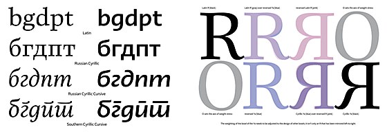
A recent project by Gary Munch: Cursive styles for northern (Russian) and southern (Serbian) Cyrillic. Sample types are Linotype Really (serif) and Linotype Ergo (sans serif). Each language prefers the shapes that come from the handwritten cursive of everyday writing in the languages; Russian uses a single unlifted stroke for pe and te, where Serbian uses a stroke made separately. Each intends to close the top of the stems of the letters.
This project by Gary Munch illustrates the differences of R and Ya set in Linotype Really. The weight of the bowls of R and Ya should be in harmony with the weighting scheme most easily seen in O. Reflection or mirroring of R to make Ya places the weight in the wrong position; better is to use rotation and adjustment of the bowl to get it to face the opposite direction.
A type designer looking to go beyond the Latin alphabet has many choices of where to begin.
Extended-Latin includes diacritical marks for Polish, Czech, Croatian, Hungarian and Romanian among others. Cyrillic, used in several languages, employs a mixture of Latin and non-Latin characters, which may make it the easiest to try first. And, of course, there are lots of languages that use non-Latin scripts entirely — Chinese, Armenian, Ethiopic, Lao, to name just a handful — that may prove daunting for the nonspeaker. Although type designers don’t need to actually learn the language, it’s a good idea for them to line up some advisors who can help them avoid common pitfalls and unintended results.
Sources:
https://typerepublic.com/
https://www.myfonts.com/person/Gary_Munch/
https://www.typotheque.com/tag/cyrillic
https://core.ac.uk/download/pdf/39016217.pdf