A small introduction to Cognitive Science

Not only language can sometimes be an obstacle in communication, it also requires a special level of knowledge to understand it. For this blog post, I’ve tried to collect more information about cognitive science and image processing, in order to be able to understand better the process behind our comprehension of words and images.

Since these findings could enlighten some crucial aspects of my thesis, I will share here the facts I found important to mention.

What do we consider as a language? 

The definition of a language varies a lot, as you browse through the internet. According to Britannica, a language is a system of conventional spoken, manual (signed), or written symbols by means of which human beings, as members of a social group and participants in its culture, express themselves. The functions of language include communication, the expression of identity, play, imaginative expression, and emotional release.

Any natural language can be described by a system of symbols (lexemes) and the grammars (rules) which manipulate the symbols. What makes one language unique are the symbols, grammars, and their interactions that make a particular language unique from others, although certain languages do have overlapping sets of symbols or grammars. For instance, “cognates” represent words that have similar spelling across languages, usually identified based on some string similarity measure (like longest common subsequence, or Levinstein distance). Such a string similarity will indicate that e.g. “name” (English) and “nome” (Italian) and “nume” (Romanian) refer to the same concept, and were derived from the same root. Despite such evidence, the concept of “cognates” usually holds only between languages from the same family (like Romance languages), and can hardly, if ever, helps the communication process between speakers of languages from different language families.

Cognitive Science

Cognitive science is the interdisciplinary study of mind and intelligence, embracing philosophy, psychology, artificial intelligence, neuroscience, linguistics, and anthropology. Cognitive science explains that we use pictorial representation because they deliver information way much quickly than verbal descriptions.

That would also explain why do people have visual images of situations, but it also claims that people have processes such as scanning and rotation that operate on those images, which produce intelligent behavior.

How do we apprehend sentences? 

The meaning of a sentence is encoded in each of its component words. To understand a sentence, all meanings of the individual words must be retrieved and combined. But what if we change the words with pictures? How do we make connections then? 

Some studies conducted by M.C. Potter, J.F. Kroll, B. Yachzel, E. Carpenter, and J. Sherman and explained in the Journal of Experimental Psychology 115 “Pictures in sentences: understanding without words” have shown, that situations in which the concrete noun in a sentence is replaced with a pictorial representation which should symbolize the word, and which is then shown to participant in rapid serial visual representation (RSVP) to forty subjects, give no significant delay in the understanding of rebus sentences compared to all words sentences. 

What is also worth mentioning, is that the speed of understanding and accuracy of comprehension remains the same, no matter what position the picture has. Also, it did not make the difference whether there it was one picture or two pictured object replacing the nouns. 

We could make a conclusion out of that and say, that the lexical representation (dictionary definition) of a noun points to a conceptual system in the human brain (which contains people’s knowledge about the world), where the meaning of the sentence is constructed. This also points to the possibility that humans can communicate with one another through non-linguistic means.

Sources:

https://academicconnections.ucsd.edu/onlinecourses/intro-cogsci.html
https://pubmed.ncbi.nlm.nih.gov/2944988/
https://www.britannica.com/topic/language
https://www.kfki.hu/~csdori/Concepts.pdf
https://digital.library.unt.edu/ark:/67531/metadc5263/m2/1/high_res_d/thesis.pdf
M.C. Potter, J.F. Kroll, B. Yachzel, E. Carpenter, and J. Sherman, Pictures in sentences: understanding
without words, Journal of Experimental Psychology 115 (1986), no. 3, 281–294.
K. Barnard and D.A. Forsyth, Learning the semantics of words and pictures, Proceedings of the IEEE
International Conference on Computer Vision, 2001.

Evaluation of an External Master’s Thesis

Title of the Work: “Pictogram System to Resolve Language Barriers in Medical Communication,  Investigation, Diagnosis and Treatment”

Student’s name: Vikram Mallik Bendapud

University: University of Cincinnati, College of Design, Architecture, Art and Planning

Date: April 2017

I’ve chosen to analyze this work because it deals with a topic that I find relevant for my research. It enters the field of Participatory Design and covers some aspects of Communication Barriers, I am also interested in. The author describes his work as an attempt to develop a system that improves communication through visual language in a medical context to be used in the Indian subcontinent. He mentions cases where a medical practitioner has to communicate with a low-literacy level, migrant patient, or those who do not speak a common language, where this project has to come up with the visual aids to be given to the patient, in order to explain his/her condition resulting in a collaborative effort with a practitioner.

Level of Design

The work has a simple layout, with a clear structure that leads the eye easily through important sections. Titles, as well as subtitles, are bolded, noticeable, and the running text is legible, with carefully considered spacing and row length, I would say. The simplicity of the layout ensures a comfortable reading flow. Different parts of chapters are divided with numbers and dots, which gives the reader precise insights into the main parts of the work. Between every chapter, there is a blank page with its title, which also separates the different sections. Graphics are placed mostly at the bottom of the text, or on a separate page, yet some of them are pixelated, which leads to the impression of insufficient material preparation.

The work does get a little bit messy at the end – in the Appendices part, since it contains numerous examples of scanned sheets used during the participatory design sessions.

Outline and Structure

The work is structured in a very nice way, giving a clear overview of the most important parts. The sequence of the chapters is logical, so the reader can easily follow.

Degree of Innovation

It is hard to estimate the degree of Innovation within this work. The author mentions one similar project which was testing the theory of icons being used as a replacement for written words in the medical field, from which his project obtained ist stylistic quality and design elements from. On the other hand, the way in which testing and development of the existing system were performed, as well as the representation of results, can be considered as very innovative. The author himself says that the present scope of the project was not to find a final design solution, than to lay the groundwork for future design improvements, evolution, and application, which, in my opinion, he has managed to do.

Independence

The independent implementation of the work is also hard to evaluate. Considering there are not many works and projects, except the one already mentioned, which handles this problem, I think it is already a certain dose of independence in the work. The author gives his opinion in most cases, but also uses quotes, and mentions various theories and researches.

Degree of Communication

I would classify the degree of communication through the work as average. The language that the author uses is easy to understand, he uses terms and design terms, in the appropriate measure. The situation and the design problems are described in a comprehensible way.

Scope of Work

The work has a total of 224 pages, which I found extensive, and hard to follow after a while, but considering the design problem and the whole participatory design process which was being conducted, I understand that it took a lot of explanation, especially in chapter 5, where we see the icon and system development.

Orthography

I would not rate this criterion as being on a high level, since as soon as I started to read, I noticed some missing letters, on the second page already.  As I went further, I noticed other spelling mistakes.

Literature

There are 22 sources mentioned in the literature list, while 6 of them are online sources.


The work is available under the following web address:
http://rave.ohiolink.edu/etdc/view?acc_num=ucin1491562397712182

New Aspects of the Topic

This semester I’ve decided to reopen the topic I was dealing with in the first semester, because it still seems contemporary and relevant to explore to me. As an introduction, I would mention, that bad communication ends a lot of good things, but it also makes people’s life harder, when it comes to multilingual communication.
Multilingual communication is communication beyond the borders of languages. It implies communication between members of different linguistic groups, often not talking any language except their mother language. Therefore I find this topic extremely important in the world we live in, with approximately 6,500-7000 languages being spoken at the moment, so I chose to base my research in this direction.
In a world of increasing migration and technological progress, multilingual communication has become the rule rather than the exception. Therefore I will try to do as much research as I can on the topic of non-verbal communication, which could also be meaningful for my master thesis.

Designing visual means and non-verbal systems as an alternative to verbal communication was already a problem of some health facilities in countries in which many languages are spoken (like India), as well as the countries with a low-reading population.
There were already several projects led by the dream of a world in which languages don’t separate people, trying to design a visual language that would use universal symbols understandable to everyone. One of these attempts was to create universal health-care symbols as part of the project “Hablamos Juntos”-“We Speak Together”.
This was a USA project about designing a visual system to help the LEP population to go through health facilities without misunderstanding and stress, which also makes physicians’ job easier.

“Making signage easy to understand and eliminating language barriers is one simple way we can improve the health-care experience for everyone,” says Yolanda Partida, director of Hablamos Juntos, an organization established in 2001 to develop practical tools to overcome language barriers to health care.
“There are limits to how many languages can be presented effectively on wayfinding signage,” explains Partida. “Universal symbols offer an alternative to bilingual or trilingual signage that can quickly become useless with unreadable font sizes.”

Communication problems continue to grow in every country with immigrant and migrant populations. The growing problem is not only noticeable in the healthcare system, but also in bureaucracy. In designing such a system, its implementation plays an important role as well. How to adjust the symbols to already existing ones, which criterium is more important when it comes to shaping: clarity or creativity? Each of these factors should be considered when thinking about these problems, which opens a sequence of questions, that will be questioned in my next blog entries.


Sources:

https://voiceboxer.com/multilingual-communication-important/
https://www.ncbi.nlm.nih.gov/pmc/articles/PMC2988148/
https://segd.org/hablamos-juntos-universal-health-care-symbols
http://liu.diva-portal.org/smash/record.jsf?pid=diva2%3A1457973&dswid=-6607
https://etd.ohiolink.edu/pg_10?0::NO:10:P10_ACCESSION_NUM:ucin1491562397712182

International Design Discourse: Summary


First of all, I want to say that I liked the topics of the lectures in the course, and the way it was put at our disposal, because we had the flexibility to watch whoever we want, whenever we want, how many times we want.

And now a little bit about each lecture:

1.Andrey Sudarikov: I like the diversity of the topics he spoke about. He showed us how broad a field of implementation of augmented reality is, and how different projects develop over time, but also that sometimes spontaneous ideas and thoughts can turn out to be excellent projects. I like his positivity, and his enthusiasm for the tasks he worked on.

2.Saskia Schmidt: She was talking about her career and her life after she graduated from the FH, and it was really fun to listen. She also prepared a high-quality video, so I appreciate that she put so much time into it. It is always interesting to hear, a story of someone who went through something you are going through at the moment.

3.Astrid Kury: She gave insights on how important it is, to work with other creatives from other fields, because you have a wider field of work, and different perspectives, that combined give an excellent solution. For me, it was fascinating to watch all of the projects she showed, especially the one about “Casa Carlota” and the process of equal exchange.

4.Florian Doppel Prix: He pointed out that it is crucial to include all aspects of perception in your work to make it complete, and he also gave some insights on his projects, so we could see what happens behind the scenes. He spoke about his works in a relaxed and fun way, so it was a pleasure to listen to him.

5.Burcin Cem Arabacioglu: He gave some meaningful insights into the future of sustainable cities and interior design. He talked about problems in megacities like Istanbul, he is living in. He pointed out that just a few percents of owners hire professionals for designing an interior of skywalkers and buildings, even though they may have a solution for making big cities sustainable, so many solutions remain unconscious.

6.Sylwia Ulicka:
I have to say, for me, this lecture was a bit hard to follow, so I had to listen more times, but it was worth it. The topics she was talking about are very important for the future of our society, and we should all question some things she mentioned, like society and the values of the world we are living in.

7.Ursula Tischner: She gave a detailed overview of the topic of sustainability, and designing sustainable systems. She mentioned some facts everyone should be aware of, like that global overshoot day happens earlier every year, that Indium and other precious metals will soon no longer exist on this planet, that there is already a water crisis, that 75% of the fish population is gone, that 70% of fresh water in the US is used for livestock production, etc.

8.Anastasia and Martin Lesjak: They inspired me with their transdisciplinary team and their extraordinary ides. They showed how successful working in such a diverse community can be.

9.Wolfgang Schlag: I enjoyed watching this lecture as well, because I got to know the history of the radio as a media. It was amusing to hear about radio station takeover in 1934 and again in 2000. He pointed out, that he believes the radio will stay alive, even in the era of the internet, because it stays politically important media, today as it was in the time of war when it was necessary to inform people in a very short form on the actual ongoing situation. He believes that with the radio, you can create a special world, like in the example of a concert through the radio, so the radio will definitely survive.

Pop Art based typefaces

Since my last blog-post about overlapping of two fields I am interested in, I’ve been searching for pop art based typefaces. I thought it could be interesting, to have a look at some examples and maybe to try out some of them myself. So my research was heading in that direction.

I’ve found a lot of type designers who admired pop art as a movement or were fascinated with pop artists and their handwriting – or just needed to create a distinctive typeface for a project. So, it was relieving to see that there are a lot of creatives out there, taking inspiration from bright colors and irresistible forms of pop art – because like it usually happens, when you deal with the topic for a while, you start losing interest and ask yourself, if you are on a good path.

Furthermore, I was surprised by the number of divergent outcomes of the projects based on the same initial thought, though it is something that proves that creativity always finds contrasting ways to express itself.
I enjoyed this process of searching and I am sure I learned a lot along the way. As I found so many examples (not each of them was good, but it was definitely fun to explore), I had to narrow my selection for this blog-post, otherwise, this would be an “endless” gallery.

Alessandra Daniele

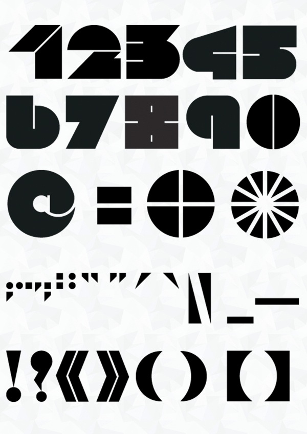
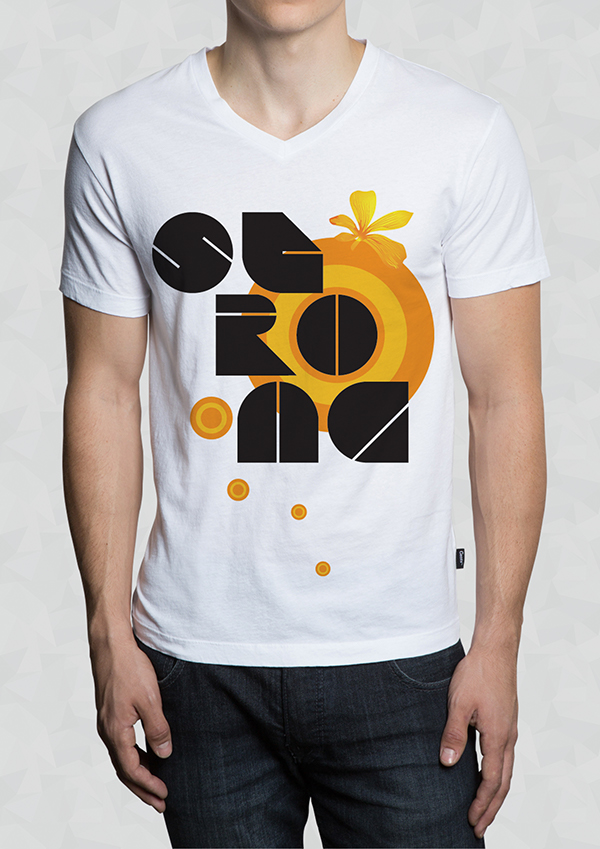
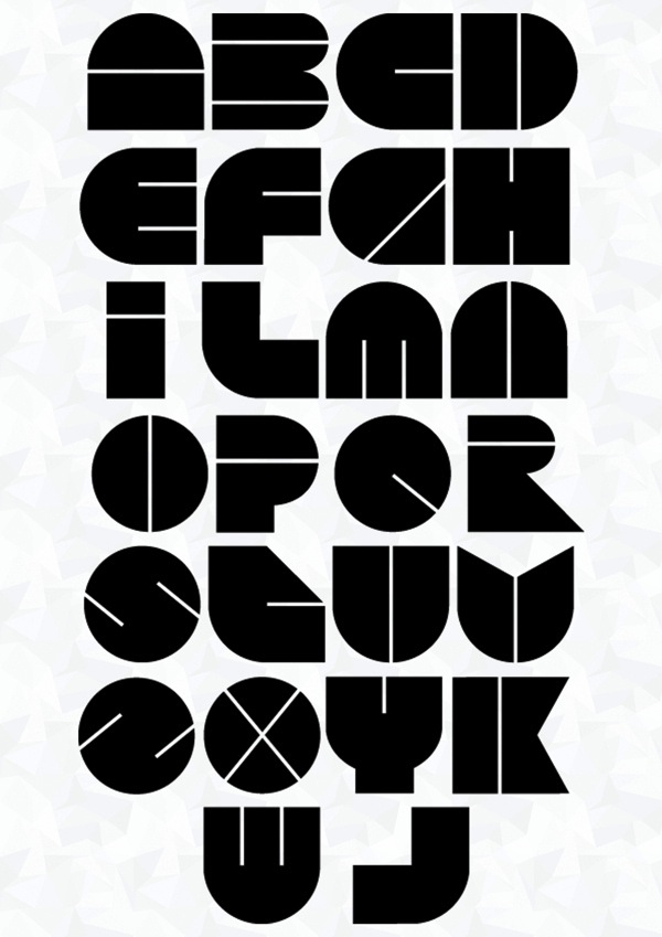
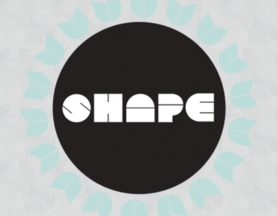
During her studies at Accademia delle Arti e Nuove Tecnologie in Rome, Alessandra Daniele designed the pop art typeface Shape in 2013.


Cahya Sofyan

In 2016, Cahya published typeface family Soda Popp. She says: “The new typeface called Soda Popp is inspired by pop-culture, vaporwave music, and seapunk that emerged in the early 2010s among Internet communities. It is characterized by a nostalgic fascination with retro cultural aesthetics, typically of the 1980s, 1990s, and early-mid 2000s”.

Creative Media Lab

Creative Media Lab published Popstick – an ultra-smooth pop art style rounded sans in 2019.


K-Type (Keith Bates)

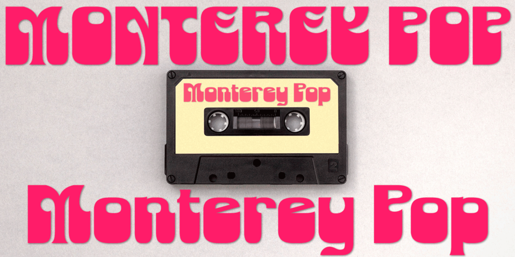
Monterey Pop oozes 1960s freedom and optimism, and is based on Tom Wilkes’s poster lettering for the Monterey International Pop Festival in June 1967, the event which heralded the legendary Summer of Love.


Sources:
http://luc.devroye.org/popart.html

Lecture #7 – Ursula Tischner

For the third blog-post about the lectures, I chose to write about the one from Ursula Tischner, which deals with crowd-based activities and their implementation in system designing.

Humanity, as well as Ursula and her team, are searching for better ways and methods which will serve in designing sustainable systems. As she said, when she mentioned the triple-bottom-line approach: we have to take care of the planet, of the people, and also of the economy, but if we lose the planet there will be no other two.

So we, as human beings living on this planet, should be aware of some facts. For example, that global overshoot day happens earlier every year, that Indium and other precious metals will soon no longer exist on this planet, that there is already a water crisis, that 75% of the fish population is gone, that 70% of fresh water in the US is used for livestock production, etc.
Not only we are spending our resources, but we are also spending them unequally. This is due to unequal material consumption among people living in countries with different development status. It means that the majority of the population (which are those people in developing countries) are living on very low material consumption – they consume much less than people in rich, industrial countries.

For me, the most interesting part of the lecture, was to hear how much stuff being designed is still in use after six months?
The answer is 1 %. So how is it possible for people to still have a good quality of life, but to reduce negative impacts on the environment?

She was also talking about how not only designing eco products is important, because people can buy eco products and use it in a way that is not eco (overconsumption). The right way to think about the problems our planet has, is to think about designing systems of products and services, to increase the system efficiency, rather than improve one product. When designing a product-service system design, we could redesign the whole system like mobility and have systems like car sharing, for example.

During this lecture, I also got familiar with the term SCP (Sustainable Consumption Production)  – which could be implemented when designing systems like mobility, food, agriculture, housing, etc.
Another thing we often forget is the power of the crowd, and Ursula believes that this is a powerful tool, which can be used in designing sustainable systems, to find the better solution that actual responses to real problems, which means that people have more impact in the designing process, we let them have more voice. Crowd based design teaches us how to use the power of the crowd in design through methods like the maker movement, crowdfunding, etc.

So it is important to take real problems, real needs, rather than the products fulfilling that needs, as a starting point to design need fulfillment systems with considerable sustainability improvements.

As a solution Ursula and her company offered to the world, she introduced their open innovation platform called Innovatives – the world’s first open innovation platform for sustainable solutions combining Crowd Sourcing, Crowd Voting, Crowd Funding, and Online Shop. And it functions pretty simply: people write problems, then the challenge starts, participants make teams, work on the solutions, and afterward the solutions are evaluated and the best one is implemented.

I think this lecture was above all informative and educational, it was significant to hear some facts, because you get some insights on how other creatives are thinking about the problems, how they approach to problem-solving, how their aim changes during the development. Some ideas I’ve heard during the talk are probably going to influence my development, because they are very interesting and add a fun note to a solution, like the sustainable dance floor in Rotterdam, which is a fun way of creating electricity, or the music stairways, which people use instead of elevators, because of the fun factor.

Lecture #4 – Florian Doppel Prix

For the second lecture, I wanted to write a review of, I chose “Is it art or can we toss it”, from Florian Doppel Prix.

He was speaking about many challenges he’s had over the past 20 years, working with different teams and team members with different background knowledge, but mostly linked to media and sound art. He referred to different projects, thus he mentioned many artists, designers, programmers, media editors, etc. While watching this lecture, I noticed that in the reality your job is not isolated from other people and other professions, especially when being a creative individual, and you have to cooperate and communicate with a lot of other creatives every day, to successfully finish the projects you are working on. As he mentioned more times, it can be stressful and messy, to work in such an environment, but nothing is easy, and everything is manageable.

He was also showing some interesting technological devices, like robotic drawing machines, which print out force fields onto canvas, also as a part of the installation he worked on. So I think we were able to get meaningful insights, about what happens behind the scenes, when it comes to a realization of the project.

After watching this, I really got the impression, that planning an exhibition is not a straightforward thing, since unpredictable problems can happen, and this is why I believe it is important to have every kind of experts in your team, since you are not able to solve every difficulty alone. As Florian has said, planning itself can be boring and exhausting, but it is also fun in a way, as it is a challenge for everyone included in the project, and it is crucial not to forget to use creative thinking in problem-solving, over and over again.

It became clear to me, that the main thing which is going to keep your exhibition alive is counting on all aspects of perception while designing it. Especially interesting, I would say, is combining acoustic elements with interactive installations, as they did in a project for Niederösterreichische Landausstellung in 2017, which includes interactive touch wall and the sensors behind the graphics, which triggers map projection with animations.

Lecture #3 – Astrid Kury

For my first lecture, I want to reflect on, I chose the one from Astrid Kury, a cultural scientist, and a director of the Akademie Graz. I found her lecture very interesting and inspirative, because she was trying her best to encourage young people to collaborate. Talking from years of experience in working with other creatives, she says she believes in benefits of the collaboration and interdisciplinarity as a proven method for developing projects with broader aspects and points of view.

From her passionate explanation about the power of collaboration, we can all learn some important things.

As she mentioned, the question if we want to work together with other experts, is also a question about what kind of world do we want to live in? Rather egoistic, competitive world or the one, where sharing of ideas, success but also problems and possible failures is an option?

I also strongly believe that collaboration can be a fast track to unique ideas, because you have a bigger picture when working in a team, and a wider perspective. It is certainly hard in the beginning, to work in such an environment, where it is hard to understand each other, because of the different areas you come from, but I also believe that it is worth it.

I was intrigued by the projects she mentioned, but also convinced by the outcomes of the same, and my favorite is the project about linguistic landscapes. Regarding this project, I find the approach of Danica Dakic innovative and original, to consider the language as the connecting aspect of the society, rather than the one who separates it. A method where you collect samples of languages and then think about visual means of expression sounds abstract, but yet is so logical and convincing.

In my opinion, most of the projects she mentioned would not be possible and manageable, if just one person was standing behind it. It would take a lot more time, to even shape the idea, and a lot more to start ist implementation. But when you are working in a team, it is easier because you have a lot of new insights coming in, daily. I think Astrid explained nicely as well, why is it meaningful to collaborate, when it comes to stakeholders. The reason is that they are already engaged in making decisions, everyone who has an interest is already on board, so no one faces criticism and failure alone. None is the genius at the end, and the success belongs to the whole group!

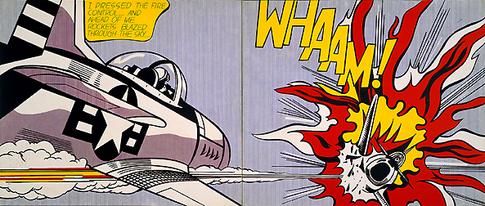
WHAAM!-isation of visual culture: Conclusion

So let’s make a conclusion:

There are various comments and criticisms about the value of pop art in development of modern graphic design. No matter how much this postmodern period of art has helped techniques to degrade the consciousness of the meaning of art, it must be emphasized that, because of its everyday life, motive is at the very core of what people want, need, or use, inseparable from popular culture, which is no coincidence.

With its special yet simple, colorful and carefree features, pop art works are part of the practice of graphic design. Graphic design is a way of designing an end-to-end message that possesses its elements and principles as tools for successful visual communication. The pop artists knew how to create because they had already adopted a visual dictionary to create a visual message; most pop artists began their careers in commercial art. Warhol was a successful illustrator and graphic designer for the magazine; Ruscha was also a graphic designer, and James Rosenquist began his career as a billboard painter and the like. Because of the knowledge on art and practice of graphic design, when it comes to visual communication, pop art artists had an advantage over traditional artists, who created for the sake of the art itself.

Some like Jan Arsen (journalist), consider that the visual culture of today is unthinkable without thousands of photographs similar to the Warhol Polaroids of the rich and famous that served as the basis for some of his work. Arsen’s point of view is that one cannot “outgrow” pop art, because it will surely outlive us.

In my next blog, I will try to make a collection of pop art based typefaces.

Sources:
https://www.fsu.edu.rs/istorija-grafiti-umetnosti-stencil-art/
http://guity-novin.blogspot.com/2010/06/chapter-33-pop-art.html
https://repozitorij.ffos.hr/islandora/object/ffos%3A4107/datastream/PDF/view

WHAAM!-isation of visual culture


According to the designer Mario Tomisa, contemporary societies are based on mass-production and consumption, and the global exchange of capital and labor, so he concludes that design can be also defined as an intellectual and creative interdisciplinary activity that functions within the society and has the need to materialize myths in order to foster mediation within the cultural system.

The term “Design” itself, as a synthesis of art and industry, began to be theoretically elaborated from an early age of “Second Modernization”, that is, in the early 1950s.

So when we say that design itself is a synthesis of art and industry, there is no wonder that we can not determine for sure what differences graphic design from pop art, which arises as a result of a technique of work applied during work process in graphic design.

Professor of Graphic Design Ryan Hembree at the University of Missouri details how graphic design differs from art, and thus the ultimate goal of creating work between an artist and a graphic designer. He points out the fact that designers sometimes use the same tools as a painter, sculptor, or photographer when creating their work, which may even contain pieces of artwork within the composition. To high art and design, creative creation is common, but individual purpose is completely different. Hembree states that high art is self-sufficient, as well as the motives of creation that are expressed on an individual level. The artist explores social problems, creates an opinion (viewpoint), and provides viewers with scenes of the world around them. Although most artists’ aspiration is to sell works to people who relate to their works on a visual and emotional level, the work itself is mostly created for its own reasons, not for the individual buyer. Graphic design, on the other hand, is a vocation that involves creating visual communication at the expense of a customer who has a very specific need and is willing to pay for it.

On the other hand theorist Rick Poynor notes and points out that graphic design has always borrowed motifs from other fields of art, questioning how the element of postmodern borrowing differs from borrowing from previous artistic periods throughout history. As an example of a design that borrows distinctive elements from previous artistic periods, he takes the design created by Malcolm Garrett to cover the album New Gold Dream of music rock band Simple Minds. Thus, the cover of the said album contains a combination of medieval motifs, such as the Catholic Cross, which at its core contains the motif of the Heart of Christ, inside which is a booklet, with a medieval calligraphic font over a “marble” background. The overall impression does not give the impression of contemporary design, but it does convey that visual message of the basic idea of ​​the album.

Through my research, I found many designers and artists, who could be interesting for my topic, but I don’t want to make this post really, really long so I am going to mention just a couple of them.

  • Butcher Billy
    One of them is a designer who publishes works under the artistic name Butcher Billy. This Brazilian illustrator and designer, like his pop predecessors, draws inspiration from what he considers to be a popular culture of various sources (such as music, comics, movies, games, etc.), and fuses them into interesting works. He considers himself a butcher of popular culture obsessed with finding the perfect cut. Nowadays, making links to pop culture can be common and boring, but this is not the case with this artist. His work is recognizable for its vibrant, vibrant colors. It gives observers, with a sense of nostalgia, a fresh look at the already familiar current scene.
  • Shepard Fairey
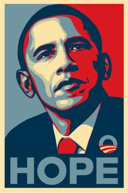
    Another example is the work of artist Shepard Fairey. Shepard Fairey is a contemporary street artist, illustrator, graphic designer, activist and founder of the OBEY Clothing clothing line. Formerly known to the public as the creator of Andre the Giant Has a Posse (1989), he became even more famous by creating the HOPE (2008) poster for Barack Obama’s presidential campaign. The HOPE poster incorporates photography into the composition.
  • Richard Avedon
    He was born in New York and he attended DeWitt Clinton High School in the Bronx, where he worked on the school paper with James Baldwin. After briefly attending Columbia University, he started as a photographer for the Merchant Marines in 1942, taking identification pictures of the crewmen with his Rolleiflex camera given to him by his father as a going-away present.
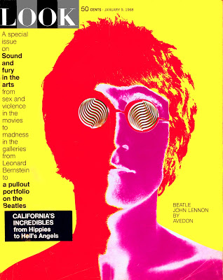
    Among his important works are the photographies of members of a music group “The Beatles”, which he took in August 1967. Four of them were later adorned with psychedelic effects. They were first published in the 9 January 1968 edition of the US magazine Look and were subsequently sold as posters.


Sources:
https://www.fsu.edu.rs/istorija-grafiti-umetnosti-stencil-art/
https://repozitorij.ffos.hr/islandora/object/ffos%3A4107/datastream/PDF/view
http://guity-novin.blogspot.com/2010/06/chapter-33-pop-art.html