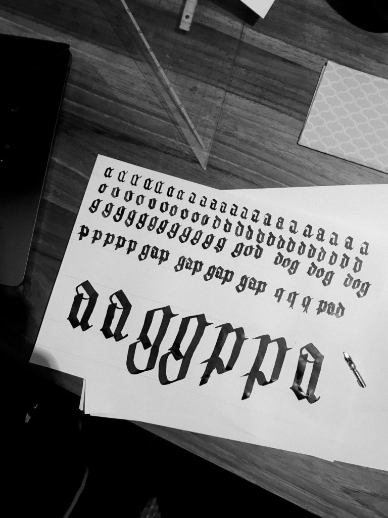
Why blackletter? I do not intend to design a of blackletter typeface, but I want to create something classic, but edgy at the same time. Doing my first sketches I realized, that my letters did kind of resemble blackletter a little. It was not at all intended, but I guess some knowledge about blackletter might be useful for me.
Blackletter, also known as Gothic script, evolved from the Carolingian minuscule in the 12th century. There was a high demand for books at that time and material was expensive. The Carolingian minuscule was very time consuming to produce and needed a lot of space. Blackletter was kind of a reaction to this problem: it saved time and space. Characteristic for blackletter are their kinked, sharp shapes with a high degree of breaking.
There are several forms of blackletter existing: Textualis, Rotunda, Schwabacher and Fraktur.
In the 14th – 15th century blackletter had it’s high point in Western Europe. At the same time the Renaissance started in Italy. People strived for something more elegant – the Humanist Antiqua evolved. Nevertheless, in german speaking countries, blackletter remained very important. They were heavily used by the Nazis, which was the reason for their ban in 1941. Now, 80 years later, blackletter is somehow still associated with the Third Empire. It has hardly been used since then, although I feel like it is having a little revival right now in the design scene.
In order to understand the shapes I went back to their origin: handwriting with a broad-edged pen. Although my letters didn’t look as good as I imagined they would, I still began to understand some relations.

DETAILS I NOTICED:
At the end and the beginning of a letterform’s stroke, there are no serifs but quadrangles. They are a consequence of writing with a broad-edged pen.

The contrast is very high. Thin, decorative lines are sometimes used to close shapes, that are commonly open (f. e.: a, g, k, s, v, w, y)

The shapes of the letters are quite narrow and stand very close to each other. They do not need a lot of space.

Most curves are completely fractionised into straight lines, but still, there are some curves and rounded edges.

The capitals of blackletter are often eye catching and quite calligraphic.
