Today is Monday the 1st of June, 2020. Since the last time I posted a lot of the things that made the new situation to what it was, went back to normal again. We are still not allowed to travel to where we want, but I feel like the situation isn’t affecting my life too much anymore. Still I spent a lot of time at home, but that is rather because of the chilly weather than due to corona.
To continue the blog-entry from last time I want to ask myself today the question if humans rather tend to get attracted by individual beauty or by beauty standards nowadays.
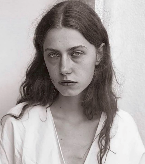
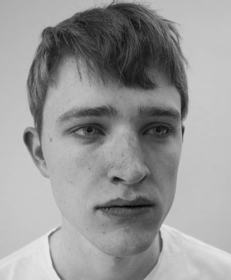
As I mentioned the last time; when it comes to human faces, the majority of people think a face to be pretty when it is very symmetrical, and it looks very normal. Everything that doesn’t look normal makes us think, that something isn’t right with the person behind that face. People also tend to think of women to be pretty when they look very feminine (big eyes, clear skin, small chin, wide hips) and they also tend to think of men to be pretty when they look very masculine (present jawlines, wide shoulder and tall body-height). At the moment a lot of discussion is going on about the topics gender-roles…but that isn’t something I am going to write about now.
I am rather asking myself, if these beauty standards we have in our minds are actually the standards in 2020 or if there are even some? Technology made a lot of things possible for us humans. Gloabalization allowed many of us to choose an exotic place to settle down and so it happened (thank god) that we are able to see very very different looking people everyday.
From a photographic point of view my opinion on beauty standards is, that they tend to look very boring most of the time. If we see everyday the same. things we tend to get blind for their beauty, no matter how beautiful it is. What makes an image interesting for me are cultural connotations. These can be made visible through the location, the fashion, the way I shoot the picture but first and foremost unusual humans are what strikes my interest. Anything that makes someone look special, can always make the image look special. In my opinion people in general underestimate their choice concerning models completely — the choice of models is actually a secret of good photographers, not the camera-settings. An example for an Austrian model agency that shares this passion for interesting looking people is Das Deck.
Beauty isn’t something that only involves pretty faces. Everything can be thought to be beautiful. But do we rather like things for the reason that we saw them a million times already or are progressive designs the designs that actually catch our attention and furthermore the key to our hearts?
I am going to list three examples and let everybody decide on his own approach as a designer in the end.
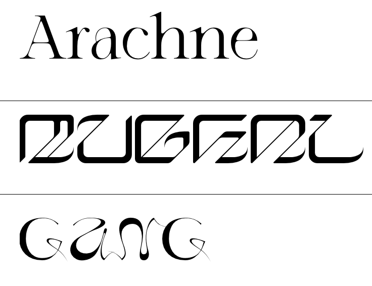
As we are communication designers let’s start this topic of with fonts. Which typeface is the most beautiful? I don’t know. I just know that Helvetica is the one typeface that is more often used than all the others. But do we use Helvetica that often because it is the most beautiful typeface or do we just use it because it features very high typographic quality and is furthermore very good legible? I think of Helvetica and some other established fonts as what they are: They are so universal because they feature indeed very high typographic quality but don’t distract the reader from the actual content. Helvetica is highly functional and functionalism is something that I really love. But is Helvetica a font where you get tears in your eyes because it is so beautiful? I don’t think so. If a general font doesn’t do so, maybe very specific and stylized ones do? When it comes to modern branding custom fonts become more and more popular. A very distinct font can be a strong fundament for a whole brand. The more characteristic it looks, the easier it is for viewers to remember the belonging brand too. I strongly believe in the beauty of very exotic typefaces, as it is so fascinating for me that the same message can be written with symbols that look very different and therefore also deliver subtext surpassing the message alone.
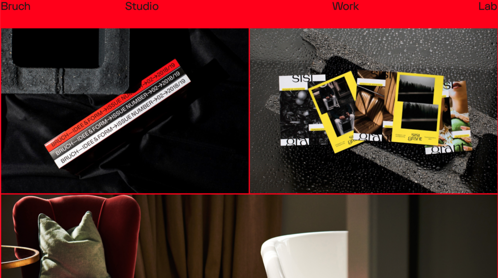
As we (the students) busy ourselves at the moment with portfolio websites, websites in general are also a nice example when I think about standardized design vs. specialized design. When I think of websites immediately some cool examples come to my mind. Two weeks ago we (students) had to make presentations about good examples of portfolio websites and why we like them. Although we (the students) are very different from each other and everybody has different styles I have to say that most of the good examples my peers curated during their research looked also cool to me. What were the examples like? They were very playful and characteristic. They where unique and actually creative. Not a single “0815-Wordpress-template-website” was shown and some colleagues even picked the same websites (from all the websites that are out there). When it comes to websites my opinion is, that it isn’t necessary to make them very shrill and colorful, but they should have something special. They should surprise the visitor, because positive surprises are very likely to be remembered and that’s what it is about when designing a portfolio website.
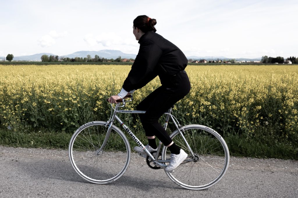
Because I already spent some hours on my bicycle this spring already and I really enjoy the beauty of riding outside I want to write something about bikes here. I don’t know if I am the only person that recognizes what bikes people are riding because I really love bicycles, but in Graz there is a species of bike-riders that ride one special bike. It can be bought with orange or turquoise wheels and I saw countless people all riding the same specific bike. I believe it is a cheap singlespeed bike from GigaSport and that’s probably why many students own it. This bike is an example for standardized bike beauty. It does look alright and the quality probably will be alright too for a city-bike but in my opinion you can’t compare it to other bikes this money could buy. My girlfriend and me were looking for a nice road-bike for her to ride through Graz. At first we thought about getting something like the “GigaSport-Bike”. Due to the fact that I always think ten times about the purchase before actually buying it, I started to look for older bikes. Long story short: We found a beautiful Italian Bianchi with a classic steel frame, got it, repaired and cleaned it and bought some new parts from the spare money. If I think about the GigaSport-Bike compared to the Bianchi I can’t tell you how glad I am that we decided to individualize a bike rather than to just buy the standardized Graz-student bike. The pure joy I get from just looking at the beautiful Bianchi shows me that individualization can definitely be the better decision.
As I absolutely exaggerated with the length of this blog-entry I want to keep myself short and precise with the conclusion. The intentional question I tried to answer was if humans rather tend to get attracted by individual beauty or by beauty standards nowadays.
The answer of course is “it depends”. You can’t really say answer A or answer B is right, but what definitely can be said is, that as a designer you should definitely ask yourself with each decision you make, if you should go with the flow or swim against it and why.