Analyse eine externen wissenschaftlichen Arbeit

 Bewertung: COCOON: EIN ZELT FÜR RADREISEN—NICOLE BOSCHITZ

Warum wurde die Arbeit gewählt?
Die Arbeit wurde gewählt, weil sie sich mit der Gestaltung eines Produkts beschäftigt, das für die Verwendung mit Fahrrädern gedacht ist. Nachdem das voraussichtliche Thema meiner Masterarbeit sich mit dem Produktdesign und der Vermarktung eines Möbelstücks zur Aufbewahrung von Fahrrädern in Wohnungen beschäftigt, hat mich die Analyse der Arbeit sehr gereizt.

Problemstellung/Fragestellung
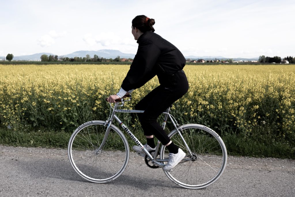
Die Verfasserin der Arbeit beschäftigt sich mit dem Entwurf eines Ein-Personen-Zelts, welches für Fahrradreisen entwickelt wurde, eine Verbindung zum Fahrrad herstellt und in weiterer Folge auch platzsparend transportiert werden kann. Um die Bedürfnisse des Radreisenden zu erfüllen, wurde sowohl Form als auch Material so minimalistisch wie möglich gehalten. Das Zelt verfügt auch über die Möglichkeit sich mit anderen baugleichen Zelten zu verbinden, um so Kommunikation zwischen mehreren Personen innerhalb ihrer Zelte zu ermöglichen. Eine konkrete Forschungsfrage konnte ich nicht direkt aus der Arbeit herauslesen, aber das Produkt ist eine Lösung zu einer spezifischen Problemstellung.

Forschungsstand
Die Autorin beginnt die Diplomarbeit mit einer kurzen Offenbarung der Ergebnisse ihrer Recherche zu verschiedenen Fahrradtypen und Zelttypen. Bei den Fahrradtypen geht sie sehr spezifisch auf verschiedene Rahmenformen und Einsatzzwecke der Velos sowie auch auf deren Eigenheiten ein. Nachdem die Arbeit von einer Architekturstudentin verfasst worden ist, geht Frau Boschitz in weiterer Folge sehr konkret auf verschiedene geläufige Bauformen von bereits existierenden Zelten ein und analysiert auch deren Eigenheiten. Sie erwähnt auch das sogenannte „Travel Tent“ welches eine veraltete, nicht ganz durchdachte Lösung für Fahrradreisende darstellt. Nachdem dieses Zelt im inneren einer Fahrradfelge zwischen den Speichen transportiert wird, bietet es nämlich eine riesige Angriffsfläche für Wind, was die Fahreigenschaften unter gewissen Bedingungen fast unfahrbar macht.

Zielsetzung
Die Zielsetzung der Arbeit ist das Entwerfen eines Zeltes für Fahrradreisende, welches leicht verstaubar ist, durch die direkte Verbindung zum Fahrrad einen Diebstahlschutz für das selbige darstellt und die Kommunikation zu anderen Reisenden ermölicht, sofern sie auch über ein Cocoon-Zelt verfügen.

Theoriebezug
Auch wenn die Arbeit hauptsächlich einen dokumentarischen Charakter hat und somit, sehr viele praktische Überlegungen und Versuche aufzeigt, basieren manche Überlegungen auf theoretischen Quellen, um die Vorgehensweise in der Planungsarbeit zu begründen. Im Großen und Ganzen empfinde ich die Arbeit nichtsdestotrotz als außergewöhnlich praxis-lastig, was ich schade finde, da sie hier sehr viel Potential verschenkt.

Methode 
Eine Methode ist immer der Weg den man geht, der zur Erreichung eines Ziels führt. In dieser Arbeit gibt es viele unzählige Schritte, die Frau Boschitz geht. Zu Beginn geht sie ganz klassisch den Weg der Literaturrecherche, welcher sie bis zum Beginn der eigenen Erstentwürfe begleitet. Vom Beginn des Erstentwurfs bis zur genaueren Formfindung, wendet die Autorin die Methode des Experimentierens an, indem sie verschiedene Modelle von Fahrrad-Zelt-Kombinationen im Maßstab 1:10 anfertigt.  Des weiteren baut sie fortlaufend verschiedene Dummies in Originalgröße zum Herantasten an die richtige Form, die schließlich auch die gewünschte Funktion erfüllt. Einige mathematische Berechnungen zur schlauesten Formgebung sowie verschiedene praktische Materialtests führen sie schließlich zu ihrem Prototypen, der noch lange nicht perfekt ist, ihr aber weiter Schwächen ihrer bisherigen Arbeit offenbart. 

Material
Nachdem ich nicht ganz sicher weiß, was mit Material gemeint ist, gehe ich vom Bildmaterial aus. Das in der Diplomarbeit verwendete Bildmaterial ist sehr vielfältig und dokumentiert den Entstehungsprozess des Prototypen sehr genau. Stilistisch reichen die Bilder von Handzeichnungen über technische Computerzeichnungen und 3d-Visualisierungen hin bis zu Fotomaterial vom echten Prototypen. Für eine Diplomarbeit einer Architekturstudentin ist das Material sehr sauber und zweckdienlich.

Literatur
Die Literatur mit der sich die Autorin auseinandergesetzt hat ist bis auf zwei physische Quellen, die ausschließlich Auskunft über statistische Hintergründe geben, hauptsächlich Sekundärliteratur aus dem Internet. Zwar wird vollends auch Zitate aus Online-Enzyklopädien verzichtet, jedoch wäre die Steigerung der Wissenschaftlichkeit der Arbeit durch Verwendung von seriöserer Literatur möglich. Ich empfinde es als sehr erstaunlich, mit wie wenig Quellen die Verfasserin gearbeitet hat.

Gliederung
Die Gliederung der Arbeit besteht aus insgesamt zehn verschiedenen Punkten, welche chronologisch den Entstehungsprozess des Zeltes dokumentieren. Die Anzahl der zehn großen Überpunkte, hätte ich auf vier bis maximal fünf reduziert und jeweils mehrere dieser Punkte zusammengefasst, um mehr Überblick zu verschaffen. Beispielsweise würde es sich anbieten Punkt III-V in einen Punkt zusammenzufassen. Die Conclusio zum Schluss der Arbeit gibt Antworten auf die in der Einleitung gestellten Fragen, was somit eine schöne in sich geschlossene Gliederung abrundet.

Ergebnis/Ausblick
In der Zusammenfassung wird die ein Resümee gezogen mit der Erkenntnis, dass die Verfasserin froh ist dieses Thema gewählt zu haben, auch wenn der Weg hin zum Prototypen viel länger und schwieriger war als anfangs gedacht, wodurch sie aber einige Sachen gelernt hat. Vor allem durch die Zusammenarbeit mit der Produktentwicklungsfirma im Ausland, habe sie profitiert. Was für die Autorin, die es architekturtypisch gewohnt ist in riesigen Maßstäben zu denken, neu war, war das sie ihre Komfortzone verlassen musste, um eher den Job eines Produkdesigners zu verrichten. Sie konnte sich ihrer Meinung nach aber schnell und begeistert damit abfinden.

Positive/Negative Kritikpunkte:

Originalität der Arbeit
Die verschiedenen Eigenheit des entworfenen Produkts, welche sich erst bei genauerem Hinsehen offenbaren, verleihen sowohl dem Produkt, als auch der dokumentarischen Arbeit einen gewissen Eigenheitscharakter. Natürlich ist die Idee ein Zelt für Fahrradreisende zu entwickeln nicht neu, jedoch sind Teile der Umsetzung definitiv weiter gedacht als Vorgänger. Gerade für eine Architekturstudentin ist die Gestaltung eines Freizeit-Produkts für Sportbegeisterte eine Neuheit. 

Ergebnis der Arbeit
Wie im vorherigen Punkt geschrieben, fand ich das Ergebnis neuartig und überraschend. Leider war der Prototyp, wie in ihrem Fazit erwähnt, sehr fehleranfällig. Dies sei aber keine Seltenheit bei neuartigen Produkten, da dort die Sampling-Zeit bis zu zwei Jahren dauern könne. 

Darstellung und äußere Form 
Die Diplomarbeit ist für eine Arbeit an einer Technischen Universität sehr sauber gestaltet. Die Visualisierungen wirken sehr professionell und es lässt sich sagen, dass konsequent und großzügig mit Weißraum gearbeitet wurde, was den Leser das Gefühl von Überforderung nimmt. Auch die Entscheidung für ein Querformat der Arbeit, macht bei den vielen Abbildungen im Querformat Sinn.

Schwierigkeit der Aufgabenstellung
Die grundsätzliche Komplexität des Themas hält sich in Grenzen, jedoch wurde durch durchdachten und verantwortungsvollen Umgang auf vieles Wert gelegt, was die Komplexität während der Arbeit steigert. 

Missing Comments

Since I watched three lectures and wrote the longer essays about them quite a while a go I managed to watched all the others in the mean time. 

So here are my short comments on the missing ones:

Burçin Cem Arabacıoglu
Burçin talked about architecture and urban planning and why sustainability is a crucial aspect concerning it. I liked his idea of designers educating common people about sustainibility. 

Florian Doppel-Prix
Florian talked a lot about the importance of concepts. What was quite memorizable for me was his saying that nothing is easy, but everything is manageable. 

Astrid Kury
Astrid talked about the importance of collaborations between different creatives and I liked her thought of sharing ideas rather than keeping them secret. Together it is easier to make progress than it is all alone. 

Andrey Sudarikov
Andrey is a Russian interaction designer who talked about three of his projects. I liked the third one the most, because the idea of engaging (young) people to join exhibitions is something that is really significant in my opinion.

Ursula Tischner
Ms. Tischner was speaking about the importance of the acceptance of sustainable design by the users. She also adressed all the designers to make sustainable solutions attractive options for them. 

Thanks for reading,
Julian 🙂

about beauty #2

Today is Monday the 1st of June, 2020. Since the last time I posted a lot of the things that made the new situation to what it was, went back to normal again. We are still not allowed to travel to where we want, but I feel like the situation isn’t affecting my life too much anymore. Still I spent a lot of time at home, but that is rather because of the chilly weather than due to corona.
To continue the blog-entry from last time I want to ask myself today the question if humans rather tend to get attracted by individual beauty or by beauty standards nowadays.

As I mentioned the last time; when it comes to human faces, the majority of people think a face to be pretty when it is very symmetrical, and it looks very normal. Everything that doesn’t look normal makes us think, that something isn’t right with the person behind that face. People also tend to think of women to be pretty when they look very feminine (big eyes, clear skin, small chin, wide hips) and they also tend to think of men to be pretty when they look very masculine (present jawlines, wide shoulder and tall body-height). At the moment a lot of discussion is going on about the topics gender-roles…but that isn’t something I am going to write about now.

Unconventinal female model from Das Deck

I am rather asking myself, if these beauty standards we have in our minds are actually the standards in 2020 or if there are even some? Technology made a lot of things possible for us humans. Gloabalization allowed many of us to choose an exotic place to settle down and so it happened (thank god) that we are able to see very very different looking people everyday.

From a photographic point of view my opinion on beauty standards is, that they tend to look very boring most of the time. If we see everyday the same. things we tend to get blind for their beauty, no matter how beautiful it is. What makes an image interesting for me are cultural connotations. These can be made visible through the location, the fashion, the way I shoot the picture but first and foremost unusual humans are what strikes my interest. Anything that makes someone look special, can always make the image look special. In my opinion people in general underestimate their choice concerning models completely — the choice of models is actually a secret of good photographers, not the camera-settings. An example for an Austrian model agency that shares this passion for interesting looking people is Das Deck.

Unconventinal male model from Das Deck

Beauty isn’t something that only involves pretty faces. Everything can be thought to be beautiful. But do we rather like things for the reason that we saw them a million times already or are progressive designs the designs that actually catch our attention and furthermore the key to our hearts?
I am going to list three examples and let everybody decide on his own approach as a designer in the end.

As we are communication designers let’s start this topic of with fonts. Which typeface is the most beautiful? I don’t know. I just know that Helvetica is the one typeface that is more often used than all the others. But do we use Helvetica that often because it is the most beautiful typeface or do we just use it because it features very high typographic quality and is furthermore very good legible? I think of Helvetica and some other established fonts as what they are: They are so universal because they feature indeed very high typographic quality but don’t distract the reader from the actual content. Helvetica is highly functional and functionalism is something that I really love. But is Helvetica a font where you get tears in your eyes because it is so beautiful? I don’t think so. If a general font doesn’t do so, maybe very specific and stylized ones do? When it comes to modern branding custom fonts become more and more popular. A very distinct font can be a strong fundament for a whole brand. The more characteristic it looks, the easier it is for viewers to remember the belonging brand too. I strongly believe in the beauty of very exotic typefaces, as it is so fascinating for me that the same message can be written with symbols that look very different and therefore also deliver subtext surpassing the message alone.

Very exotic and distinct fonts seen at Typelab.fr

As we (the students) busy ourselves at the moment with portfolio websites, websites in general are also a nice example when I think about standardized design vs. specialized design. When I think of websites immediately some cool examples come to my mind. Two weeks ago we (students) had to make presentations about good examples of portfolio websites and why we like them. Although we (the students) are very different from each other and everybody has different styles I have to say that most of the good examples my peers curated during their research looked also cool to me. What were the examples like? They were very playful and characteristic. They where unique and actually creative. Not a single “0815-Wordpress-template-website” was shown and some colleagues even picked the same websites (from all the websites that are out there). When it comes to websites my opinion is, that it isn’t necessary to make them very shrill and colorful, but they should have something special. They should surprise the visitor, because positive surprises are very likely to be remembered and that’s what it is about when designing a portfolio website.

Playful & characteristic website from Studio Bruch

Because I already spent some hours on my bicycle this spring already and I really enjoy the beauty of riding outside I want to write something about bikes here. I don’t know if I am the only person that recognizes what bikes people are riding because I really love bicycles, but in Graz there is a species of bike-riders that ride one special bike. It can be bought with orange or turquoise wheels and I saw countless people all riding the same specific bike. I believe it is a cheap singlespeed bike from GigaSport and that’s probably why many students own it. This bike is an example for standardized bike beauty. It does look alright and the quality probably will be alright too for a city-bike but in my opinion you can’t compare it to other bikes this money could buy. My girlfriend and me were looking for a nice road-bike for her to ride through Graz. At first we thought about getting something like the “GigaSport-Bike”. Due to the fact that I always think ten times about the purchase before actually buying it, I started to look for older bikes. Long story short: We found a beautiful Italian Bianchi with a classic steel frame, got it, repaired and cleaned it and bought some new parts from the spare money. If I think about the GigaSport-Bike compared to the Bianchi I can’t tell you how glad I am that we decided to individualize a bike rather than to just buy the standardized Graz-student bike. The pure joy I get from just looking at the beautiful Bianchi shows me that individualization can definitely be the better decision.

Individualized Bike

As I absolutely exaggerated with the length of this blog-entry I want to keep myself short and precise with the conclusion. The intentional question I tried to answer was if humans rather tend to get attracted by individual beauty or by beauty standards nowadays.

The answer of course is “it depends”. You can’t really say answer A or answer B is right, but what definitely can be said is, that as a designer you should definitely ask yourself with each decision you make, if you should go with the flow or swim against it and why.

Lecture #06

The third lecture I watched and would like to write something about is the one from Sylwia Ulicka. She is a designer and lecturer from Puebla in Mexico and her major focus lies on sustainability. 

In the lecture she is trying to convince us to question the material culture we are living in, because she thinks that we as designers have the power to make a change, what is actually a very nice thought of her IMO.

She starts and ends the lecture with two almost similar quotes that basically have the same meaning: A human made artifact is symbolic of the world view held by the society in which it is created. That sounded quite meaningful to me and gave me a very new perspective on the world we are living in. 

Sylwia further states that politicians have been talking for quite a long time about the topic sustainability now, but nothing has really changed, because the idea of an endless economic growth seems more important to them. 

Professor Ulicka goes on by explaining that real sustainability means that the economic, the ecological and the social factor in a society are well balanced — and that is definitely not the case in the world I am living in. 

She explains eco-efficiency as an approach that adds more value to goods and services by reducing the use of resources and decreasing the level of environmental polution — basically it means to produce more with less. Eco-efficiency was in the beginning thought to work out with new technology and it probably would have worked out, if the global consumption wouldn’t have increased as it has since then.  Due to the overconsumption high-income countries are living and due to the increasing overpopulation since 1970 to 2010 the CO2 emission increased by 60% and the biodiversity decreased by 30% what is indeed very very sad. 

I can remember when I was a very young child that when I visited a friend of mine I saw a sticker in the house of his parents that said in German something like „We won’t recognize that we can’t eat money until there is no single animal and no single tree left“. As I grew up I always kept that quote in my mind, cause it hit me at this very young age with such a low amount of words. Anyway Sylwia talked on about that in 2050 we are estimated to waste the resources only three planets could deliver us. She also stated that it is the responsibility of high-income countries to rethink the consumption patterns, because their ecological footprint is approximately five times as big as the one from low-income countries. 

The lecturer from Mexico thinks that we as a new generation of designers should use discursive design or speculative design as she calls it too to make a change. This kind of design is clearly disconnected from our economic system and its’ major goals are to reflect and to evoke discourse about problems of our society. Discursive design is focused on behaviors, emotions and meanings and if we try to design sustainable we need to question the status quo of our behaviors, emotions and meanings. 

She relates in her lecture about three objects students designed as projects to learn something about discursive design:

-HUGO; Hugo is an hugging pillow with arms and is about social isolation in times of permanent social connection in virtual space. 
-TRASH-HOUSE; Students thought of the waste that is produced by political campaigns and they build a house out of the trash. 
-PEPPER-SPRAY; Due to the fact that femicide-rates are enormous in Mexico and women only are legally allowed to defend themselves when they are hurt students designed a pepper-spray that has needles on the trigger-button, so that the women is always hurt before she uses it. 

For me personally this examples are rather art than actual design, because for me to evoke discussions about something was always something that was in the nature of art and I can’t really see a difference to it here. Nevertheless (I really don’t care if its art or a new form of design) I think that everything that makes people communicate about real problems is something that is valuable and needs to be supported. 

As a conclusion I would like to repeat Sylwias conclusion: Modern consumption-patterns are the real problem and design can contribute to change them. If I think of an approach how to change consumption-patterns I always like to think of products that are so well designed, that they last forever and never get out of fashion — that is a different approach than Professor Ulicka told us about, but I like the idea so much. 

Because… in the end design is an expression of how we think about the world that we live in and what we value in it.

Lecture #08

Die zweite Lecture, die ich mir angesehen habe, haben Anastasia & Martin Lesjak abgehalten. Die beiden sind Gründungspartner von 13&9 Design und Martin ist zusätzlich noch einer der Gründer vom INNOCAD Architekturbüro. 

Im Talk sprechen sie anfangs über das Golden Nugget, ihr extravagantes und selbst gestaltetes Bürogebäude in der Grazbachgasse. In diesem Golden Nugget sitzen nämlich die beiden Unternehmen und sie bezeichnen es selbst als ein Transdisciplinary Lab. Die verschiedenen Disziplinen, die darin bedient werden sind Architektur, Interior Design, Produkt Design, Sound Design & Research. 

Martin und Anastasia selbst sind kaum Freunde vom klassischen Disziplinen-/Schubladendenken, da sie für die Unternehmen und wie sie miteinander agieren einen ganz besonderen Ansatz gewählt haben. Sie sprechen nämlich über einen Disziplin-übergreifenden „holistic approach“, durch den sie mit jedem Projekt neue Ansätze und somit echte Innovation schaffen. 

Im Solar Innovation Center, einem beeindruckenden Bauwerk in Dubai haben sie ihre Drei „Kernbereiche“ Space, Light und Sound vereint. Durch Spiegel lenken sie das natürliche Sonnenlicht genau ins Zentrums des Gebäudes, mit Spezialfolien (dichroic foil) erzeugen sie verschiedene Lichtstimmungen und -effekte und ein eigens erstelltes Sounddesign unterstützt die Gestaltung des Lichts anhand einer übersetzbaren Skala von Licht in Klang. Das Solar Innovation Center ist also ein Musterbeispiel für die Unternehmen, da sie dem holistischen Ansatz mustergültig gerecht werden. 

Weitere Projekte, die gezeigt werden befinden sich unter anderem im Landzeughaus, wo die beiden es geschafft haben, einen weiteren sehr spannenden Ansatz zu finden. Sie haben, inspiriert von den bekannten Murnockerln, welche das geologische Fundament der gesamten Grazer Region sind, Interiordesignlösungen gestaltet. 

Auch über das Golden Nugget erzählen sie mehr und dass der goldene Schnitt sowohl bei der Außenarchitektur des Gebäudes als auch bei dem übersetzten Pendant aus dem Bereich der Mode eine große Rolle gespielt hat. 

Um den Umfang des Blogbeitrags nicht zu sprengen, schlage ich vor sich den Rest der Lecture selbst anzusehen, da es sich lohnt.

Abschließend möchte ich ein Kompliment aussprechen, da dieser holistische Ansatz ein Ansatz ist, der mir sehr gefällt und von dem ich sehr stark überzeugt bin, dass sich die gesamte Kreativbranche in eine solche Richtung entwickeln wird. Momentan gibt es viele kleine Spezialisten, die wie ich finde, gemeinsam disziplinenübergreifend unter guter Führung viel mehr bewirken könnten, als sie es gerade tun. Netzwerke sind stark, aber alles aus einer Hand hat oft die bessere Qualität.

Lecture #02

Saskia Schmidt ist eine selbstständige Designerin, die ursprünglich aus Remscheid in Deutschland kommt, ihren Bachelor aber im Jahrgang IND11 an der FH Joanneum in Graz gemacht hat.

Bevor Saskia nach Graz kam, hatte sie bereits in Deutschland eine Ausbildung als Mediengestalterin abgeschlossen, in der sie immer wieder den Satz “Ein guter Gestalter kennt die Regeln und setzt sie außer Kraft” hörte. Sie verstand es anfangs nicht, alles musste bei ihr geordnet sein. Das Verständnis dafür kam dann durch praktische Erfahrung.

In der Lecture selbst spricht sie viel über ihren Werdegang, der davon geprägt ist, dass sie eine gewisse Zeit gebraucht hat, um sich selbstständig zu machen. Das lag in erster Linie daran, dass sie sehr viel Zeit mit nicht-selbstständiger Arbeit bei verschiedenen Agenturen verbracht hat.

Neben En Garde verbrachte sie auch einige Zeit bei studio grau in Berlin, wodurch sie nicht nur viel über Print lernte, sondern später auch Leadership-Skills unter Beweis stellen konnte, da sie ihre Chefin bei studio grau aufgrund einer Schwangerschaft für vier Monate vertreten sollte.

Mittlerweile hat sie erfolgreich den Sprung in die Selbständigkeit geschafft und arbeitet über einige ihrer bekannten Agenturen für eine große Bandbreite and Kunden.

Im Talk spricht sie auch darüber, dass das Netzwerk, dass sie sich im Laufe der Zeit aufgebaut hat mittlerweile zum Großteil aus Freunden besteht, was für sie gold wert ist.

Was man von Saskias Werdegang lernen kann ist, dass die meisten ungeplanten Umwege, die man so macht, auch etwas Gutes mit sich bringen. Jede getroffene Entscheidung, jede neue Bekanntschaft und jede Möglichkeit sich zu beweisen, haben dafür gesorgt, dass sie jetzt in der Lage ist, auf die sie hingearbeitet hat.


about beauty

Today is Monday the 20th of April, 2020. I am currently sitting in front of my workspace at home, where I spent the most time of the last month due to the curfew. I am sure that this new situation for many people created some time to reflect on theirselves and to think about life. For my part, I  used some leisure time wisely to invest in research on topics I was interested in for a long time already. One of these topics is beauty. As a designer this subject is something, I come face to face with all the time. As a designer I often find myself reflecting on my own consumer behavior just to think about, why I buy/like certain products over their competitors. Sometimes I come to the conclusion that I like things, that are probably considered to be rather mainstream, but sometimes I feel like I am the only person on the planet who can see the beauty in certain things. But what is this beauty, that influences most of the decisions we make in our lives, why do we even perceive something as beautiful and why does it matter at all?

Another common colloquial expression for beauty is aesthetic. The word aesthetic is derived from the Greek aisthetikos and means perception/sensation. So something that is aesthetic always affects our senses somehow. To be exact: also something that looks horrible is called aesthetic, because something that looks horrible of course implicates a stimuli. Does that mean that horrible equals beautiful? 

Immanuel Kant, a German philosopher, describes beauty as something that is generally liked by many, even if there isn’t even a concept behind. Beauty in general isn’t something concrete. Due to the fact that aesthetics is a whole branch of philosophy, there are many different approaches and opinions on what defines beauty.
 
Stefan Sagmeister who is one of the most influential contemporary graphic designers defines beauty as the synergy of different aesthetic values like color, form, material and composition. He often talks about that there are tendencies which of these aesthetic values are considered as beautiful. He makes claims that everywhere on the earth a circle is considered the most beautiful geometrical shape and blue is the most beautiful color. I personally am not really sure that such general statements are that reliable, considering cultural differences occurring from country to country and even from region to region. What Sagmeister also likes to tell is that familiar things are perceived as more beautiful than unfamiliar ones. Many scientists would at least agree with him on that point.

In the 90s two painters made a survey in fourteen different countries all over the world on how a beautiful painting should look like. With the help of the survey findings they created a painting for every of the fourteen countries. The astonishing outcome was that every of the fourteen paintings almost looked like each of the other thirteen ones. Each painting had a blue sky, something that could function as a shelter, something edible and a lake with enough water in it. This experiment leaves the impression that humans only perceive beauty to survive.

Studies show that most people in fact agree on beauty in the nature far more than on beauty in the culture. When you show beautiful landscapes to very different people with very different backgrounds they are very likely to agree on its beauty. Also faces that are considered to be pretty in one country are most likely to be considered to be pretty in other countries. Humans tend to like very symmetric faces and they like faces to be rather pretty masculine or pretty feminine but nothing in between. Considering beauty in culture such as in architecture, art or fashion the similarity in the taste of different people differs massively. Some people really like the impressing sight of a gothic church and others hate how it looks. Some people like the raw and naked look of brutalist buildings made out of concrete and others hate how it looks. Some people really fall in love with the simplicity and functionality bauhaus-inspired architecture offers to them and others think its boring. But why do some people think that it is rather boring than beautiful? 

There are some more factors than just the aesthetic ones that decide about how something is perceived. These factors aren’t concerning the specific object, but rather the subject that is watching the specific object. Place, time, culture and ideology are very important factors when judging the beauty of something. For example  someone who used to live in Japan some years ago would judge black teeth as very beautiful. When you ask European people today what they think of black teeth, most of them would think about them as gross. Considering bauhaus-inspired architecture reasons why someone might not think of it as beautiful might be that, he/she doesn’t know what Bauhaus was about and so the lack of education is the reason for missing out the beauty of it. Also someone who is very educated and knows about architecture can think that Bauhaus is very boring of course. One simple reason for that might be, that they like other styles of architecture because of their specific taste more.

So it isn’t that simple to give answers on the question what defines beauty. It in fact is easy to answer the question why beauty matters for all of us.  Pierre Bourdieu, a French sociologist, felt confident about his assumption that the prettier you are, the more success you are capable of having. Every human being has an economic potential, a cultural potential and a social potential. The truth is that people who are pretty are very likely to be associated with other positive properties too. That means that they are perceived to be more trustworthy than others what boosts their social potential enormous. Bourdieu says that social potential can be translated into economic potential – The prettier you are, the more likely you are going to have success in life.

What for me as a designer matters more than my own physical appearance (although it of course matters) is how beauty in our lives affects us. When we see beautiful things our reward center sends dopamine to our brain. So beauty actually makes us feel happy. The complete sacrifice of beauty to keep everything just functional would affect the livability extremely. For me, as stupid as it sounds, beauty is one of the things in life, I always could enjoy, no matter how bad everything else around is going to be. I will always be able to feel happy, when I look at my glass of water and the sun just hits it enough to project wonderful reflections on my beautiful wooden desk. I really believe in beauty and I think every designer should.

WHAT HAPPENED SO FAR?

The first semester comes to an end in no time and that is the reason for this post. I simply wanted to state that I am surprised how much I enjoyed the education we got. 

For my part, I used the first semester to experiment with different techniques and tried mixing some of them with one another. As I wrote in my first blog post, the most interesting thing in my opinion is to have a look at the future of visual design. What I found out so far, is that the borders between the different design disciplines are disappearing more and more and it is very crucial for a designer to at least know some things about other disciplines than their specialized one too. I for example may not be the best graphic designer, web-designer oder type-designer at all, but I try to understand all of those disciplines and I always try to combine the ones I need for a specific project. 

I have not had any real experience with web design so far, but had the possibility to create a digital version of last years forward magazine and succeeded. I succeeded, although I did something I wasn’t aware I was capable of.  The fact that I allowed myself to enter a new path is the reason why I will also be able to create a digital version of next years forward magazine, what is a super cool opportunity for me to get some exposure (plus some money). Although everyone is talking about specialization, it is definitely not my way of thinking. I try to soak up as much knowledge as I can and I try to build a skillset with very diverse skills, to be able to realize my own ideas. As a matter of fact design is changing and some „specializations“ will simply get redundant.

Although topics such as animated posters, may rather be the present than the future, I tried to create some quick ones, just to get a feeling what this dynamic medium can offer me over static posters. Besides the static and animated posters, you can also visit: www.julianpresent.com/forward to get insights on what I did. 

Are we gonna make a change?

Attending the EYA Festival 2019 today I noted some things I wanted to state in a blog post. One observation I made while listening and comparing the presentations was, that all the participants had ideas, that were or at least wanted to be ethical correct. If the drive to create things is to help someone with something, that in my opinion alone deserves recognition and gives hope that our generation is actually going to make a change.

One group called „eye build it“ developed a special software to enable physically disabled people to work in 3d programs by using affordable eye-tracking devices. What I really liked about the idea was, that you really can give a meaning to peoples lives who would have struggled finding one without it. I would really enjoy to see some of the biggest companies in the world using this tool to open doors for disabled people to unleash their potentials.

There was another group called „imagilabs“ whose initial intention it was to learn very young people the basics of coding. I kinda liked the idea, because everyone should have access to the knowledge he or she needs. For me the crux of the matter was that, this whole program was only meant for girls. In my opinion, that isn’t what equality looks like and it never will. Another thing that grinded my gears about „imagilabs“ was the fact that education should be sold with their program. The thought of someone not being able to afford this product, is one very very little piece that is helping to seperate the poor from education. Besides the girl-exclusivity and the monetization I liked a lot of things what they did. They decided for example to give people using the programs the possibility to exchange and discuss topics.

All in all I enjoyed the presentations and I am kinda proud that the EYA Festival took place at the FH Joanneum in Graz.

What a time to be alive!

The world we live in always changed in the history of time, but never changed as quickly as it does today. It took the iPhone only twelve years to make the world a different place to live than it was before. I presume the speed technology is making progress with won’t stagnate in the future and that’s why I think the world will also keep changing. For designers it is crucial to at least try to understand the environment they are living in, because only if they understand problems as a whole, they are able to solve them properly. Print is on its retreat, and even though it is a very beautiful medium for communication, designers need to keep up with the technological progress. 
Nowadays people tend to read way more than they did ever before. The difference today is just, that they read much shorter texts on screens all the time instead of reading books like they used to. So it seems like screens will be our future medium of choice – I am not sure how long they will be. At the moment I would consider variable fonts and animated graphic design as the big top-design-trends right now. With my research I will try to find out what actually comes next, what is interesting for me as a designer and also what could maybe be interesting for what kind of client.

Looking forward to the future – Julian