A new direction I visited the last few weeks was to expand the cover design topic. Instead on only focusing on book covers I also looked a little bit into magazine covers.
The thing that stuck out most to me was the identification of magazine covers with its core themes. Book covers trends seem to be more universal. Take for example the last few years, when graphic designs became all the rage. In a lot of cases it is impossible to guess what genre a book is by looking at the cover. With magazines this seems to be different. Most of the time you understand what kind of magazine you are dealing with by a quick look at the cover. Design trends seem to play a secondary role.
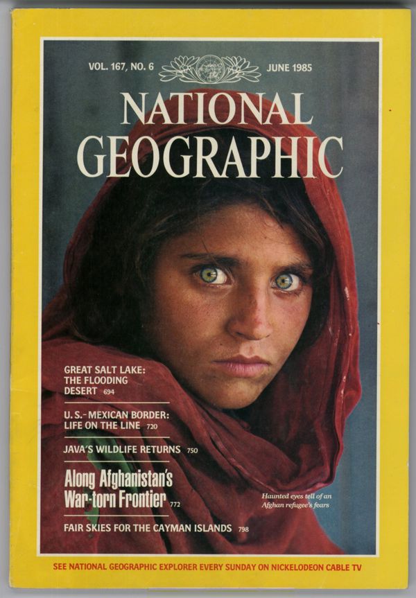
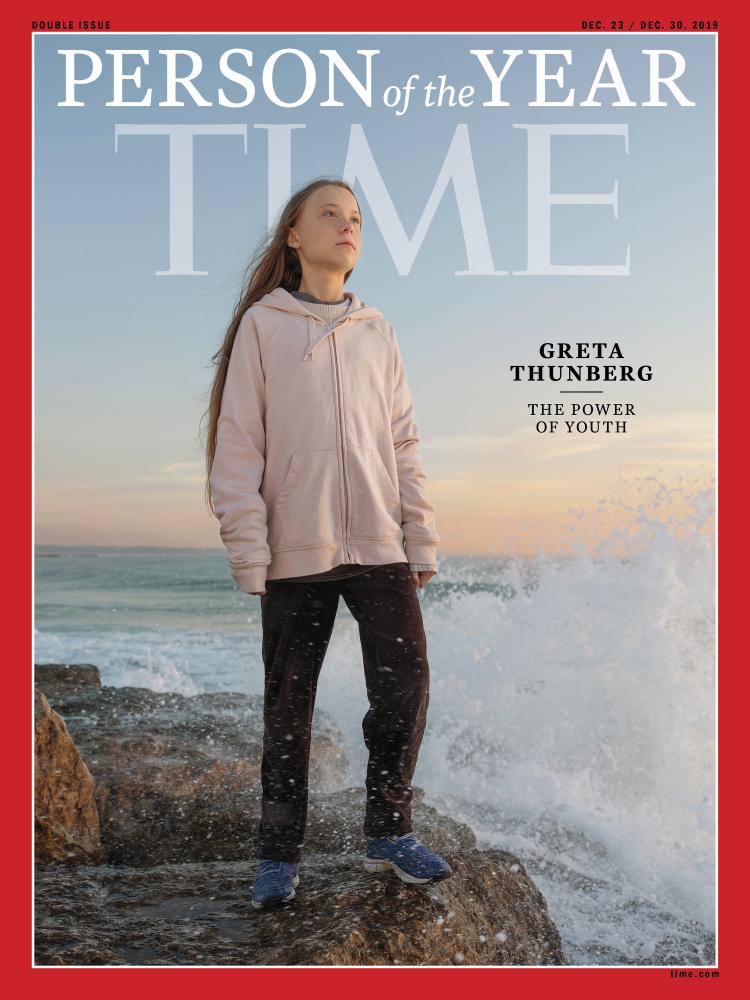
Publications like “Time Magazine” or “National Geographic” use a distinct design element to achieve a coherent look. They use a simple frame to make the covers instantly recognisable. The great thing about this is that there is no need of a consistent picture style.
Fashion magazines on the other hand have a look that is very easy to recognize. Usually they depict a model looking straight into the camera to engage with the costumer. Obviously, “Vogue” is the prime example for fashion magazines. There is some experimentation with their covers. What is interesting is that even if they use unusual techniques like illustration, they still are very recognizable ss fashion magazines.
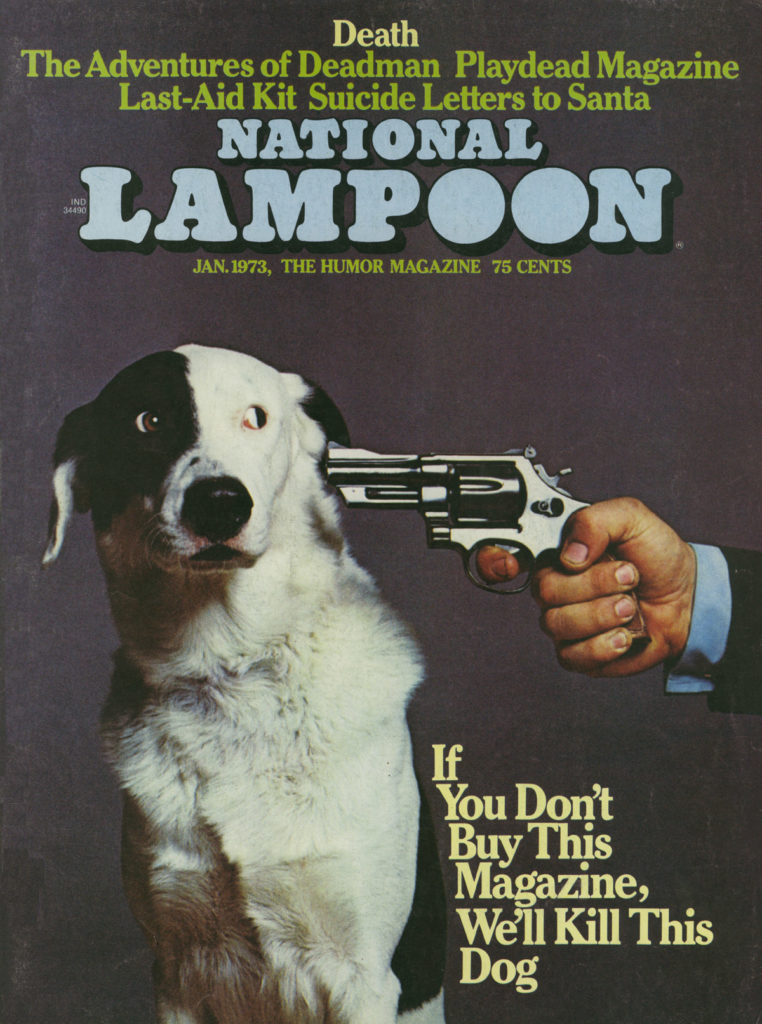
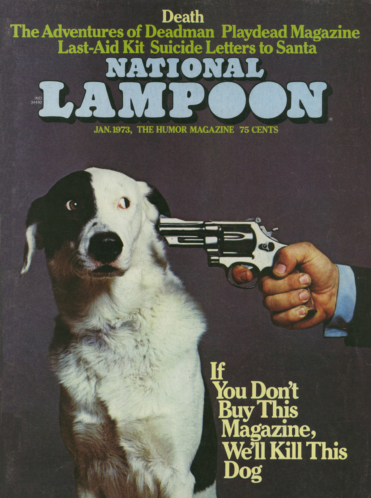
Satirical and critical Magazines often use illustrations to depict the comedic side of news. “The New Yorker” and “Mad” use illustrations since their beginnings. Illustration gives them a playful look and the opportunity to express themselves freely.
Magazine Covers can be as influential and iconic as book covers. They can become symbols and talking points in history. I think the juxtaposition of book and magazine covers could be very interesting and the further exploration could lead to an exciting master theses topic. The biggest problem I see is the sheer amount of references. I think defining the topic more is key.