Interactive Data Visualization: Sankey Diagrams

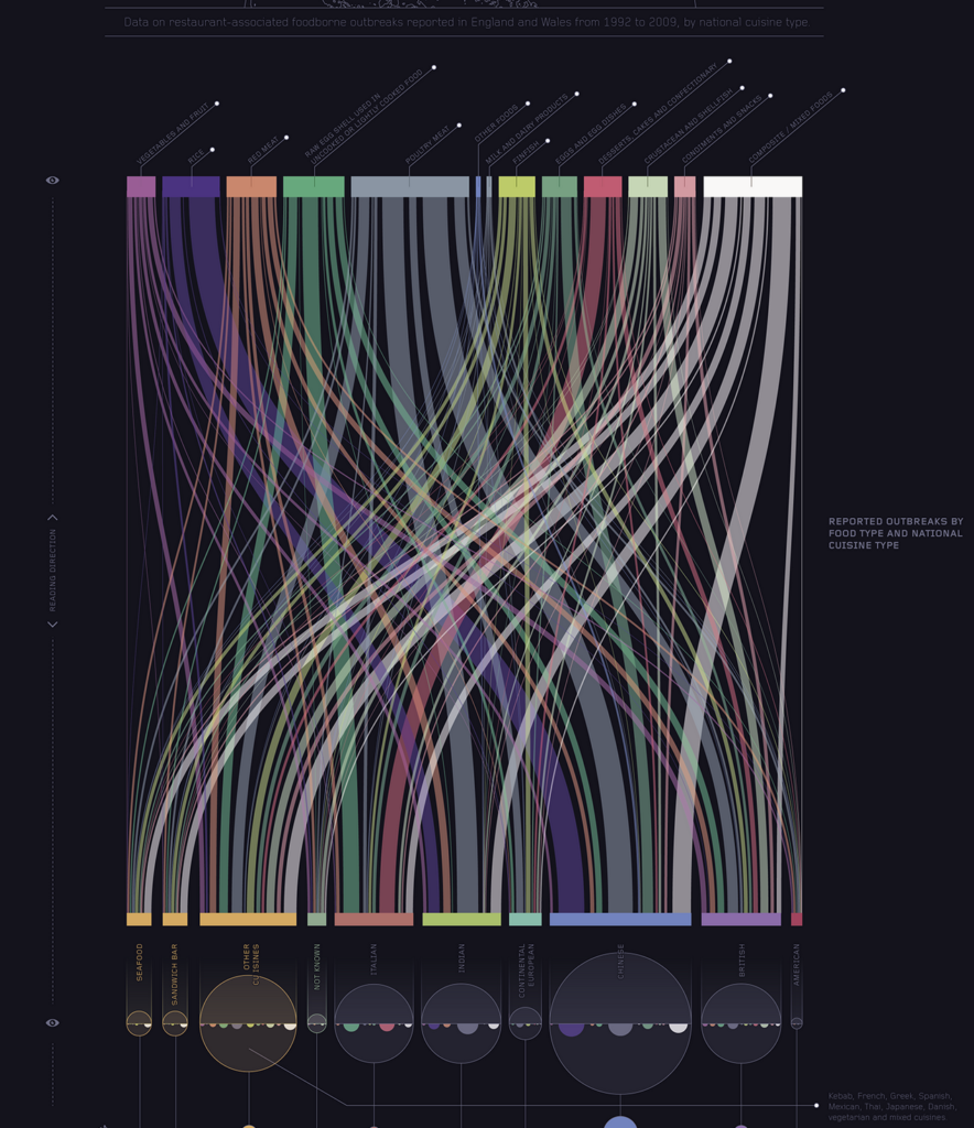
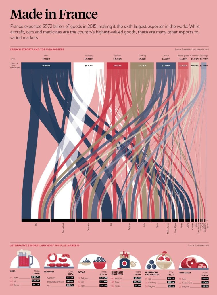
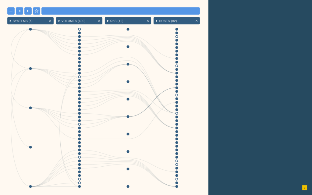
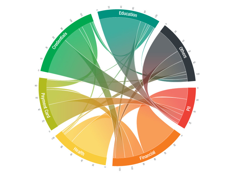
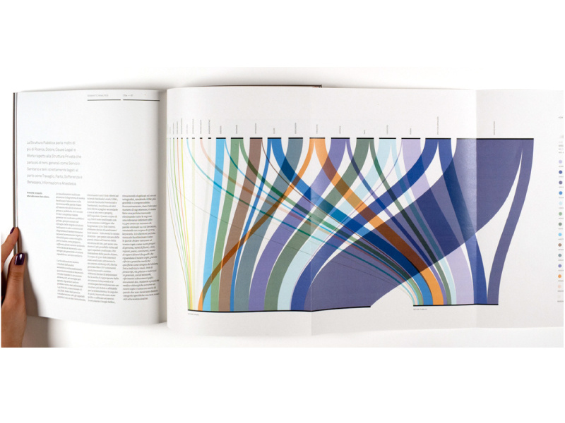
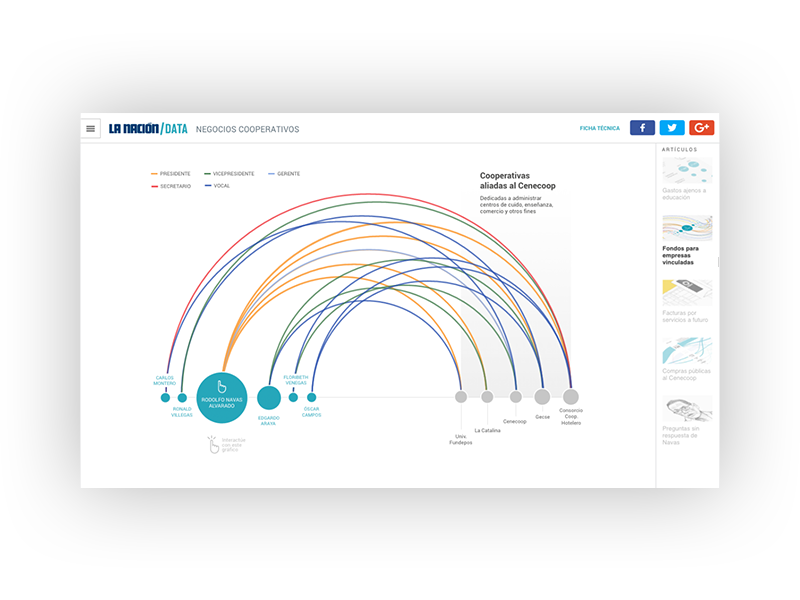
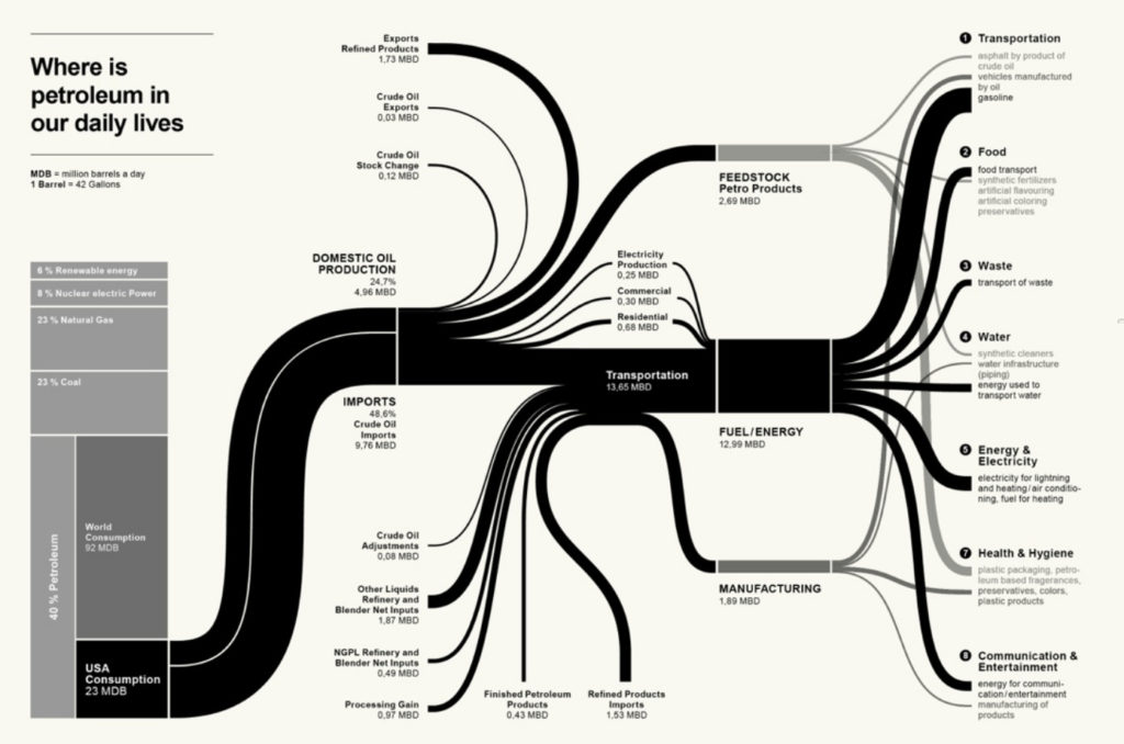
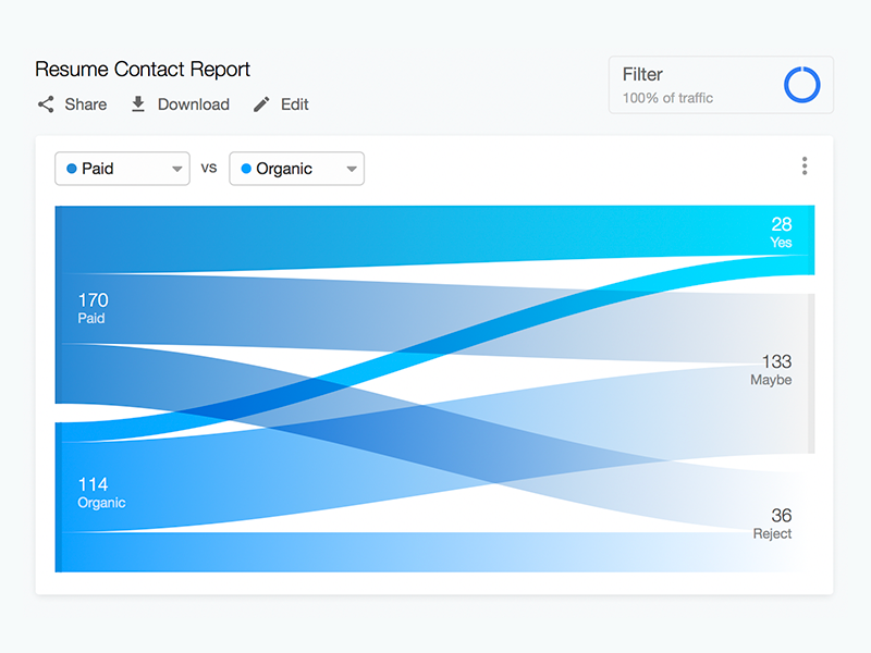
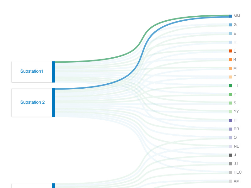
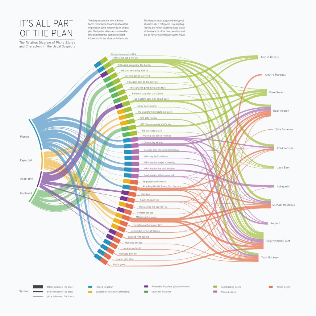
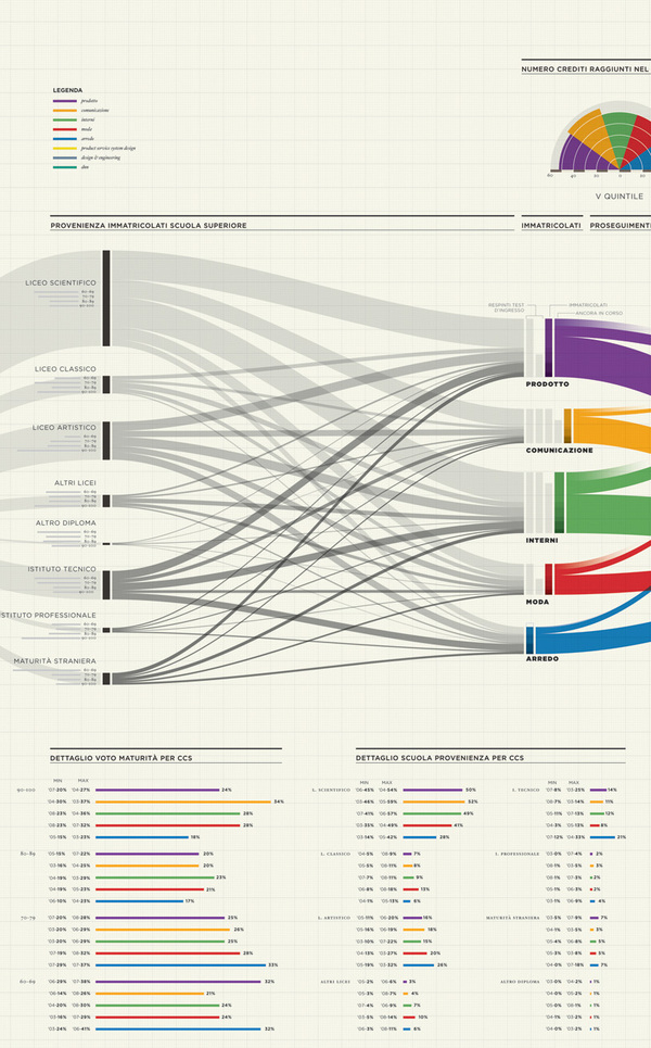
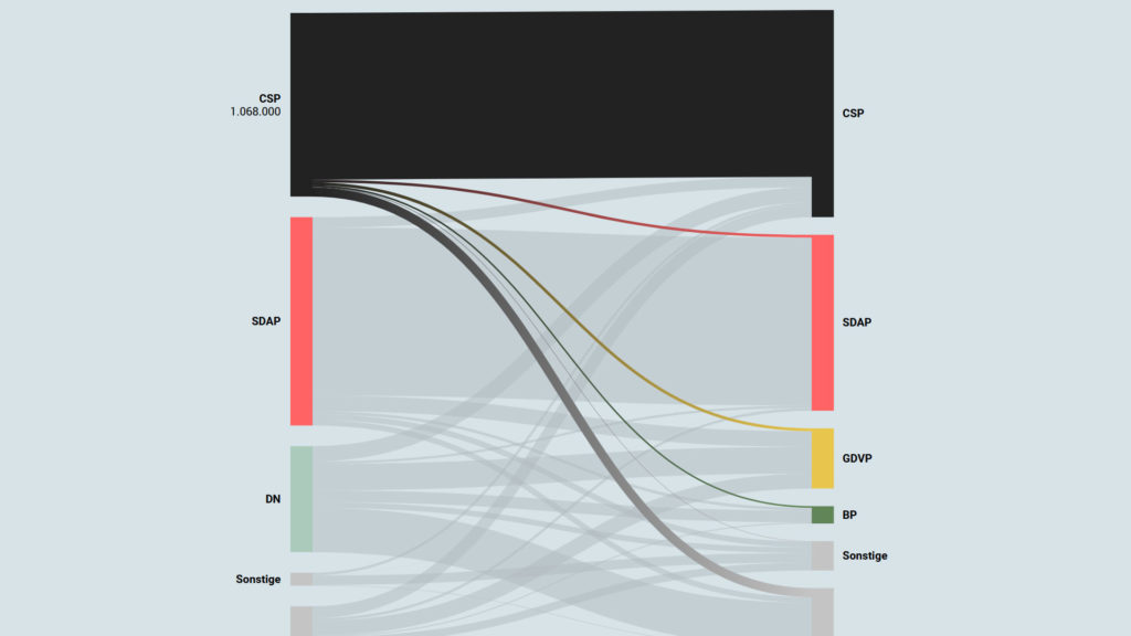
Sankey diagrams are a specific type of flow diagram, in which the width of the arrows is shown proportionally to the flow quantity. They are typically used to visualize energy or material or cost transfers between processes. They can also visualize the energy accounts or material flow accounts on a community level. Sankey diagrams put a visual emphasis on the major transfers or flows within a system. They are helpful in locating dominant contributions to an overall flow.

This kind of diagram is often used for voter transition analysis, so I wanted to explore different examples of sankey diagrams and also I wantred to find out how they are done.

Static examples of Sankey Diagrams:

Interactive Data Visualization: Voter transition analysis

The voter transition analysis allows the user to see how the votes transitioned from one party to another after the elections. The idea is a simple one: if a party gains most votes in those municipalities in which another party had the most votes at the election before, it is interpreted as a vote transition between those parties.

This method is very popular in countrys like Austria and Germany but doesn’t really work in 2-Party systems like the US.

Below you can see some examples of interactive voter transition analysis:

100 Jahre Wählerströme // Der Standard