The voter transition analysis allows the user to see how the votes transitioned from one party to another after the elections. The idea is a simple one: if a party gains most votes in those municipalities in which another party had the most votes at the election before, it is interpreted as a vote transition between those parties.
This method is very popular in countrys like Austria and Germany but doesn’t really work in 2-Party systems like the US.
Below you can see some examples of interactive voter transition analysis:
100 Jahre Wählerströme // Der Standard
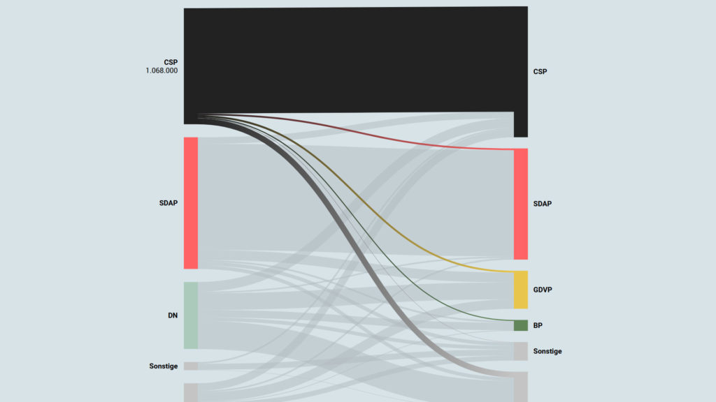
This tool from the austrian newspaper “Der Standard” allows the user to see the voter transitions from all the elections in the last 100 years. The information is displayed in a sankey diagram.
Wählerstromanalyse // Kurier
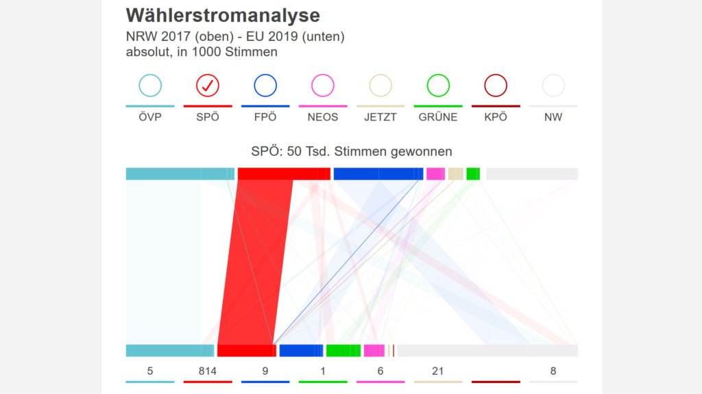
In this analysis from the austrian Newspaper “Kurier” they also use a sankey diagram rotated by 90 degrees. Overall this display has a very static feeling.
Wählerströme 2015 // drawingdata.net
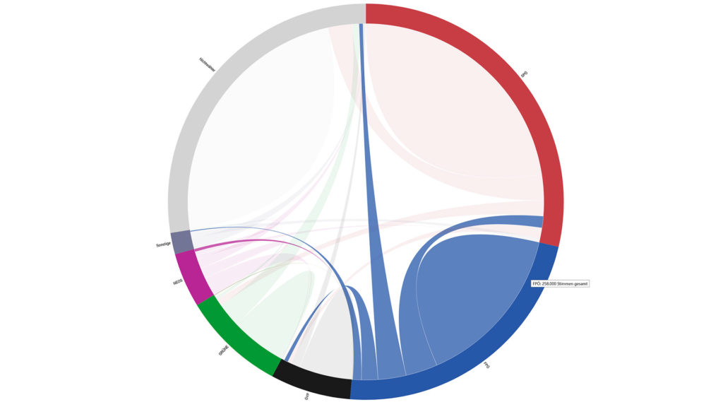
This is a different representation of the same data. For this vizualization a chord diagram is used.
Online Sources:
https://wahlen.strategieanalysen.at/stmk2019/wsa.php
https://www.drawingdata.net/eu2019_wsa/
https://observablehq.com/@joshrayman/eu-parliament-mep-sankey