Interactive Data Visualization: Voter transition analysis

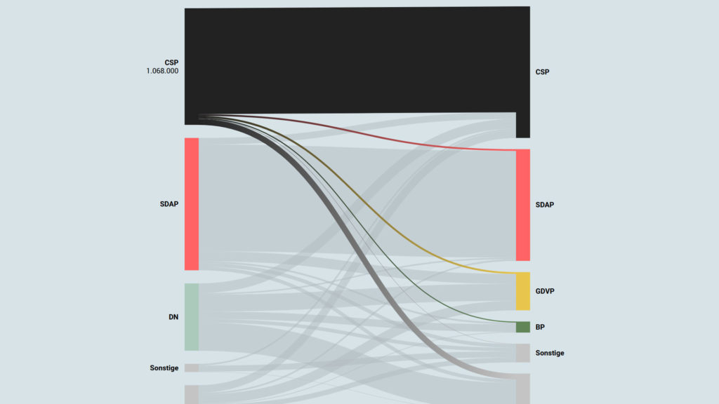
The voter transition analysis allows the user to see how the votes transitioned from one party to another after the elections. The idea is a simple one: if a party gains most votes in those municipalities in which another party had the most votes at the election before, it is interpreted as a vote transition between those parties.

This method is very popular in countrys like Austria and Germany but doesn’t really work in 2-Party systems like the US.

Below you can see some examples of interactive voter transition analysis:

100 Jahre Wählerströme // Der Standard

Interactive Data Visualization: Definition and Best Practice

Data can be very powerful. If you can actually understand what it’s telling you, that is. It’s not easy to get clear takeaways by looking at some numbers and stats. You’ve got to have the data presented in a logical, easy-to-understand way.

With data visualization the human brain processes visual information better than it processes text – so by using charts, graphs, and design elements, data visualization can help you explain information much more easily.