Data can be very powerful. If you can actually understand what it’s telling you, that is. It’s not easy to get clear takeaways by looking at some numbers and stats. You’ve got to have the data presented in a logical, easy-to-understand way.
With data visualization the human brain processes visual information better than it processes text – so by using charts, graphs, and design elements, data visualization can help you explain information much more easily.
Best Practice:
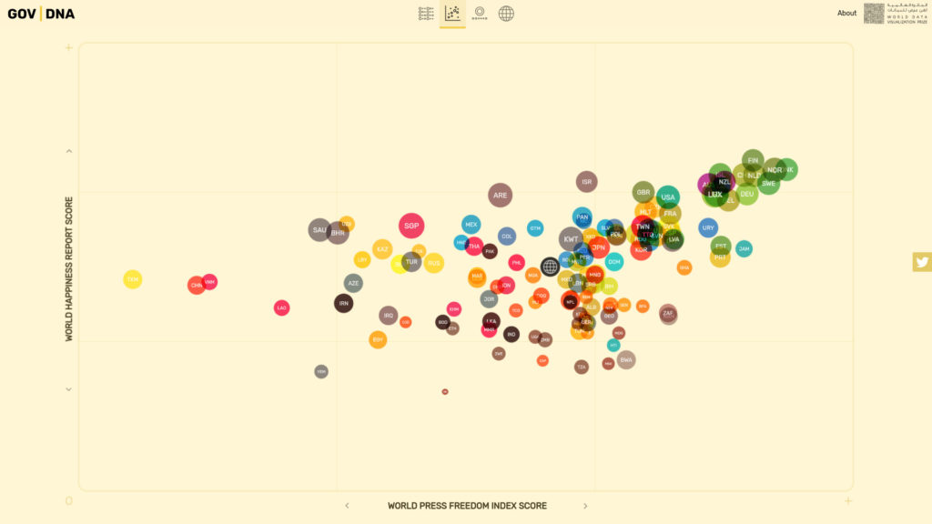
This beautiful interactive graphic shows the “DNA” of good government. You can compare multiple indicators to investigate their influence on countries, and share your findings with others.
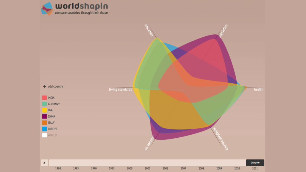
worldshapin helps to study the interdependence of Health, Carbon footprint, Workplace equality, Living standard, Population and Education across the world through the last three decades. It also compares countries with the world, continents and other countries on the mentioned indicators, helping to understand how these factors accelerate or decelerate a country and the world in accordance with the time.
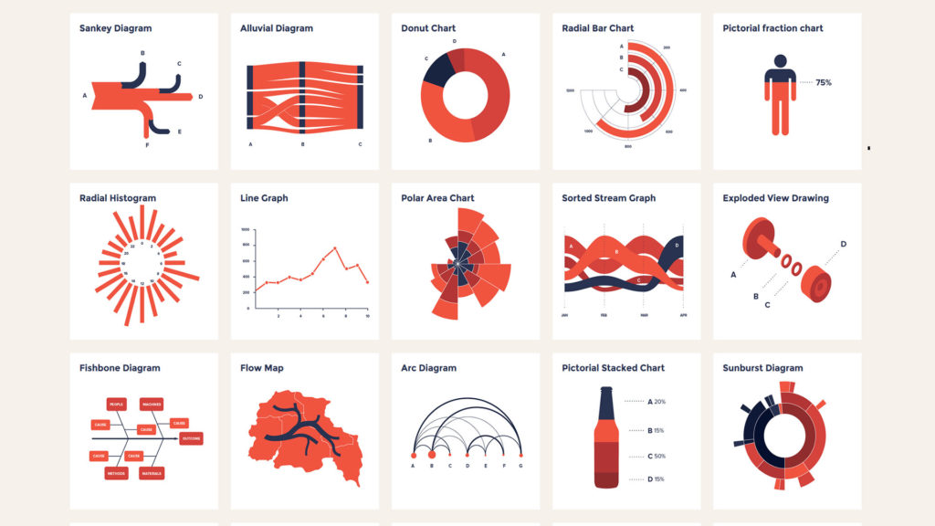
The datavizproject is a toolbox trying to present all relevant data visualizations types, so you can find the right visualization and get inspired how to make them.
Online sources:
https://uxdesign.cc/tagged/data-visualization
https://www.interaction-design.org/literature/article/how-to-design-an-information-visualization