Interactive Data Visualization: Javascript Data Visualization Libraries

We live in an era of data explosion, where nearly every application/website uses data to improve the experience delivered to the users.

Sometimes, the best feature is the data itself. However, table and number charts are often hard to read and it can be hard to draw insights from large data tables.

Instead different data visualization methods can be used that simulate the brain’s ability to process data in a visual way.

In my research I found different Javascript Libraries that could help to make data interactive.
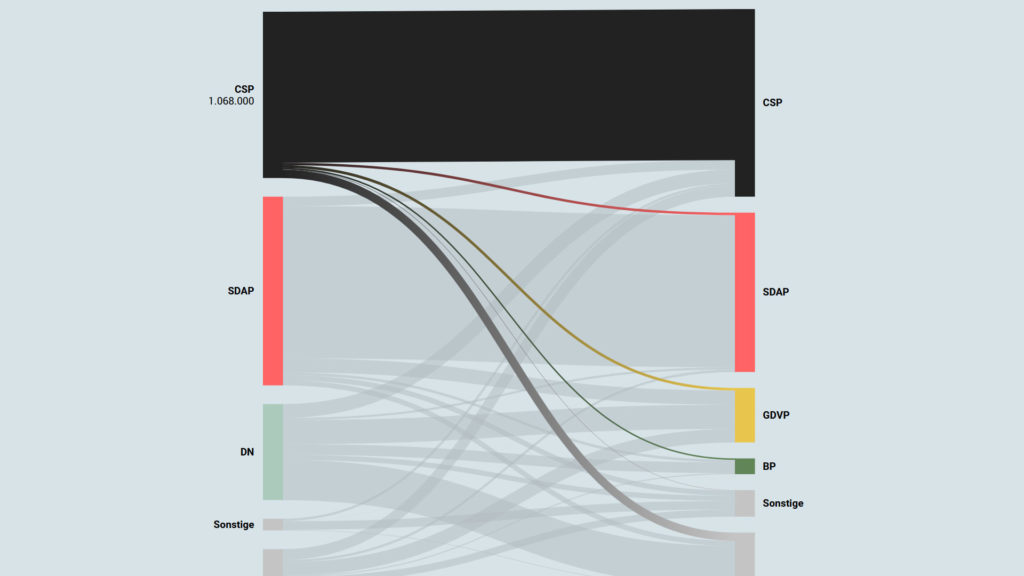
Interactive Data Visualization: Voter transition analysis

The voter transition analysis allows the user to see how the votes transitioned from one party to another after the elections. The idea is a simple one: if a party gains most votes in those municipalities in which another party had the most votes at the election before, it is interpreted as a vote transition between those parties.

This method is very popular in countrys like Austria and Germany but doesn’t really work in 2-Party systems like the US.

Below you can see some examples of interactive voter transition analysis:

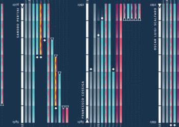
100 Jahre Wählerströme // Der Standard

Interactive Data Visualization: Election results

Interactive visualizations and information graphics are becoming an inseparable part of modern print media as well as digital media, such as newspapers, magazines, online news websites, blogs, discussion forums and social media. The primary reason behind widespread acceptance of visualization techniques is their ability to represent large amount of complex data as a storyline.

When it comes to elections, beyond just good traditional journalism, readers have also come to expect good visual reporting.

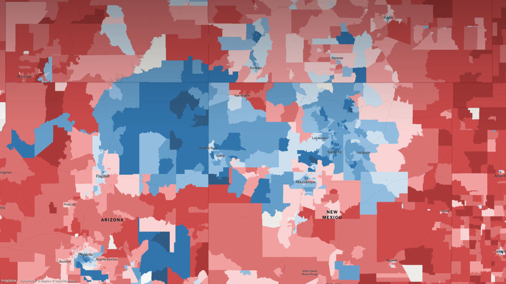
An extremely detailed map of the 2016 elections

Interactive Data Visualization: Definition and Best Practice

Data can be very powerful. If you can actually understand what it’s telling you, that is. It’s not easy to get clear takeaways by looking at some numbers and stats. You’ve got to have the data presented in a logical, easy-to-understand way.

With data visualization the human brain processes visual information better than it processes text – so by using charts, graphs, and design elements, data visualization can help you explain information much more easily.