Interactive visualizations and information graphics are becoming an inseparable part of modern print media as well as digital media, such as newspapers, magazines, online news websites, blogs, discussion forums and social media. The primary reason behind widespread acceptance of visualization techniques is their ability to represent large amount of complex data as a storyline.
When it comes to elections, beyond just good traditional journalism, readers have also come to expect good visual reporting.
An extremely detailed map of the 2016 elections
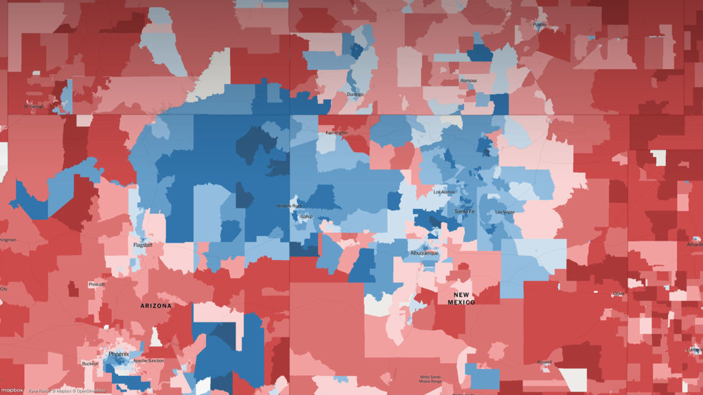
This map by the New York Times allows the user to explore the results of every district in the 2016 presidential elections. Below you can find some nice examples.
How Britain Voted
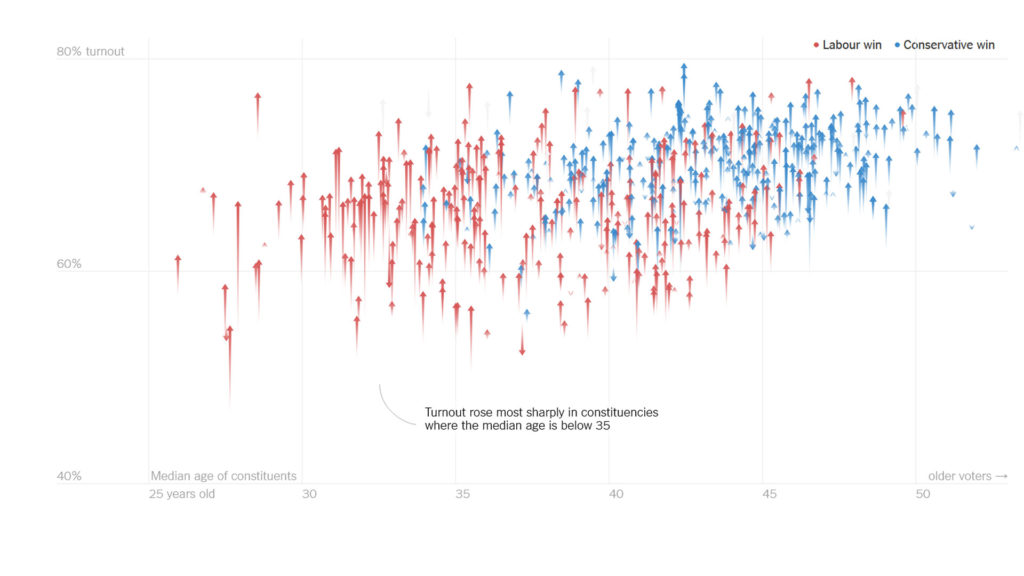
This is another election special by the New York Times, with a lot of very interesting interactive modules.
UK Poll Tracker
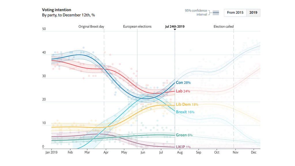
This is a nice general election poll tracker from the Economist in the UK. It’s very easy to see who is winning the race for 10 Downing Street.
General election results
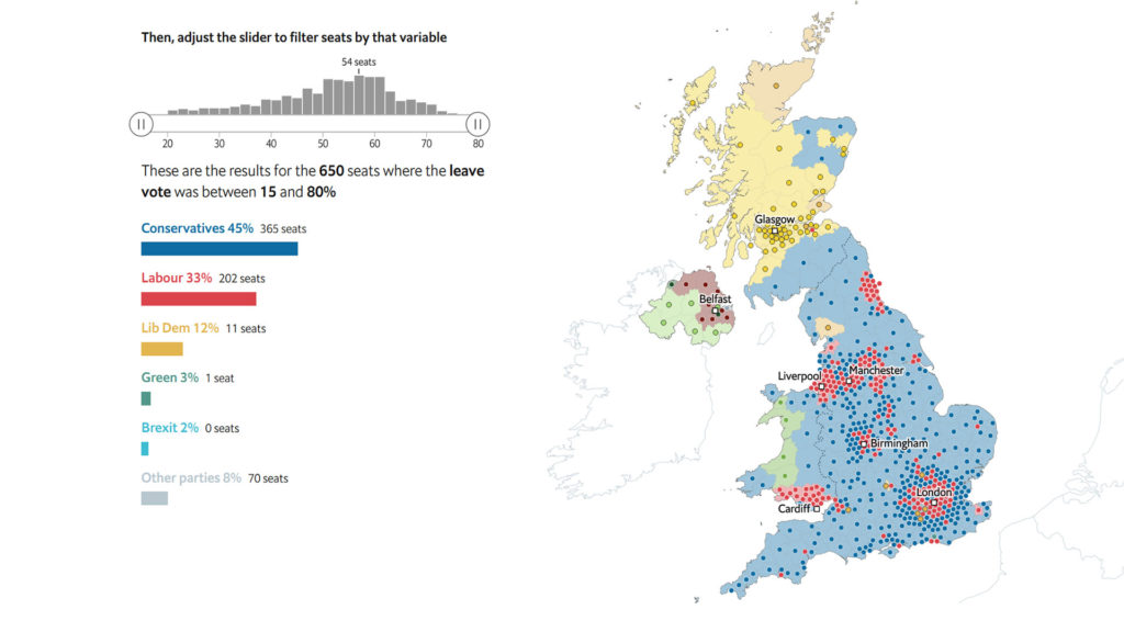
With this interactive tool you can explore the final results of the general election.
Online sources:
https://flourish.studio/2019/04/15/report-on-elections-with-flourish/