Online Journalism
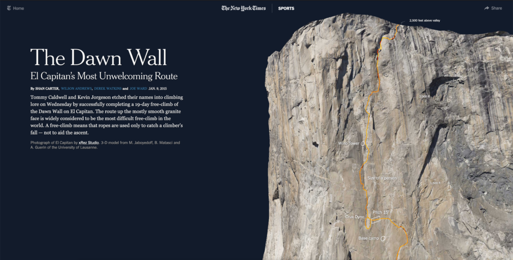
Beispiel 1: The Dawn Wall
Communication, Media, Sound and Interaction Design 2019

Online Journalism
Beispiel 1: The Dawn Wall
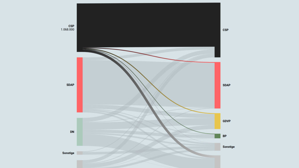
The voter transition analysis allows the user to see how the votes transitioned from one party to another after the elections. The idea is a simple one: if a party gains most votes in those municipalities in which another party had the most votes at the election before, it is interpreted as a vote transition between those parties.
This method is very popular in countrys like Austria and Germany but doesn’t really work in 2-Party systems like the US.
Below you can see some examples of interactive voter transition analysis:
Infografiken findet man heutzutage überall. Die geläufigste Definition der Infografik beschreibt diese einfach als visuelle Repräsentation von Informationen und Daten. Durch die Kombination von Text, Bilder, Diagrammen und auch Videos, ermöglichen Infografiken ein effektive Darstellung von Daten. Wann ist eine Infografik gut und welche Anwendungsbereiche gibt es?
Interactive visualizations and information graphics are becoming an inseparable part of modern print media as well as digital media, such as newspapers, magazines, online news websites, blogs, discussion forums and social media. The primary reason behind widespread acceptance of visualization techniques is their ability to represent large amount of complex data as a storyline.
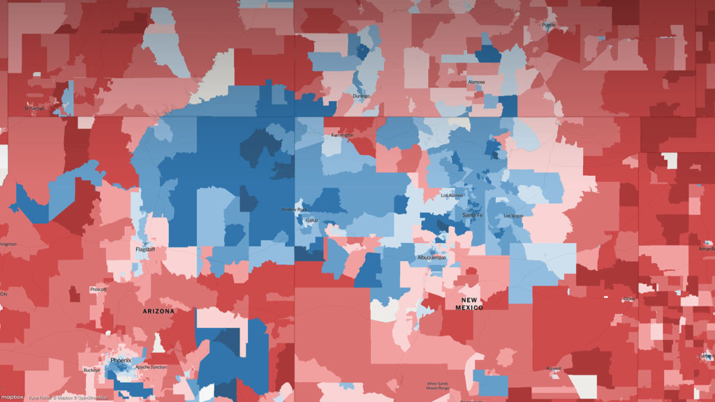
When it comes to elections, beyond just good traditional journalism, readers have also come to expect good visual reporting.

Oftmals sind Infografiken eine Aufbereitung von Daten und Zahlenmaterial, auch besser bekannt als “Chart” bzw. Diagramme. Wenn eine entsprechende Datenbasis in digitaler Form vorliegt lassen sich daraus sehr einfach interaktive bzw. dynamische Infografiken erstellen. Sie erklären komplexe Zusammenhänge auf einen Blick und bringen Informationen schnell auf den Punkt. Der gestalterische Aspekt spielt dabei eine tragende Rolle. Gute Infografiken sollte sowohl informativ als auch unterhaltsam aufbereitet sein. Insbesondere interaktiver Content, also Inhalte, der den User zum Mitmachen motiviert, werden immer bedeutsamer.