Um sich den Bedürfnissen von sehbeeinträchtigten Menschen zu nähern, ist es wichtig zu verstehen, welche Sinneskanäle am Meisten beansprucht werden. Dazu gehören das Hören und Fühlen, auch beim Bedienen von Apps.
Category: Interaction Design
Pingboard – Who’s Who
Die mobile Applikation “Who’s Who” von Pingboard stellt für neue Mitarbeiter eine lustige, interaktive Möglichkeit dar, Kollegen und andere Mitarbeiter bereits im Vorfeld etwas besser kennenzulernen. Durch das Spielen eines einfachen Flashkarten-Matching-Spiels lernen sie, wer was in ihrer Organisation macht. Sie können ihr Wissen beim Abgleich von Gesichtern und Namen unter Beweis stellen, lernen Positionen, Amtszeiten, Fähigkeiten, Interessen, Standorte und mehr über ihre jeweiligen Kollegen in ihrem Team besser kennen und erhalten im Zuge dessen Punkte. Die integrierte Highscore-Liste soll zudem noch mehr die Motivation und den Ehrgeiz anregen.
Human Factors influencing the VR environment
My first blogpost was called „Designing for VR“ – but currently I’m not sure if Virtual Reality is the right term but rather Mixed Reality.. To be honest I’m not sure yet but hopefully I’ll find out in my further research.
Proper exercise form-correcting wearable
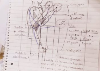
My starting point for my research was to find a problematic subject and try to come up with a design solution for it. Before going outwards, I looked inwards to my self. My often frustration with executing gym exercises (weight lifting) with proper technique while minimizing the risk of injury surfaced. As I am relatively new to the gym culture, I thought that a possible design solution to this problem will not only benefit other people who face the same frustrations, but also myself. So I was found in a very optimistic position, because I could use myself as the target user, among others, to begin researching about this design solution. My first aim of research was to understand the bio mechanics of weight lifting.
How the muscle works ( in weight lifting)
When we are performing a movement that requires our muscles to contract and stretch, as we expose them to stress, they experience microscopic damage. The injured cells release inflammatory molecules called cytokines, that activate the immune system to repair the injury. This is when the muscle-building happens. The bigger the damage to the muscle tissue, the more the body will need to repair itself. The cycle of damage and repair, eventually makes the muscles bigger and stronger, as they adapt to progressively greater demands.
Paying attention to our form in strength training, meaning joint alignment, range of motion and tension are extremely important to achieve the desired strength and muscle hypertrophy goals, while avoiding any potential injury.
Regardless of what is the goal of exercise, proper form and technique is key to progressing in weight lifting, otherwise increasing intensity of a workout while losing proper form can lead to injury and lessen the effect on the targeted muscle.
Idea:
Create a wearable device that monitors and corrects all the parameters of weight lifting in real time as the exercises are executed. A possible wearable that monitors the relative position of joints and posture of the body while executing an exercise and communicating with vibrations to adjust the posture/form of the exercise.
Analyzing gym trainees.
The main types of people who do weight lifting are:
People who train without any education on form and proper execution.
People who train on their own but research about techniques and form.
People who train using an online coach and have more access to educational content and supervision
People who train assisted by a personal trainer and have direct supervision over execution form.
People who have assistance of a personal trainer while they perform their lifting routine, do not apply as potential users of such device.
Examples of doodles
Here are some examples of how doodles can be used in multiple ways in design.
Interactive Data Visualization: Sankey Diagrams
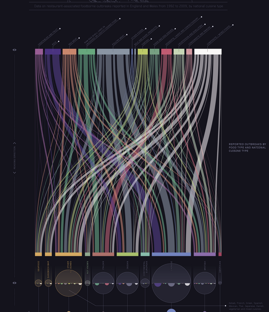
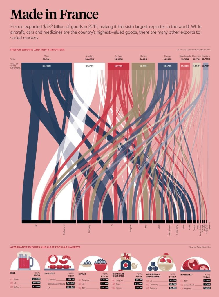
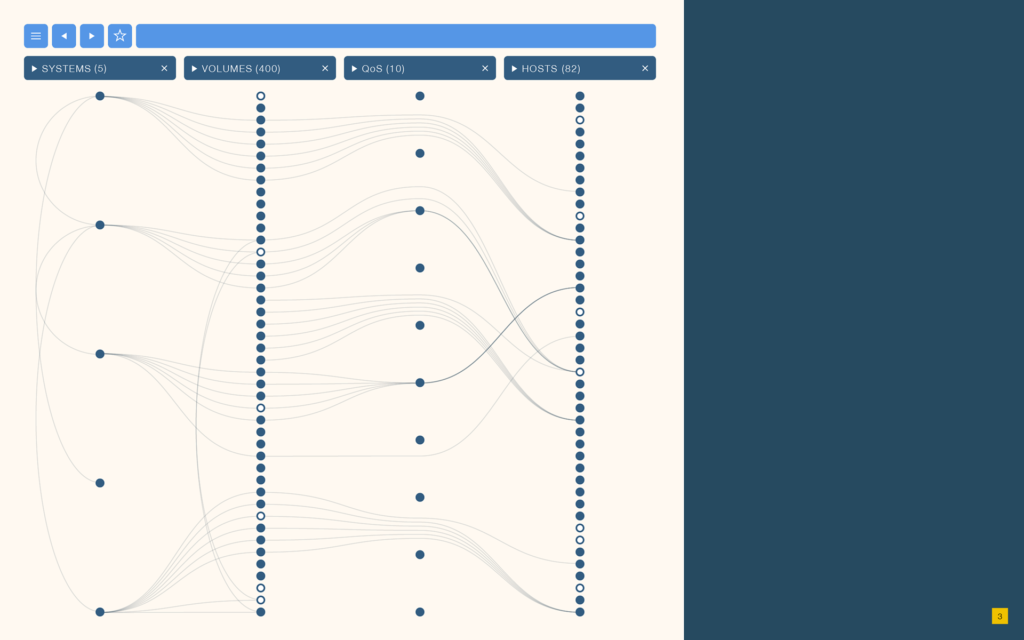
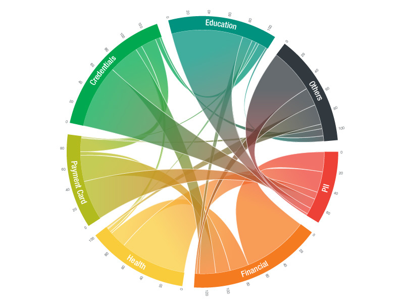
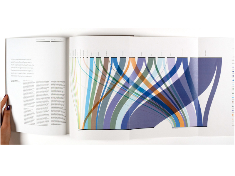
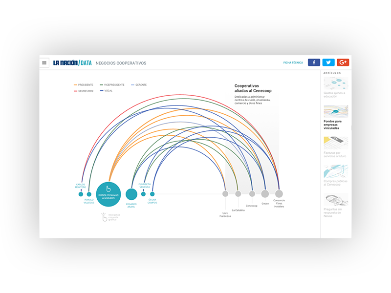
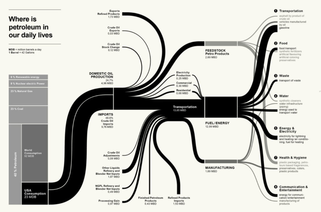
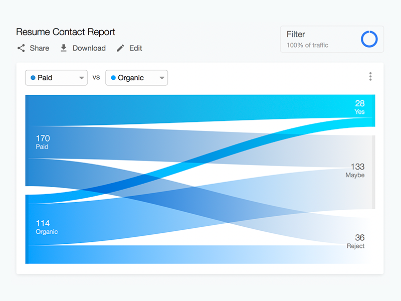
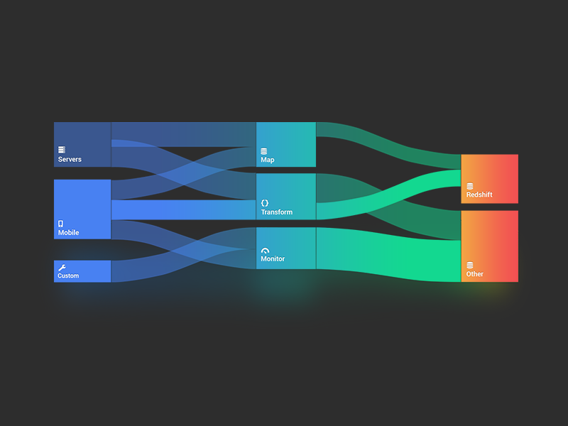
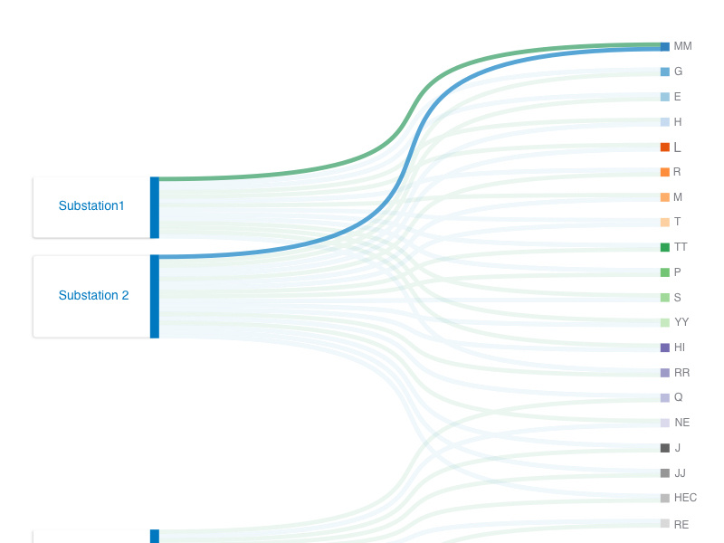
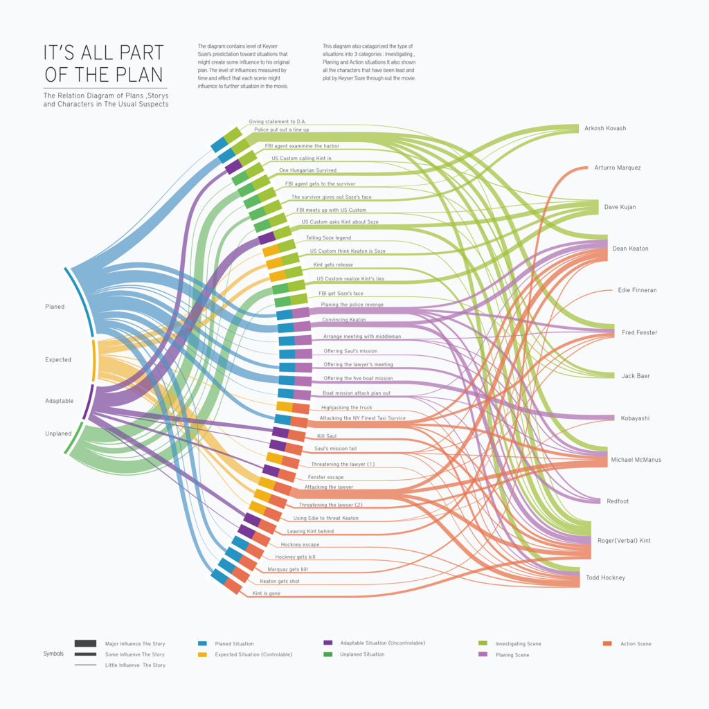
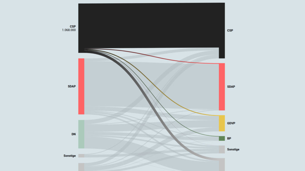
Sankey diagrams are a specific type of flow diagram, in which the width of the arrows is shown proportionally to the flow quantity. They are typically used to visualize energy or material or cost transfers between processes. They can also visualize the energy accounts or material flow accounts on a community level. Sankey diagrams put a visual emphasis on the major transfers or flows within a system. They are helpful in locating dominant contributions to an overall flow.
This kind of diagram is often used for voter transition analysis, so I wanted to explore different examples of sankey diagrams and also I wantred to find out how they are done.
Static examples of Sankey Diagrams:
Glossary
As is the case with any science, it is important to define the main terms in order to create an equal basis for discussion. For this purpose, a list of important terms for my research is given below. The definitions are taken from “The Handbook of Multimodal-Multisensor Interfaces” by Cohen and from the scientific paper by Karpov and Yusupov “Multimodal Interfaces of Human-Computer Interaction”.
Mitarbeiter Onboarding Plattform von Talmundo
Neben den bereits erwähnten Apps „Appical“ von Raven51 sowie “Push to know you” von Randstad sorgt auch die Software von Talmundo für einen reibungslosen Onboarding-Prozess der Mitarbeiter.
Zu ihren Kunden zählen große Unternehmen wie beispielsweise KPMG, Bacardi, Deloitte, Lidl, Lufthansa und viele mehr.
Interactive Data Visualization: Voter transition analysis
The voter transition analysis allows the user to see how the votes transitioned from one party to another after the elections. The idea is a simple one: if a party gains most votes in those municipalities in which another party had the most votes at the election before, it is interpreted as a vote transition between those parties.
This method is very popular in countrys like Austria and Germany but doesn’t really work in 2-Party systems like the US.
Below you can see some examples of interactive voter transition analysis:
100 Jahre Wählerströme // Der Standard
Why multimodal multisensory interfaces?
During my research I read some excerpts from the book “The Handbook of Multimodal-Multisensor Interfaces” to understand the basic principles of multimodal interface design and to familiarize myself with the vocabulary. The book was published in 2017 and deals intensively with various aspects of interface design and conception based on neuroscientific and psychological research. In my blog entries I would like to excerpt some passages and take a closer look at them.
