Interactive Data Visualization: Javascript Data Visualization Libraries

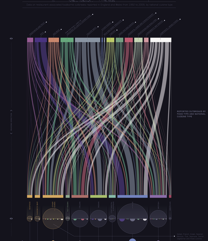
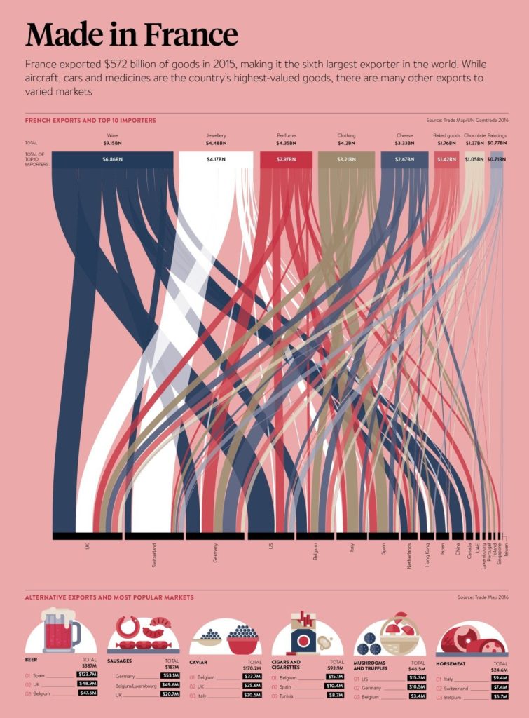
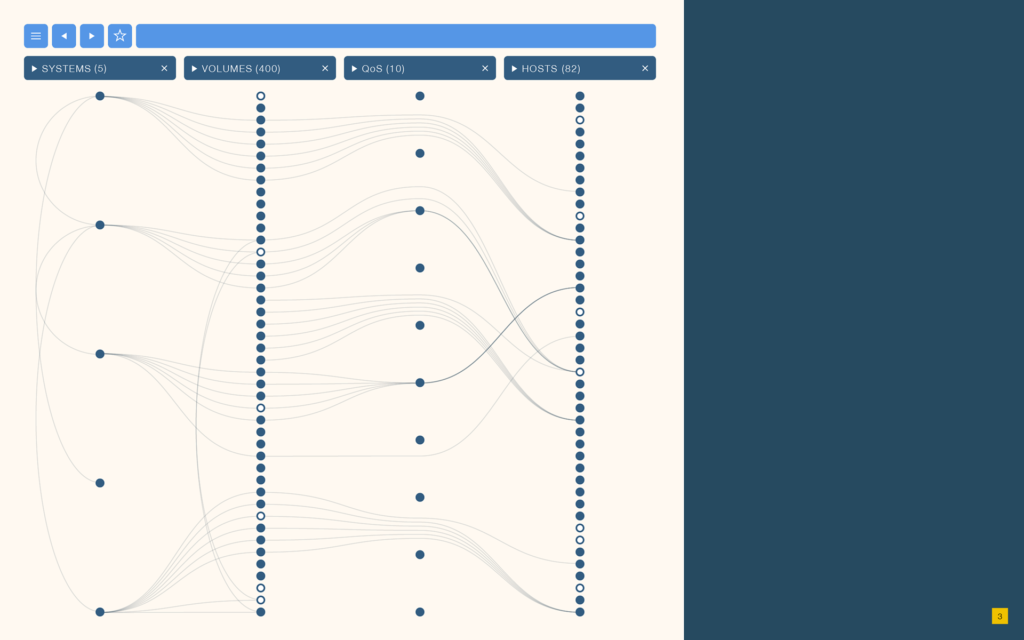
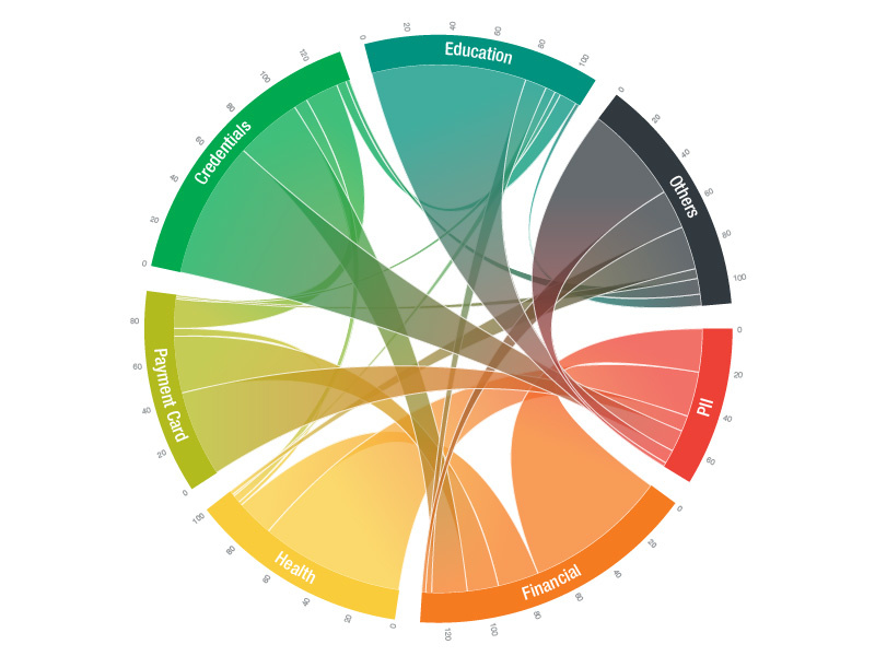
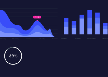
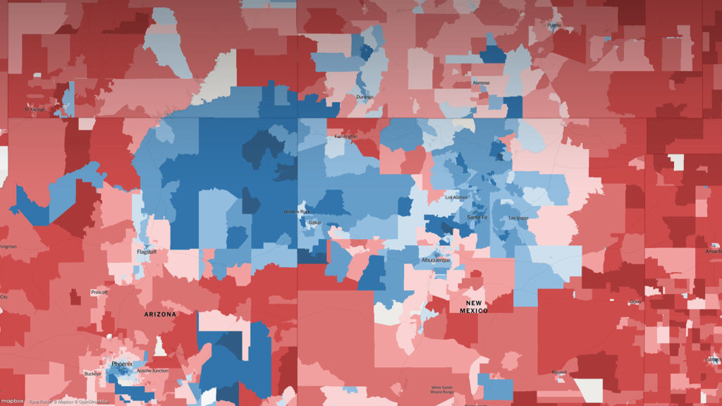
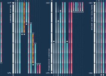
We live in an era of data explosion, where nearly every application/website uses data to improve the experience delivered to the users.

Sometimes, the best feature is the data itself. However, table and number charts are often hard to read and it can be hard to draw insights from large data tables.

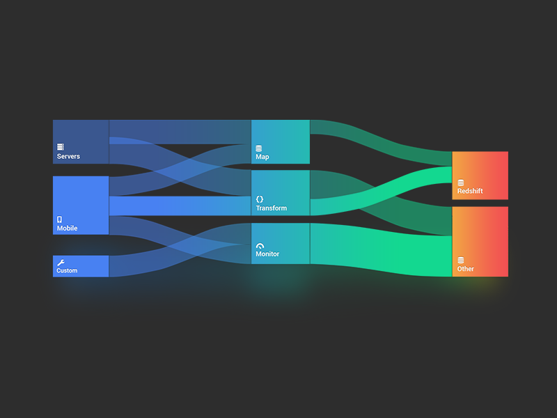
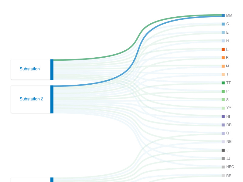
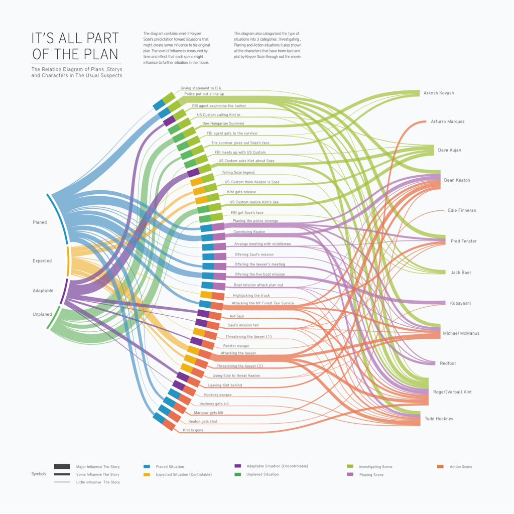
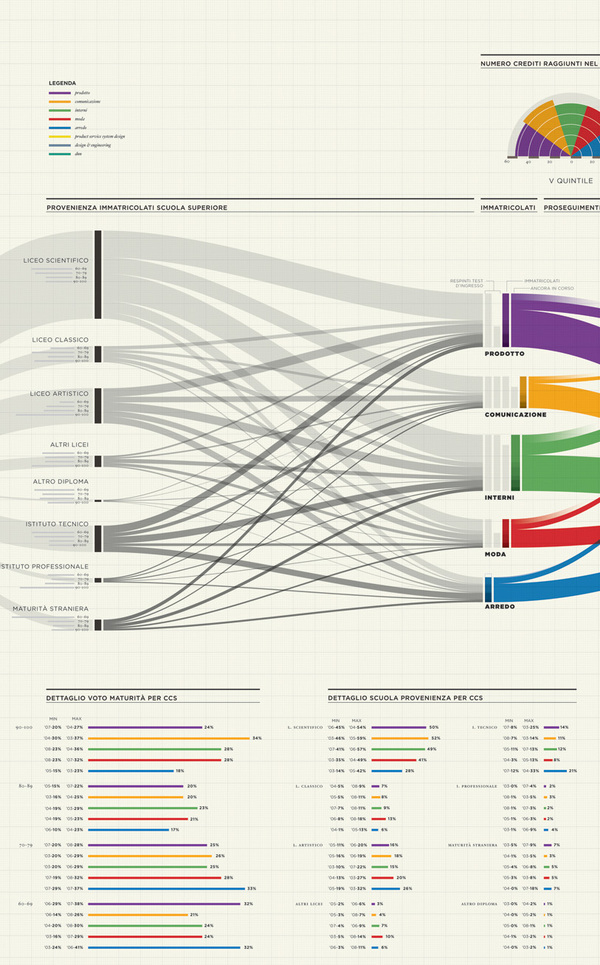
Instead different data visualization methods can be used that simulate the brain’s ability to process data in a visual way.

In my research I found different Javascript Libraries that could help to make data interactive.

Interactive Data Visualization: Sankey Diagrams

Sankey diagrams are a specific type of flow diagram, in which the width of the arrows is shown proportionally to the flow quantity. They are typically used to visualize energy or material or cost transfers between processes. They can also visualize the energy accounts or material flow accounts on a community level. Sankey diagrams put a visual emphasis on the major transfers or flows within a system. They are helpful in locating dominant contributions to an overall flow.

This kind of diagram is often used for voter transition analysis, so I wanted to explore different examples of sankey diagrams and also I wantred to find out how they are done.

Static examples of Sankey Diagrams:

Interaktive Infografiken: Definition und Anwendung – Benefits von Infografiken

Infografiken findet man heutzutage überall. Die geläufigste Definition der Infografik beschreibt diese einfach als visuelle Repräsentation von Informationen und Daten. Durch die Kombination von Text, Bilder, Diagrammen und auch Videos, ermöglichen Infografiken ein effektive Darstellung von Daten. Wann ist eine Infografik gut und welche Anwendungsbereiche gibt es?

Interactive Data Visualization: Election results

Interactive visualizations and information graphics are becoming an inseparable part of modern print media as well as digital media, such as newspapers, magazines, online news websites, blogs, discussion forums and social media. The primary reason behind widespread acceptance of visualization techniques is their ability to represent large amount of complex data as a storyline.

When it comes to elections, beyond just good traditional journalism, readers have also come to expect good visual reporting.

An extremely detailed map of the 2016 elections

Interactive Data Visualization: Definition and Best Practice

Data can be very powerful. If you can actually understand what it’s telling you, that is. It’s not easy to get clear takeaways by looking at some numbers and stats. You’ve got to have the data presented in a logical, easy-to-understand way.

With data visualization the human brain processes visual information better than it processes text – so by using charts, graphs, and design elements, data visualization can help you explain information much more easily.

Interaktive Infografiken – Vom klassischen Informationsdesign zu lebendigen Infografiken

Oftmals sind Infografiken eine Aufbereitung von Daten und Zahlenmaterial, auch besser bekannt als “Chart” bzw. Diagramme. Wenn eine entsprechende Datenbasis in digitaler Form vorliegt lassen sich daraus sehr einfach interaktive bzw. dynamische Infografiken erstellen. Sie erklären komplexe Zusammenhänge auf einen Blick und bringen Informationen schnell auf den Punkt. Der gestalterische Aspekt spielt dabei eine tragende Rolle. Gute Infografiken sollte sowohl informativ als auch unterhaltsam aufbereitet sein. Insbesondere interaktiver Content, also Inhalte, der den User zum Mitmachen motiviert, werden immer bedeutsamer.