LECTURE #3: ASTRID KURY „WHY COLLABORATE?”

Astrid Cury is the director and culturologist at the „Akademie Graz“. She told how important cooperation is and why creative people, especially designers, artists, etc. should cooperate as much as possible.

She also talked about the „Akademie Graz“. This is a creative association founded in 1987 by Emil Breisach and it is focused on the implementation of creative projects, art and the organization of exhibitions.

She says collaboration has many benefits:

  • unique ideas
  • perfect equation of form and content
  • increases social relevance and impact
  • includes work on democracy
  • to promote social cohesion and enable equal access

But in the beginning, the collaborative process is always very complicated. People should find a way of interaction that is comfortable for them and develop a clear structure so that it is easier for everyone to work.

Today it’s quite difficult to manage a project alone, in any area we need to interact with other people. And the more intense the exchange of experience, the faster and easier it is to find new solutions and ideas. Astrid shows how different approaches and views on a particular topic affect the result and how to use this to see a more complete picture. This is exactly what I like about this approach. Many projects simply cannot be implemented alone.

I also like the way they care about people who have had a disaster in life and offer to feel stronger and prove themselves as professionals in a creative environment. She also talked about “inclusion”, which means full integration of people with disabilities into society. Inclusion is a vision of a society without barriers to the diversity of people.

La casa Carlota & Friends is a design studio in Barcelona, where people with Down syndrome or autism fully embody their creative ideas. They create collages, paintings, hand-drawn typography for their customers. It really is an amazing place, and they work really creative and unique, made with sincerity and soul.

Physical Interfaces in the Electronic Arts Interaction Theory and Interfacing Techniques for Real-time Performance

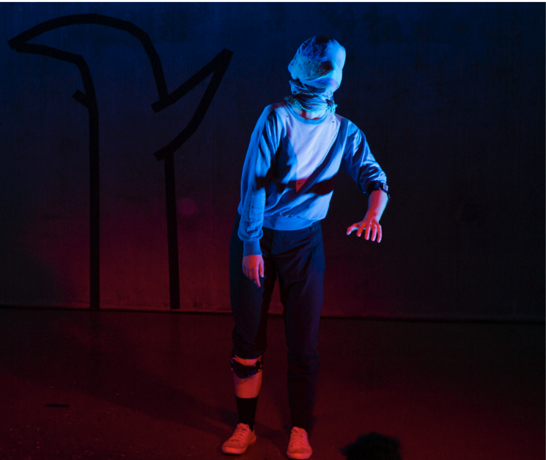
For a new blog entry, we had to read a paper about the topic mentioned above by Bert Bongers. The paper describes aspects of physical interfaces in the electronic arts. It’s splits into two parts where one of them is describing the interactions that can take place in electronic arts through a Human Factors point of view and the other one is more practical explaining more details about sensory technologies and categories to make physical interaction possible.

Interactive Data Visualization: Javascript Data Visualization Libraries

We live in an era of data explosion, where nearly every application/website uses data to improve the experience delivered to the users.

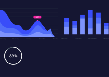
Sometimes, the best feature is the data itself. However, table and number charts are often hard to read and it can be hard to draw insights from large data tables.

Instead different data visualization methods can be used that simulate the brain’s ability to process data in a visual way.

In my research I found different Javascript Libraries that could help to make data interactive.

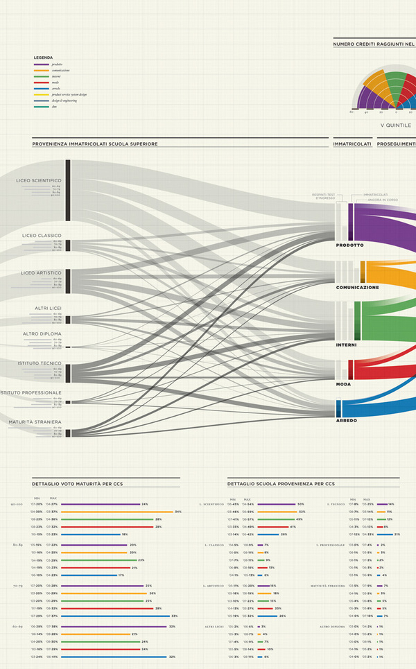
Interactive Data Visualization: Sankey Diagrams

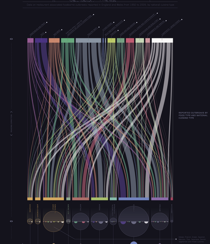
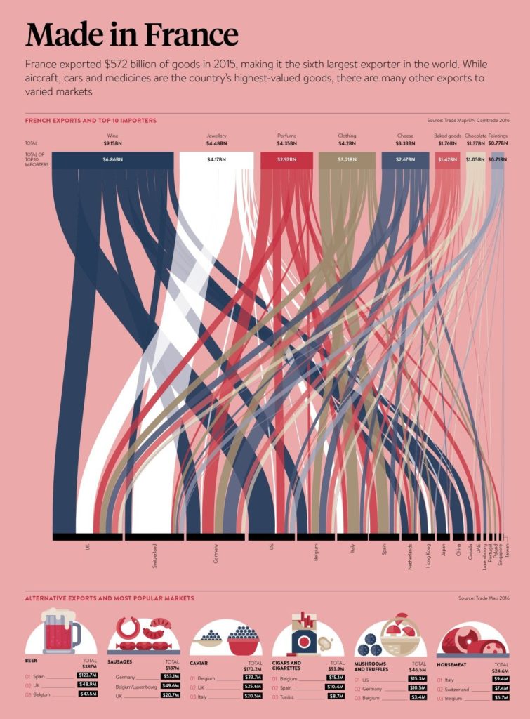
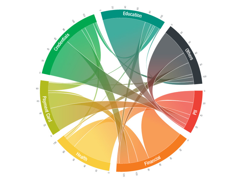
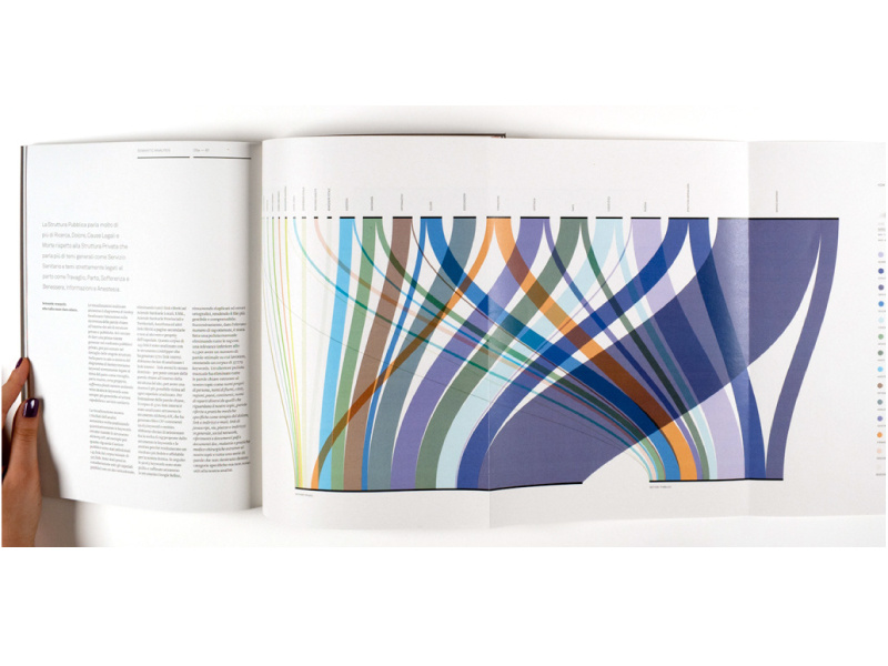
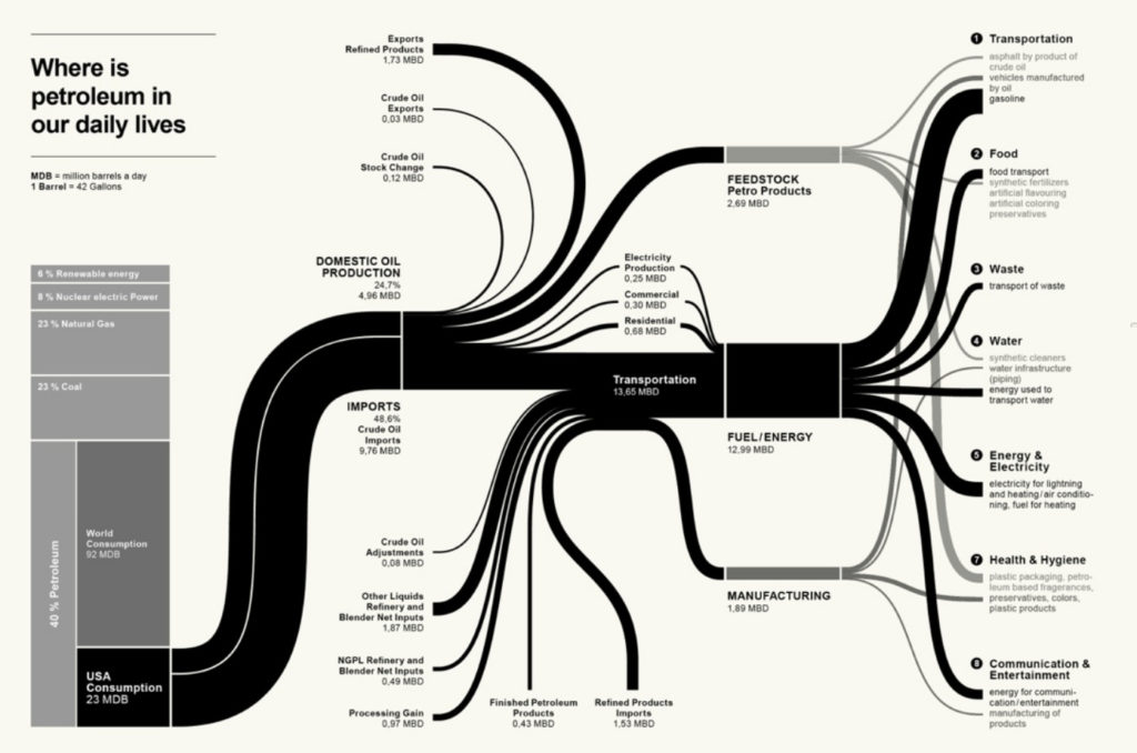
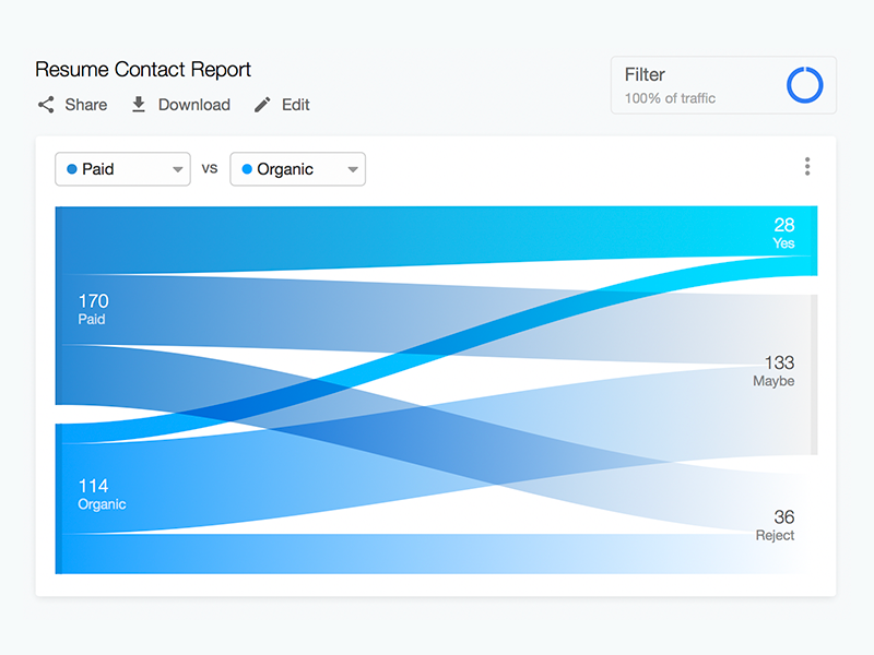
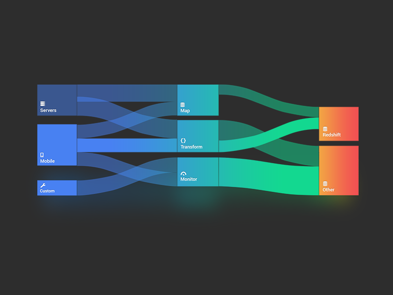
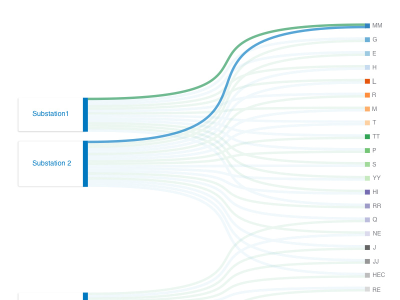
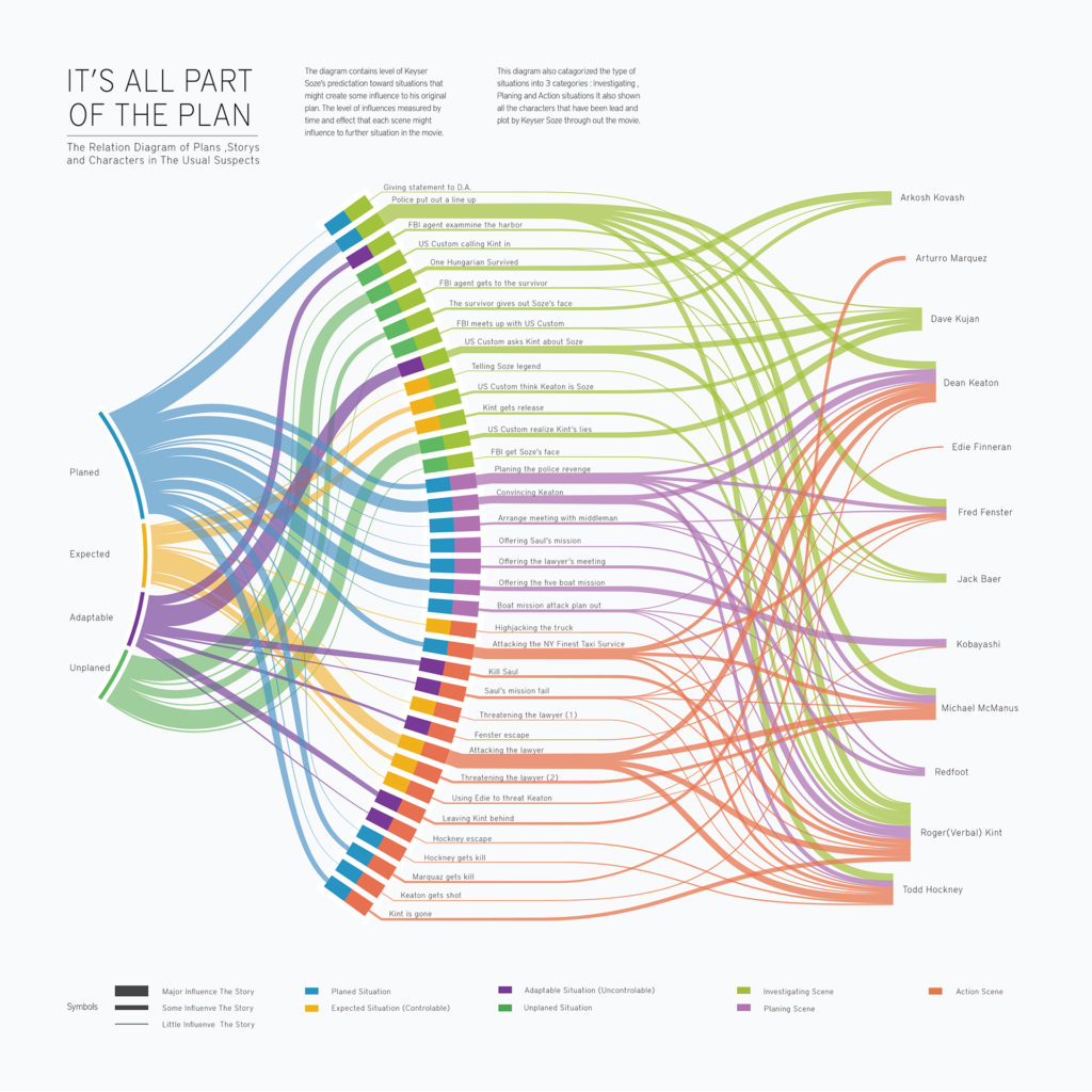
Sankey diagrams are a specific type of flow diagram, in which the width of the arrows is shown proportionally to the flow quantity. They are typically used to visualize energy or material or cost transfers between processes. They can also visualize the energy accounts or material flow accounts on a community level. Sankey diagrams put a visual emphasis on the major transfers or flows within a system. They are helpful in locating dominant contributions to an overall flow.

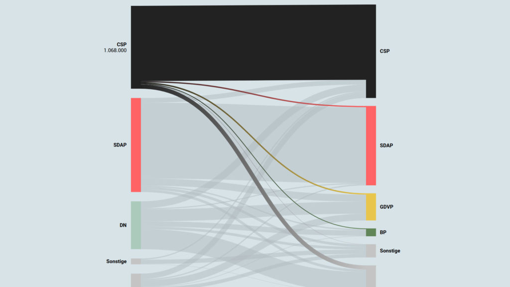
This kind of diagram is often used for voter transition analysis, so I wanted to explore different examples of sankey diagrams and also I wantred to find out how they are done.

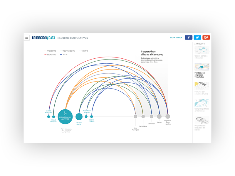
Static examples of Sankey Diagrams:

Interactive Data Visualization: Voter transition analysis

The voter transition analysis allows the user to see how the votes transitioned from one party to another after the elections. The idea is a simple one: if a party gains most votes in those municipalities in which another party had the most votes at the election before, it is interpreted as a vote transition between those parties.

This method is very popular in countrys like Austria and Germany but doesn’t really work in 2-Party systems like the US.

Below you can see some examples of interactive voter transition analysis:

100 Jahre Wählerströme // Der Standard

Why multimodal multisensory interfaces?

During my research I read some excerpts from the book “The Handbook of Multimodal-Multisensor Interfaces” to understand the basic principles of multimodal interface design and to familiarize myself with the vocabulary. The book was published in 2017 and deals intensively with various aspects of interface design and conception based on neuroscientific and psychological research. In my blog entries I would like to excerpt some passages and take a closer look at them.

Interaktive Infografiken: Definition und Anwendung – Benefits von Infografiken

Infografiken findet man heutzutage überall. Die geläufigste Definition der Infografik beschreibt diese einfach als visuelle Repräsentation von Informationen und Daten. Durch die Kombination von Text, Bilder, Diagrammen und auch Videos, ermöglichen Infografiken ein effektive Darstellung von Daten. Wann ist eine Infografik gut und welche Anwendungsbereiche gibt es?

Integration of the sensory system in the design of user experiences

The dream of visual dynamism is the same; to leave behind earthbound stasis and to fly into that liquid space of numerical architecture without gravity – John Whitney

This quote by John Whitney poetically describes the claim he made for himself as an animator, inventor and composer. The fascination in Whitney’s quote lies in the statement “to leave behind earthbound stasis” – herewith Whitney declares his vision as an animator to break out of the conventional and to get to the bottom of new possibilities.