Graphic Design: The Influence of Pop Art

Due to the fact that I feel like I’ve reached an end of my research on the topic I’ve been dealing with last semester, I’ve decided to deal with another one this semester, with which I can relate even more. 
So I’ve selected a new topic that deals with interconnections between the pop art movement and the development and shaping of graphic design. I find this topic very interesting, and I think it has a lot of aspects to be considered – because there is only a fine line that separates graphic design from pop art. 

Pop art is one of the most famous art movements, and a significant art and design milestone, in developing and upgrading a new mindset among the people who deal with visual communication.

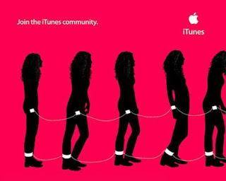
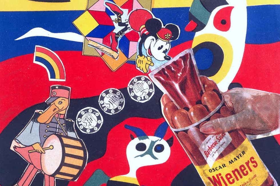
If we look back to the middle of the last century, we will see that some of the main principles we also follow today, when creating the design content, were established through pop art. It also created another approach which “depicted the affluence and abundance of postwar society with imagery that celebrated materialism”. That led to a form of advertising and consumerism with prominent brand names and recognizable packaging.

Principles set back then, are the ones we follow today in our daily work, but maybe the whole process goes unnoticed because we don’t know the background and the conception of the same. Simply, if we know more about the genesis of this movement, we could understand and apply it better, and understand why it is becoming more and more popular in design these days.

In my first blog, I will make a short introduction about the inception of the movement with some examples that influenced the development of graphic design, and in the next ones, I will talk about how and where it could be applied or rather where the possibility of implementation lies.

An Introduction to Pop Art

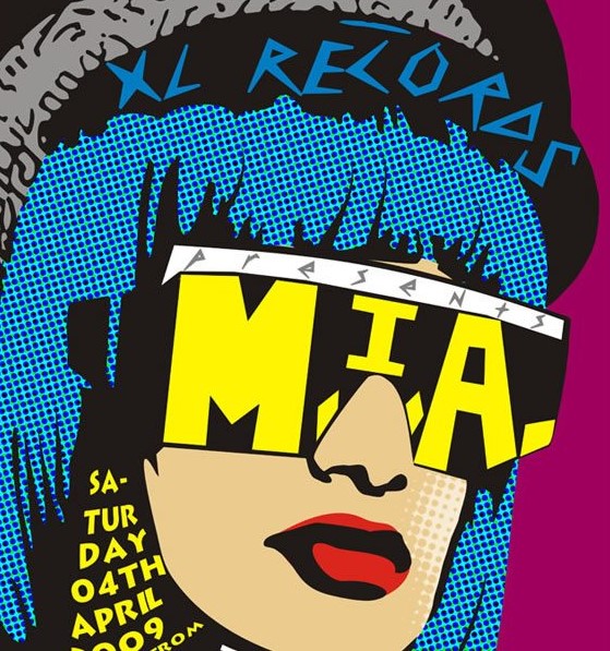
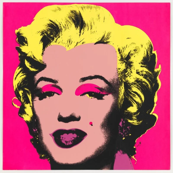
Pop art emerged in the mid-1950s and 60s in Britain and America when artists created works inspired by the realities of everyday life – of popular culture, hence the name. Stylish, colorful, humorous, unsettling- Pop Art is highly recognizable and visually appealing. The movement had its heyday in from the 1950s but remains influential in both fine art and design trends today. Pop Art can be broadly defined as any art which depicts images and iconography culture and mass media out of its original context with the goal of holding a mirror up to the society which created it. 

Artists such as Andy Warhol, Roy Lichtenstein, and Richard Hamilton questioned elitist culture and fine art traditions and instead used imagery and techniques drawn from mass media and mass culture.

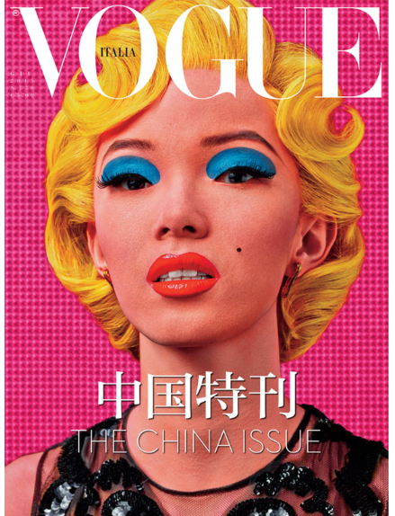
With saturated colors and bold outlines, their vivid representations of everyday objects and everyday people reflected the optimism, affluence, materialism, leisure, and consumption of postwar society. Pop art is known for its bold features and can help you grab the attention of your audience instantly.

Because pop art is so bright, and it draws attention so well it matches the criteria of poster art perfectly. That is the reason why its many aspects have been absorbed into the world of design and commercial aesthetics.


Sources:
http://cynthiachircop.blogspot.com/2014/12/the-influence-of-pop-art.html
http://drdgraphicdesigns.blogspot.com/2012/06/pop-art-movement-and-graphic-design.html
https://www.webdesigndegreecenter.org/art-influences-design-pop-art/
https://www.canva.com/learn/ways-pop-art-changed-modern-design/

Intercultural Design Competence (part 2/3)

One concern many designers have is that misinterprations of their designs occur by people from other cultures. There are three common approaches to intercultural graphic design:

1) Graphic designers attempt to translate their own visual language into another culture’s visual language. This becomes more and more outdated because the same idea is often translated into multiple languages. But „many ideas do not clearly translate from one culture to another. Visual language, just like verbal language, has a specific grammatical structure. Whereas verbal language cannot be translated word for word, visual language cannot be translated image by image“ the article states.

2) Graphic designers focus on transforming their ideas rather than translating. They apply images or ideas only because of aesthetic reasons without really understanding them and copy specific styles of design. A designer should go further and rather „understand the images and ideas of different cultures, and then merge these with their own cultural knowledge to create an entirely new visual message.“ The article suggests the designer to be a chameleon and reflect local color but retain their form.

3) Graphic designers gain an understanding of the audience’s culture, because they want to avoid offending the audience. It’s important to not only avoid offending but to connect and look deeper.

Heimat vieler Meinungen

Auf Recherche im World Wide Web

Da sich zum Thema Heimat erstaunlich viele, auch aktuelle, Videos, Kommentare, Essays und wissenschaftliche Texte finden, erstelle ich eine Liste mit Links zu interessanten Beiträgen. Weitere Links befinden sich in einem früheren Posting.

https://www.derstandard.at/story/2000082078831/gabalier-vs-krautschaedl-wem-gehoert-der-heimatbegriff

https://www.deutschlandfunkkultur.de/heimatbegriff-und-die-musik-volksmusik-heisst-immer-auch.2177.de.html?dram:article_id=410841

https://www.stadlpost.at/heimatmusik-verbindet-menschen-heute-so-stark-wie-nie-zuvor/

https://www.grin.com/document/86300

http://www.ernst-bloch.net/owb/fobei/fobei31.htm

https://www.diepresse.com/1437689/lasst-uns-heimat-bauen

https://trends.google.de/trends/explore?date=all&geo=AT&q=Heimat

https://www.dwds.de/r/plot?view=1&corpus=dta%2Bdwds&norm=date%2Bclass&smooth=spline&genres=0&grand=1&slice=10&prune=0&window=3&wbase=0&logavg=0&logscale=0&xrange=1600%3A1999&q1=Heimat

Intercultural Design Competence (part 1/3)

New semester, new research topic. To put it short: I liked the topic logo design and was interested in it, but as we still have enough time to research in other fields, I looked for something I have a more personal connection to. Working on a master thesis is quite time-consuming and in order to keep going, being intrinsically motivated is important. 

As I really want to go abroad during my masters degree and I’m always fascinated by getting to know other cultures and becoming more and more open-minded, I thought of a cultural approach. I already wrote my bachelor thesis on the topic: „Erasmus students at the University of Salzburg. An analysis of motivation, satisfaction, communication and cultural challenges in the context of a stay abroad.“ Therefore, I conducted interviews with Erasmus students and I really enjoyed working on the topic and getting to know people with other different backgrounds. There is so much we can learn from each other. 

But now, back to my new topic: I started doing my research and came across this article:

https://www.academia.edu/29572529/Intercultural_Design_Competence_A_Guide_for_Graphic_Designers_Working_Across_Cultural_Boundaries?auto=download

“Struggle” ums Thema

Neues Semester – neues Thema

Nachdem ich mit meinem letzten Thema (Podcasts) nicht wirklich glücklich geworden bin, will ich nun eines finden das mich wirklich fasziniert und begeistert.

Momentan überlege ich zwischen zweien: Zum Einen möchte ich genaueres zu Character Design und Animationen erforschen, zum Anderen gibt es einen Animationsstil der mich schon länger fasziniert: 2D und 3D nahtlos kombiniert. Vielleicht ergibt sich auch eine interessante Kombination..

Character Design/Animation

Character Design ist natürlich ein sehr breites Thema. Wenn dann noch Animation hinzukommt, wird es nicht unbedingt einfacher. Der Fokus hier würde vermutlich darauf liegen was einen charismatischen und ansprechenden Character ausmacht? Unterthemen wären zum Beispiel Bewegung, Animationsstil, Gesichtsanimation, wie unterstützen sie die Wahrnehmung eines Characters?

Interessenbooster: Markus Magnussons Kurs

2D und 3D Combined

Besonders faszinierend finde ich das mischen von 2D und 3D Elementen in Animationen. Wie in dem Musikvideo Dark Stars. Designer Rich Hinchcliffe nutzt in dem Video hauptsächlich 2D Illustrationen und Animationen. Unterstützt wird die Szene von 3D Elementen um dem Bild mehr Tiefe zu geben.

Dark Stars von Motion Designer Rich Hinchcliffe

Genau andersrum ist es beim animierten Film Spider-Man into the Spider-Verse der Fall. Die 3D Animation sieht in jedem Frame so aus wie eine eigenständige Illustration in einem Comicbuch. Unterstützt wird dieser Effekt durch 2D Illustrationen/Animationen die über der 3D Animation liegen. Vor allem Konturen wurden dafür extra nachgezeichnet und darübergelegt.

Spider-Man into the Spider-verse

Die Frage hier wäre wohl ob die Kombination von 2D und 3D Elementen in Animationen die Erzählung einer Geschichte unterstützt oder doch nur visuell toll aussieht? Und wenn ja, wie und wann kann/soll dieser Animationsstil sinnvoll eingesetzt werden?

Combining Digital Transformation and Environmental Responsibility

Many established brands are failing to take full advantage of new technology, such as increasingly sophisticated automation, virtual reality and augmented reality. This is why the technological revolution has been accompanied by a slowdown in the growth of more traditional businesses. Companies like Amazon, Facebook and Netflix rely on technology but don’t physically manufacture.

This points to one of the biggest trends of the current age: the rise of software products. Consumer behaviour is evolving at a faster pace than many businesses can cope with. Consistently, across the board, traditional firms of all sectors are failing to deliver what their customers want and expect in the digital age. And, for those that fail to keep up, the impact can be substantial.

One single device like a smartphone can store a huge amount of data. Advances like this in technology and digitalization have the potential to drive society toward a sustainable future, but only if this can be done sustainably. For example, electric vehicles offer enormous potential to improve mobility, reduce harmful emissions and pollution, and mitigate climate change, but not if the electricity required to power them comes from unsustainable power generation, such as coal.

Renewable energies are of major importance in Austria. In 1990 only 61,4% of the total energy in Austria was supplied by renewable energy sources (e.g., hydropower, biomass, solar energy). As of 2018, renewable energies account for 81.59% of the energy in this country. 100% of renewable energy generation is planned to be achieved by 2030 and Austria will proceed to decarbonize the energy system by 2050.

Sources: https://www.information-age.com/how-companies-must-adapt-digital-revolution-123461760/, https://www.theguardian.com/global/blog/2015/nov/13/digital-revolution-environmental-sustainable, https://www.natixis.com/natixis/jcms/lpaz5_79618/en/real-environmental-impact-of-the-digital-world, https://theconversation.com/the-digital-revolution-could-unlock-a-green-transformation-of-the-global-economy-123645, https://investinaustria.at/en/sectors/environmental-technologies/renewable-energies.php, https://iiasa.ac.at/web/home/about/news/190711-TWI2050-digitalization-report.html

Malerei im Raum – Recherche

Die Malerei, welche als Kunstform tief in der Geschichte verwurzelt ist und zahlreiche Richtungen eigeschlagen und Strömungen erzeugt hat, ist dennoch immer wieder an ihre Grenzen gestoßen. Der erweiterte malerische Raum, welcher Farbe, Inhalt und Form von der klassischen Leinwand löst, ist die logische Antwort auf dieses Problem.

Fernand Léger (1881-1955) entwickelte enge Verbindungen zu Schlüsselfiguren der modernen Architektur wie Robert Mallet-Stevens, Le Corbusier, Charlotte Perriand, Wallace K. Harrison, Paul Nelson, André Bruyère, und Carlos Raul Villanueva. Die intensive malerische Auseinandersetzung mit dem gebauten Raum war für den gelernten Architekturzeichner Léger von höchster Bedeutung. So wollte er Farbe und Leben auf ihre weißen, neutralen Wände bringen und der modernen Architektur helfen, sich in den Alltag zu integrieren, um das menschliche Leben durch die soziale und psychologische Wirkung von Farbe zu verbessern.

La Grande Fleur Qui Marche, 1952, in Den Haag

Auch Ernst Caramelle (*1952) beschäftigte sich nach 2010 mit raumgreifenden Konzepten im dreidimensionalem Ausstellungsraum. In Projekten, die nach 2010 entstanden sind, überführt Caramelle seine raumgreifenden Konzepte in den dreidimensionalen Ausstellungsraum. So bringt er beispielsweise 2012 im Wexner Center for the Arts in Columbus, Ohio, eine temporäre Wandmalerei an, bei der er mit verschobenen Farbfeldern arbeitet.
In der Ausstellung in der Kunsthalle Krems (13. März bis 19. Juni 2016) arbeitete Caramelle ebenfalls mit einer spannungsreichen Anordnung unterschiedlich getönter Farbflächen, die den Ausstellungsraum dynamisierten. Dabei galt sein besonderes Interesse den Möglichkeiten, den Raum selbst zum Kunstwerk werden zu lassen. Susanne Längle bezeichnet die Raumbezüge in Caramelles Werk als „Postarchitektonische Malerei“. „Statt Architektur nur zu porträtieren, greift Caramelle nun mit der Setzung farbiger Flächen in einen realen architektonischen Körper und seine räumliche Konfiguration ein. Überschneidungen der Farbflächen und deren Staffelung dynamisieren die Fläche in die dritte Dimension und veranlassen das betrachtende Gegenüber, sein Blick kontinuierlich zu justieren und sich in dem engen Zusammenspiel von Bild, Wand und Raum entsprechend neu zu verorten.

Comma 26, Ernst Caramelle, Bloombergspace, 2010

Quellen:

https://d-nb.info/1084224429/04

https://artmap.com/bloombergspace/exhibition/comma-26-ernst-caramelle-2010?print=do