WHAAM!-isation of visual culture


According to the designer Mario Tomisa, contemporary societies are based on mass-production and consumption, and the global exchange of capital and labor, so he concludes that design can be also defined as an intellectual and creative interdisciplinary activity that functions within the society and has the need to materialize myths in order to foster mediation within the cultural system.

The term “Design” itself, as a synthesis of art and industry, began to be theoretically elaborated from an early age of “Second Modernization”, that is, in the early 1950s.

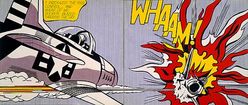
So when we say that design itself is a synthesis of art and industry, there is no wonder that we can not determine for sure what differences graphic design from pop art, which arises as a result of a technique of work applied during work process in graphic design.

Professor of Graphic Design Ryan Hembree at the University of Missouri details how graphic design differs from art, and thus the ultimate goal of creating work between an artist and a graphic designer. He points out the fact that designers sometimes use the same tools as a painter, sculptor, or photographer when creating their work, which may even contain pieces of artwork within the composition. To high art and design, creative creation is common, but individual purpose is completely different. Hembree states that high art is self-sufficient, as well as the motives of creation that are expressed on an individual level. The artist explores social problems, creates an opinion (viewpoint), and provides viewers with scenes of the world around them. Although most artists’ aspiration is to sell works to people who relate to their works on a visual and emotional level, the work itself is mostly created for its own reasons, not for the individual buyer. Graphic design, on the other hand, is a vocation that involves creating visual communication at the expense of a customer who has a very specific need and is willing to pay for it.

On the other hand theorist Rick Poynor notes and points out that graphic design has always borrowed motifs from other fields of art, questioning how the element of postmodern borrowing differs from borrowing from previous artistic periods throughout history. As an example of a design that borrows distinctive elements from previous artistic periods, he takes the design created by Malcolm Garrett to cover the album New Gold Dream of music rock band Simple Minds. Thus, the cover of the said album contains a combination of medieval motifs, such as the Catholic Cross, which at its core contains the motif of the Heart of Christ, inside which is a booklet, with a medieval calligraphic font over a “marble” background. The overall impression does not give the impression of contemporary design, but it does convey that visual message of the basic idea of ​​the album.

Through my research, I found many designers and artists, who could be interesting for my topic, but I don’t want to make this post really, really long so I am going to mention just a couple of them.

  • Butcher Billy
    One of them is a designer who publishes works under the artistic name Butcher Billy. This Brazilian illustrator and designer, like his pop predecessors, draws inspiration from what he considers to be a popular culture of various sources (such as music, comics, movies, games, etc.), and fuses them into interesting works. He considers himself a butcher of popular culture obsessed with finding the perfect cut. Nowadays, making links to pop culture can be common and boring, but this is not the case with this artist. His work is recognizable for its vibrant, vibrant colors. It gives observers, with a sense of nostalgia, a fresh look at the already familiar current scene.
  • Shepard Fairey
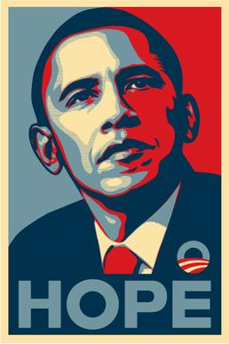
    Another example is the work of artist Shepard Fairey. Shepard Fairey is a contemporary street artist, illustrator, graphic designer, activist and founder of the OBEY Clothing clothing line. Formerly known to the public as the creator of Andre the Giant Has a Posse (1989), he became even more famous by creating the HOPE (2008) poster for Barack Obama’s presidential campaign. The HOPE poster incorporates photography into the composition.
  • Richard Avedon
    He was born in New York and he attended DeWitt Clinton High School in the Bronx, where he worked on the school paper with James Baldwin. After briefly attending Columbia University, he started as a photographer for the Merchant Marines in 1942, taking identification pictures of the crewmen with his Rolleiflex camera given to him by his father as a going-away present.
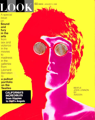
    Among his important works are the photographies of members of a music group “The Beatles”, which he took in August 1967. Four of them were later adorned with psychedelic effects. They were first published in the 9 January 1968 edition of the US magazine Look and were subsequently sold as posters.


Sources:
https://www.fsu.edu.rs/istorija-grafiti-umetnosti-stencil-art/
https://repozitorij.ffos.hr/islandora/object/ffos%3A4107/datastream/PDF/view
http://guity-novin.blogspot.com/2010/06/chapter-33-pop-art.html

Theory research

To get more familiar with non linear storytelling it is required to go back in time and read where the idea of telling stories  in a different way compared to the conventional way in general, and creating movies in particular, came from.

I started from the oldest movie that uses a non-linear narrative that I know: Citizen Kane. Citizen Kane is a film released in 1941 by Orson Welles, who acted as producer, co-screenwriter, director next to playing the title character. It seems necessary to me to look further into art and theories Welles has been influenced by.

I went back to read about the nonlinear basics. When reading the sentence:”Nonlinear film emerged from the French avant-garde in 1924 with René Clair’s Entr’acte, Dadaïst film and then in 1929 with Luis Buñuel and Salvador Dalí’s Un Chien Andalou (English: An Andalusian Dog).” I understood I had to go back in time even further than I thought.

“The Avant-garde pushes the boundaries of what is accepted as the norm or the status quo, primarily in the cultural realm” https://en.wikipedia.org/wiki/Avant-garde . The Avant-garde concept was about creating art pieces differently, as well as more  of a critiquing tool than the “mainstream” art and media were. 

As the non linear storytelling isn’t, or at least wasn’t the mainstream way of telling a story it is considered to be affected by the avant-garde concept. I shall read much more about those before writing about my opinions, and how it will lead me to my subject in the next blog entry.

Stereofonie – Mikrofoniertechniken

Durch (Hör-) Erfahrung lernt man am besten – das hat sich schon in vielerlei Hinsicht bewiesen. Zudem gibt es sehr viele technischen Möglichkeiten, die man als Sound Designer geboten bekommt, um Aufnahmen zu machen. Um aber auch das passende Mikrofon in der richtigen Aufstellung zu nutzen, um das Klangobjekt oder –Ereignis zu mikrofonieren, muss man zunächst herausfinden, welche Mikrofoniermethode für welchen Zweck optimiert ist.

Das ist besonders interessant in der Stereofonie, welche man sowohl bei Konzerten als auch bei Field Recordings viel nutzt. Um die Unterschiede durch eigene Erfahrung mit den Aufnahmemethoden festzustellen, haben wir Sound Designer folgende vier Stereofonien getestet:

MS – Stereofonie

MS steht für „Mitte Seite“ und besteht aus einer Kombination aus zwei Mikrofonen mit verschiedener Richtcharakteristik. Das M-Mikrofon nimmt das Mittensignal oder auch Monosignal auf – das kann zum Beispiel eine Kugel- oder Nierencharakteristik sein. Das S-Mikrofon mit der Achtercharakteristik zeigt nach links und nach rechts (verpolt in negativer Phase) und nimmt somit beide Seitensignale auf.

Diese Aufnahme kann man dann durch die MS-Matrix dematrizieren, wodurch man ein Links/Rechts Stereosignal erhält. Eine MS-Aufnahme kann man somit in ein XY Signale umwandeln.

In unserem Fall haben wir das MSH-6 genutzt, welches schon beide Mikrofone in ein MS-Mikrofon integriert hat (siehe Abbildung).

XY – Stereofonie

Für eine XY – Stereofonie benötigt man zwei Mikrofone mit derselben Richtcharakteristik, welche meistens eine Niere ist. Für diese Stereofonie ist der Pegel-Intensitätsunterscheid ausschlaggebend. Die beiden Nierenkapseln werden direkt übereinander angeordnet, wodurch so gut wie keine Phasenunterschiede entstehen. Um den Aufnahmewinkel, also die Stereobreite, zu verändern, muss man den Öffnungswinkel der Mikrofone vergrößern bzw. verkleinern. Hierbei gilt: Je größer der Öffnungswinkel, desto kleiner wird der Aufnahmewinkel („Zoom in“ an Klangobjekt). Gängige Winkelungen sind z.B. 90° und 120° (siehe Abbildung).

Das XYH-5, welches wir für unseren Mikrofonierungstest verwendet haben, ist schon im 90° Winkel voreingestellt (siehe Foto).  Besonders interessant ist hierbei die Mono-Komptabilität, da man durch die Nähe der Mikrofone auch nur ein Signal verwenden kann.

AB – Anordnung

Eine Stereofonie in der AB-Anordnung besteht aus zwei omnidirektionalen Druckempfängern (Kugelmikrofonen). Durch die Kondensator-Druckempfänger kann mit dieser Stereofonie vor allem gut die tiefen Frequenzen abgebildet werden, weshalb sie häufig bei Klassikaufnahmen als Hauptstereofonie verwendet werden. Die unterschiedlichen Anordnungsformen variiert mit dem Abstand zwischen den beiden Mikrofonen. Mit mind. 17cm Abstand bis ca. 38cm hat man eine „Klein-AB“Anordnung, wodurch alles darüber bis ca. 1m mit „Groß-AB“ benannt wird. Mit „Groß-AB“ wird die Abbildung größer, wodurch die Räumlichkeit besser abgebildet werden kann.

Wir haben eine „Klein-AB“ Aufnahme gemacht, bei der die beiden Kugelmikrofone auf einer Stereoschiene 17cm voneinander entfernt sind, was ungefähr dem durchschnittlichen Kopfdurchmesser ist. Hierbei ist der Aufnahmewinkel ca. 180°.

ORTF (Äquivalenzstereofonie)

Mit Äquivalenzstereofonie ist gemeint, dass die Stereofonie sowohl Laufzeit- als auch Pegeldifferenzen aufweist. Das bedeutet vereinfacht gesagt, dass eine rechts stehende Klarinette auf dem linken Kanal sowohl leiser abgebildet wird als auch verzöget ankommt. Dadurch kann sehr gut eine räumliche Tiefe abgebildet und eine gute Trennung und Ortung einzelner Klangquellen hergestellt wird.

 Beim ORTF, was für Office de Radiodiffusion-Télévision Francaise steht, werden die Kapsel in einem 17cm Abstand zueinander aufgestellt, wobei zwischen ihnen ein Öffnungswinkel von 110° besteht.

Dadurch, dass die Mikrofone wie beim AB räumlich getrennt sind und nicht so nah platziert wie bei MS und XY, nimmt eine ORTF Stereofonie ein breiteres Stereobild auf, jedoch nimmt man weniger Klangraum auf im Vergleich zum AB, da die Mikrofone beim ORTF gerichtet sind (Nierencharakteristik).

Aufnahme Session im Stadtpark

In unserer Aufnahme Session im Park haben wir alle 4 Stereoaufstellungen ausprobiert, wobei wir jedoch beim ORTF versehentlich die 17cm Abstand zwischen den Mikrofonen vor der Winkelung bemessen hatten und nicht den Abstand der Kapseln, weshalb ich nur die anderen drei Aufnahmen vergleiche. Hier ist unser Aufbau und die technischen Daten übersichtlich aufgelistet:

Da wir die Aufnahme im Stadtpark gemacht haben, bilden die Mikrofone keinen „Raum“ an sich ab, sondern stehen im Freiraum. Es ist deutlich hörbar, dass die Kugelmikrofone bei der AB-Stereofonie als Druckempfänger deutlich mehr tiefe Frequenzen abbilden als die anderen Mikrofonierungen. Jedoch wäre eine größere AB Aufstellung für Field Recordings vermutlich von Vorteil, um noch mehr das Freiraumvolumen aufzunehmen. Die Ortungsschärfe leidet bei dieser Mikrofonierart durch die omnidirektionale Abstrahlung ein wenig. Die Aufnahmen klingen jedoch etwas dumpf, was aber auch an den improvisierten Windschützen liegen könnte oder am Frequenzverlauf der Mikrofone. Bei der XY-Stereofonie hört man eine genauere Ortungsschärfe als bei AB, dafür nimmt es wegen der nahen Mikrofonierung weniger von der Klangumgebung auf, wodurch der Raum (auch wenn es in unserem Fall ein Freiraum war) kleiner abgebildet wird. Die MS-Stereofonie wird vorallem in der Dematrizierung interessant. Hier kann man nämlich im Nachhinein die Seitensignale und das Mittensignal getrennt voneinander bearbeiten. Dadurch kann man entweder den Raumklang vergrößern, es ist Mono-kompatibel und hat eine Stereobreite wie bei der AB Stereofonie. 

Fazit

Die Ortung ist sowohl bei XY als auch bei MS gut und deutlich, wobei MS noch den Vorteil hat die Signale im Nachhinein zu verändern. AB ist mit 17cm im Freiraum eher nicht geeignet, das selbe Experiment wäre sinnvoller in einer ruhigen Umgebung (z.B. einem Wald) mit einer größeren AB-Aufstellung auszuprobieren. Indoor ist AB nämlich eine sehr gute Stereofonie und kann sicher auch bei Field Recordings nützlich sein. Ebenso werde ich die richtige ORTF Aufstellung nochmals bezüglich des Field Recording Zwecks ausprobieren. Bis dato werde ich weiterhin meine Field Recordings in MS Aufnahmen, da diese Stereofonie für mich klanglich das beste Abbild aufnimmt.

Quellen

Buch: Mikrofone in Theorie und Praxis – Görne, Thomas
https://www.motorradreisefuehrer.de/Zoom-h6.html
https://www.zoom.co.jp/products/field-video-recording/field-recording/h6-handy-recorder/capsules
https://thomwettstein.com/stereo-mikrofonierung/
https://deacademic.com/dic.nsf/dewiki/896629
https://de.ehomerecordingstudio.com/stereoaufnahmeverfahren/

Physical Interfaces in the electronic arts

The following paper by Bert Bongers describes in a compact way

  • needed mindset when designing physical interfaces
  • Variety of sensors and their areas of application

I found the introduction to the paper particularly exciting, in which the author describes two approaches to a physical interface in the electronic arts:

  • Human factor: Which is basically asking the question: How does it feel?
  • Sensor categorisation: Which deals with the technical side and asks: how does it work?

Was ich als Sound Designer vom UX-Design lernen kann

Sound Design ist ein sehr breites Feld. Ob es um Sound für Film, Videospiele, Klanginstallationen oder Musikproduktionen geht, um Software oder akustische Eigenschaften industrieller Produkte – im Idealfall wird es irgendwann einen User oder Rezipienten erreichen. So ist natürlich die User Experience auch für Sound Designer ein essentieller Aspekt.

In ihrem Buch über User Experience zeigen die Herren der Firma Simplease auf, wie sie UX-Design in der Praxis anwenden. Demnach gehe es erst einmal darum, das tatsächliche Problem zu identifizieren. Es gebe normalerweise eine Diskrepanz zwischen der Wahrnehmung und der Wunschvorstellung, was auf ein Problem hindeuten könne. Allerdings sei sowohl die eigene Wahrnehmung grundsätzlich verzerrt, als auch das eigentliche Problem oft ein tieferliegendes, was mit offensichtlichen Symptomen verwechselt werden könne.

Da Fehler aufwendiger zu beheben seien, je weiter ein Projekt fortschreitet, solle man diese möglichst am Anfang machen, alle Stakeholdergruppen möglichst früh einbinden, z.B. durch ausführliche Interviews, und genau analysieren, ob man es mit einem Problem zu tun hat, das es wert ist, gelöst zu werden.

Anschließend plädieren die Autoren für einen agilen Entwicklungsansatz, so dass man möglichst schnell Prototypen bereitstellen kann, um User Tests durchzuführen. Außerdem solle man möglichst ein Minimal Viable Product entwickeln, damit man weiterhin die User in den Prozess einbinden kann und frühzeitig abgleichen kann, ob die eigenen Vorstellungen der Realität entsprechen.

Ob diese Herangehensweise sich direkt auf die Tätigkeiten eines Sound Designers übertragen lässt, muss man dann doch etwas differenziert betrachten, zumindest was die Terminologie betrifft. Ich arbeite gerade an einem Software-Instrument, wo es sehr viel Sinn macht, iterativ zu arbeiten, Prototypen und ein MVP zu entwickeln und regelmäßig User Tests durchzuführen. Ähnliches gilt sicher für die industrielle Produktentwicklung. Aber das sind ohnehin die klassischen Anwendungsfelder für agiles Projektmanagement.

Im künstlerischen Bereich würde man wahrscheinlich selten von einem Problem sprechen, das gefunden oder gelöst werden muss. Auch ist ein wichtiger Aspekt der Kunst, dass sie nicht immer von möglichst vielen Rezipienten verstanden oder gemocht werden soll. Dennoch kann es sinnvoll sein, unausgereifte Versionen einer ausgewählten Hörerschaft zu präsentieren um sich Feedback einzuholen und auszuloten, ob das Werk die gewünschte Wirkung erzielt.

Letztendlich kommt es immer auf den Kontext an, ob und wie sehr die UX-Design-Methoden im Sound Design relevant sein könnten. Sie zu kennen und gegebenenfalls anwenden zu können, wäre sicher sinnvoll.

Physical Interfaces in the Electronic Arts – Bert Bongers

The starting point and usage of electric media to make art can be found in music, as it has a long tradition of performance and of precise and intimate relationship between human and technology. In comparison to musical instruments where the technology was reflected in the instruments and the type of sound generation process determined the design of the instrument, this relationship is often less clear in instruments that use electricity.

Physical Interfaces in the Electronic Arts Interaction Theory and Interfacing Techniques for Real-time Performance

For a new blog entry, we had to read a paper about the topic mentioned above by Bert Bongers. The paper describes aspects of physical interfaces in the electronic arts. It’s splits into two parts where one of them is describing the interactions that can take place in electronic arts through a Human Factors point of view and the other one is more practical explaining more details about sensory technologies and categories to make physical interaction possible.

Live keyboard performance sound manipulation using a Multi Touch Interface

The idea of creating a multi touch interface of controls for keyboarders on a widespread medium such as an iPad is very promising. Up until now, keyboarder during a live performance had to use one hand to alter the sound they produce by changing the state of a knob, button or a fader etc. In case multiple parameters were required to be changed at the same time during a live performance, it was impossible to achieve that by using just one hand while taking into consideration the relative distance between one physical control on the keyboard to another. By developing this multi touch application, the keyboarders can alter multiple parameters of their sound using just one hand, with gestures, swipes and finger count, in the most intuitive way possible. Tests conducted by the developer team in cooperation with professional keyboarders show that the application can become intuitive after a small amount of practice. The application works by setting up gestures and parameters by the keyboarder beforehand and then applied during the live performance. With this application the live performance can come closer to the production of the same sound that could be produced in the studio.

Source: https://www.nime.org/proceedings/2013/nime2013_275.pdf

Grundlagen von Sensory Branding

Wie bereits im letzten Blogpost erwähnt, versteht man unter multisensualer Markenführung das Ansprechen der Zielgruppe durch das Bedienen aller fünf Sinne, oder zumindest möglichst vielen Sinnen. Dies hilft dabei Marken besser bekannt zu machen, da sich diese leichter und stärker im Gedächtnis der Konsumenten einprägt. „Grundlegend ist dabei die Annahme, dass die Wirkung der kognitiven Verarbeitung eingehender Reize umso höher ist, je mehr Reizmodalitäten gleichzeitig und ganzheitlich eingesetzt werden“ (Steiner 2020, S.8).  Beim Kommunizieren von Markenbotschaften werden allerdings meist nur ein oder zwei Sinneskanäle angesprochen, nämlich visuell und akustisch. Das Potenzial wird somit nicht ausgeschöpft.